Work / Corporate & Tech
Axletree Solutions
Enterprise data connectivity, simplified
- Client
- Axletree Solutions
- Year
- 2026
- Industry
- Corporate & Tech
A twenty-five year old financial connectivity company that had outgrown its own identity. We rebuilt it around one promise — peace of mind — and gave it a system disciplined enough to run across three sub-brands and a global sales deck.
01The Brief
Axletree moves money between systems that were never designed to talk to each other.
It transmits any transaction, from any system, to any network, anywhere in the world — SWIFT, host-to-host, API, banks, corporates, networks. Twenty-five years of it, since 2001.
The problem with selling that is the same problem as selling plumbing. It is critical, invisible, and technically dense. The old identity described a company that did complicated things. It did not describe why anyone should feel safe handing it their payment traffic.
The rebrand was not cosmetic. In their own words: not change for appearance's sake, but a deliberate shift to ensure the identity mirrors the sophistication, clarity, and impact of the work.
Fintech infrastructure brands all sound the same because they all describe the pipe.
Problem
Secure. Scalable. Seamless. Robust. Every competitor owns those words, which means nobody does. And none of them answer the only question a bank's operations head actually has, which is whether they will get a call at 2am.
Stop selling the pipe. Sell the outcome of the pipe working.
Solution
The brand promise became We Provide Peace of Mind — the feeling on the other side of the technology, not the technology. Every design decision then had something to be judged against: does this reduce doubt, or add to it?
Underneath it, a two-tier message system. Find Your Any carries the capability in short form. Enterprise Data Connectivity, Simplified is the everyday articulation of what they actually do.
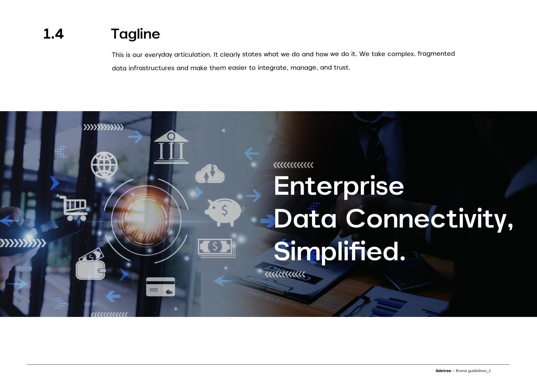
The tagline: the everyday articulation
02Three Principles
Human. Clear. Trust.
Not adjectives on a wall — a test. Human means designing around real responsibilities and workflows, in language that is respectful and inclusive. Clear means one visual hierarchy, copy distilled to what is essential, and decisions driven by function rather than decoration.
Trust means a calm, composed visual language and choices that favour longevity over trends. For a company selling reliability, a trend-led identity would have argued against itself.
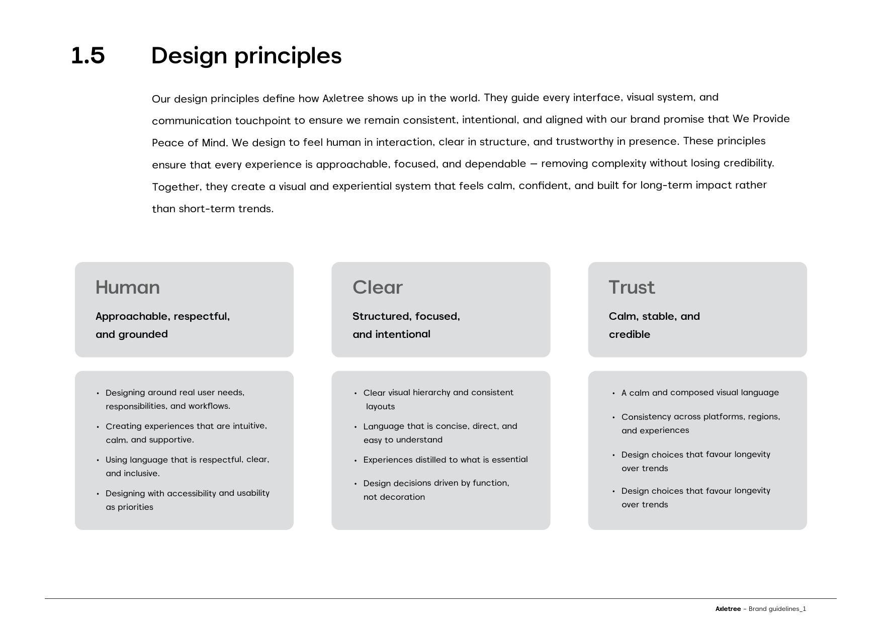
The three principles, and what each one rules out
03Symbol and Wordmark
Two elements that can separate without losing recognition.
The identity is a symbol and a wordmark with a deliberately adaptable relationship — stacked, locked horizontally, or the symbol alone, depending on where it lands. That flexibility is the point: a company operating across markets and formats cannot afford one rigid lockup.
From the symbol comes a supergraphic — key elements extracted and enlarged to express scale and connectivity where the full logo would be impractical. Exactly two crops are approved. No rotations, no alternatives, no exceptions.
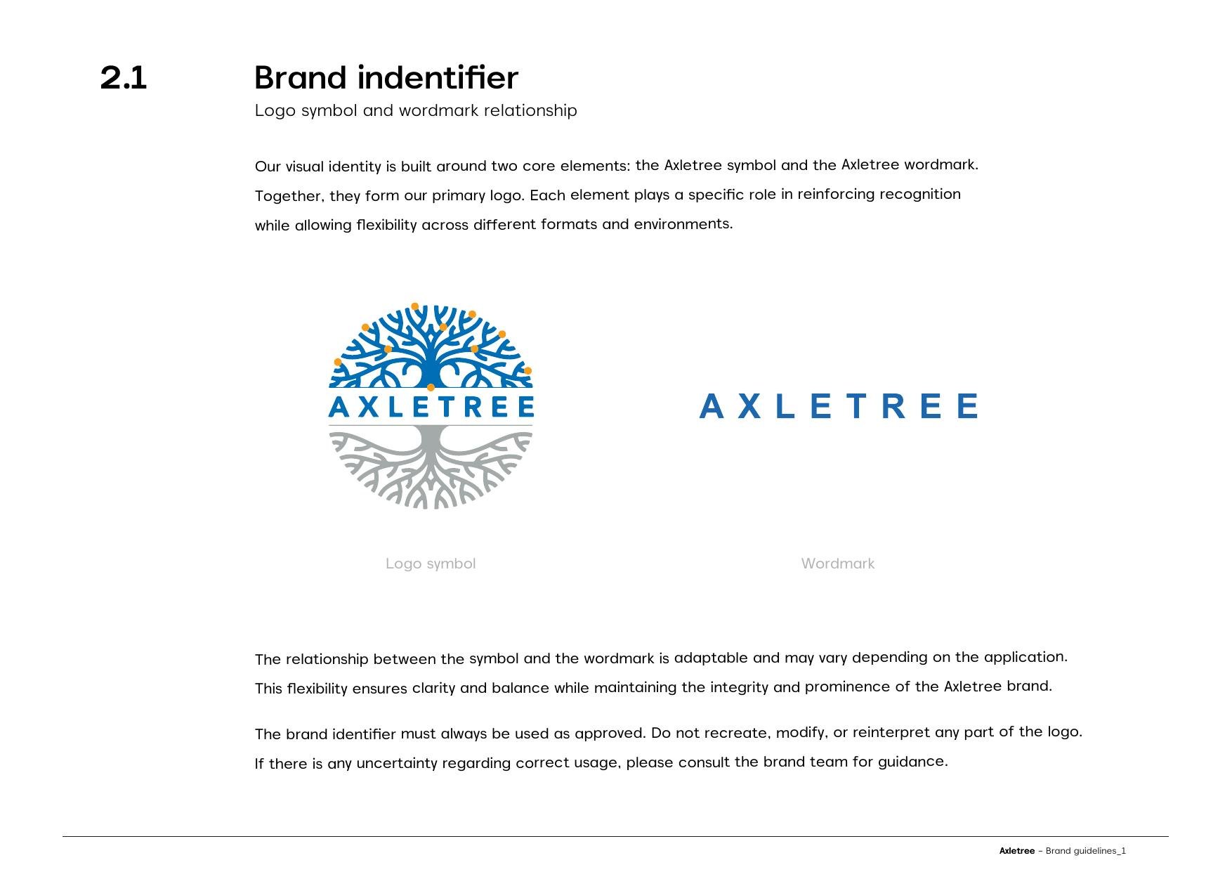
Symbol and wordmark
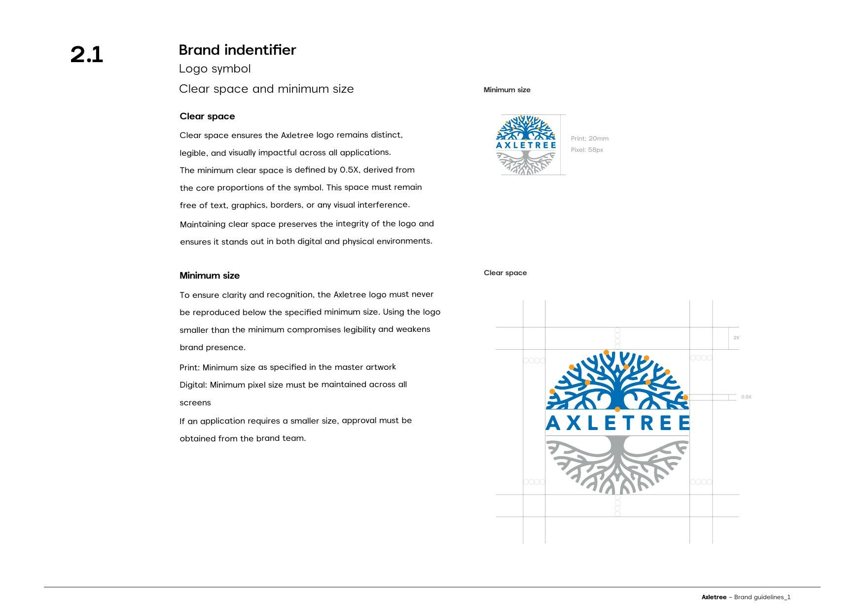
Construction and clear space
04Colour
A mesh, not a palette.
Three core colours — a deep institutional blue, a warm amber, a neutral grey — then four approved mesh gradients built from them. The mesh is what stops a blue fintech brand reading as cold: it moves, it has depth, and it never sits flat.
Every gradient is specified by corner, not by feel, so a deck built in Mumbai matches one built in New Jersey.
Core
Axletree Blue
#23508C
Amber
#EA9C4E
Grey
#8B9096
Cyan
#009EDA
Green
#479652
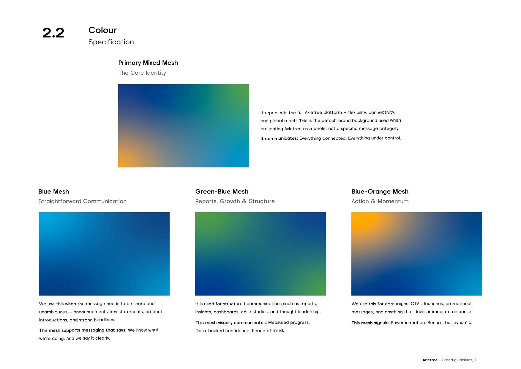
Specified corner by corner
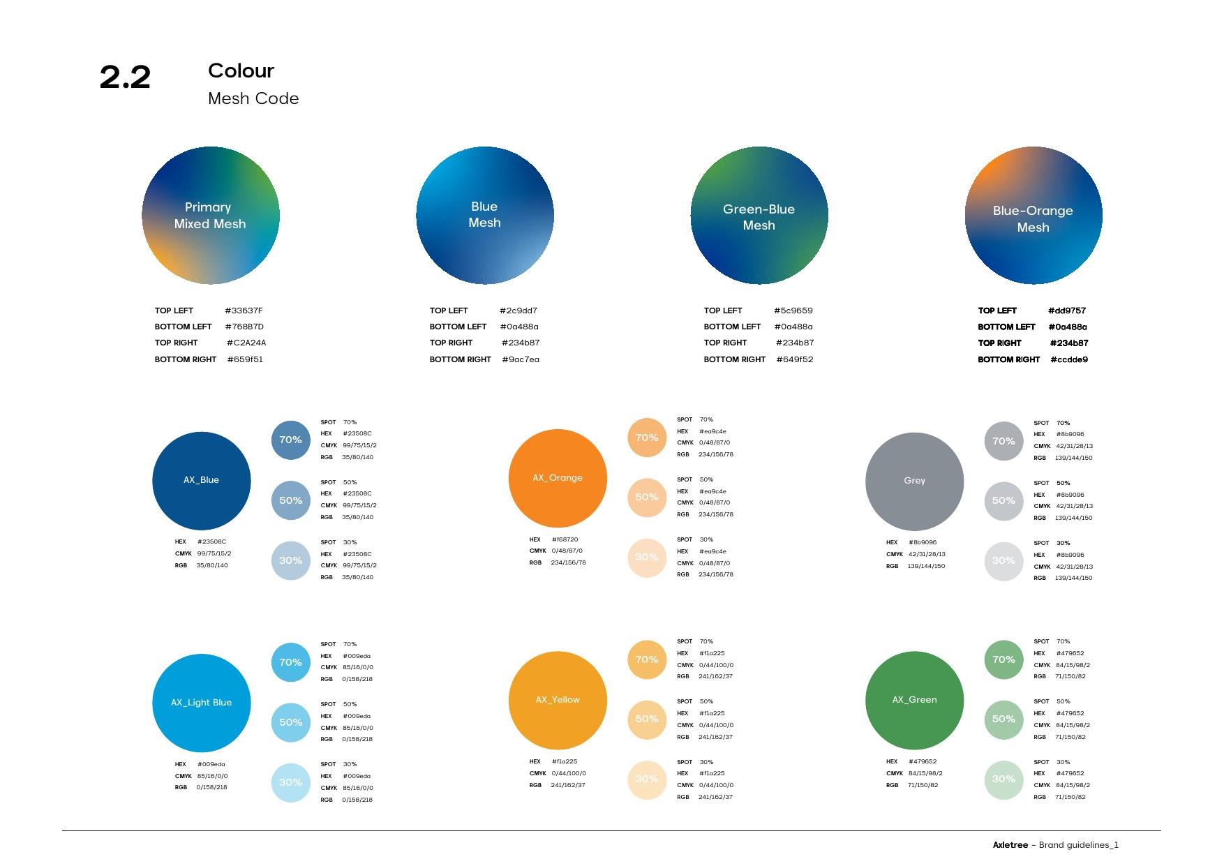
The four approved meshes
05Type and Hero Numerals
Akmorn Grotesque, plus a set of numerals that do their own arguing.
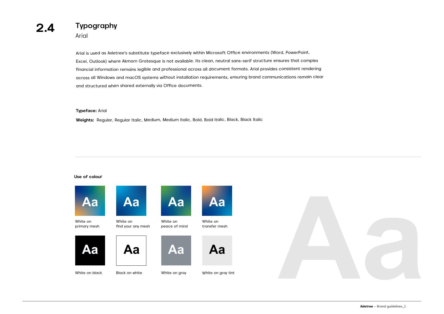
Akmorn Grotesque across sixteen weights, chosen for clarity in digital-first environments — neutral enough that dense financial information reads without visual noise. Arial as the Office fallback, so a spreadsheet leaving the building still looks like the company.
The interesting decision is the hero numerals. Strong horizontal and vertical proportions give large figures visual weight without any surrounding graphic device, so $150+ billion or 1,200,000+ transactions can carry a slide on their own. Restricted to exactly that job — big metrics, nothing else.
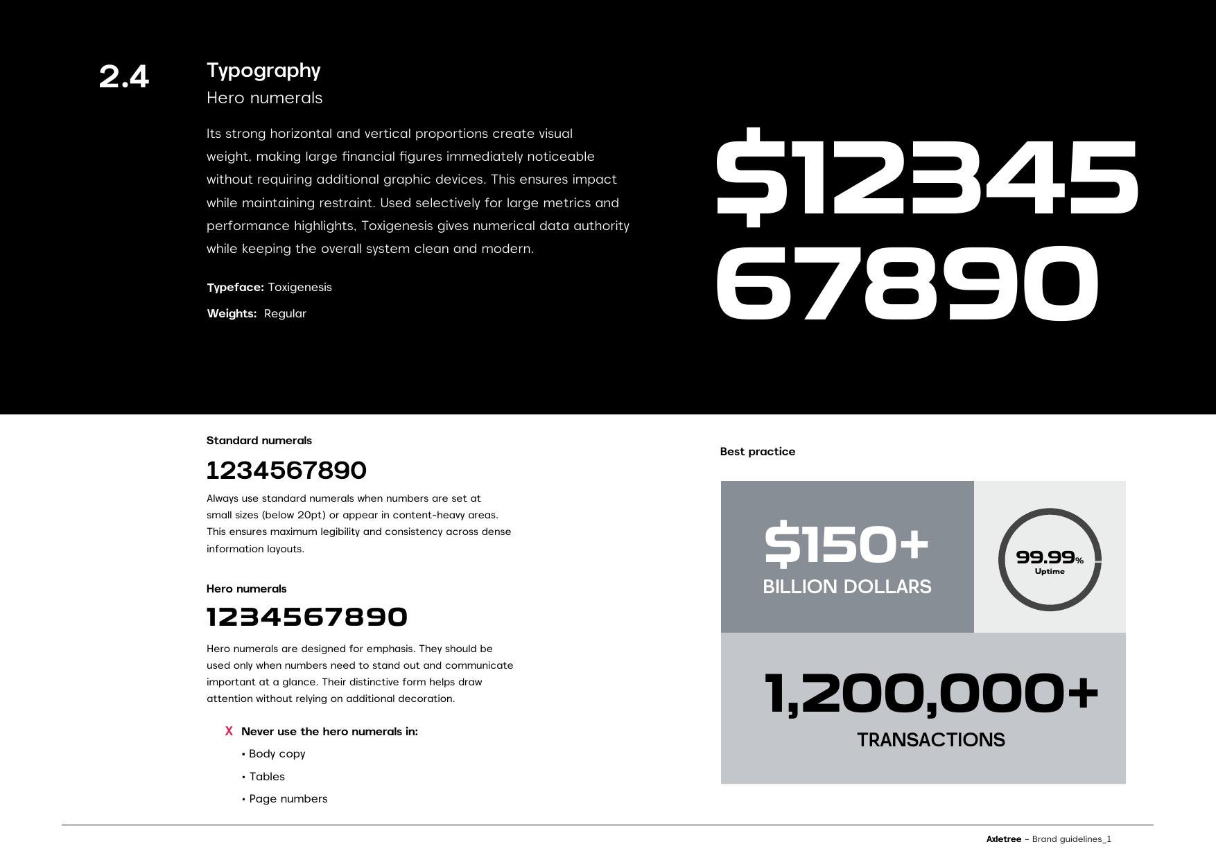
The numeral set
Where they are allowed
06Three Sub-Brands
One system, three jobs it has to do without fragmenting.
The 25th Year mark is a commemorative device for the milestone year — deliberately temporary, deliberately aligned to the master brand, retired when the year ends.
LiA is Life in Axletree: the internal cultural expression, covering people, values and shared milestones. The guidelines are explicit that it is not a corporate positioning statement — it exists to strengthen internal connection.
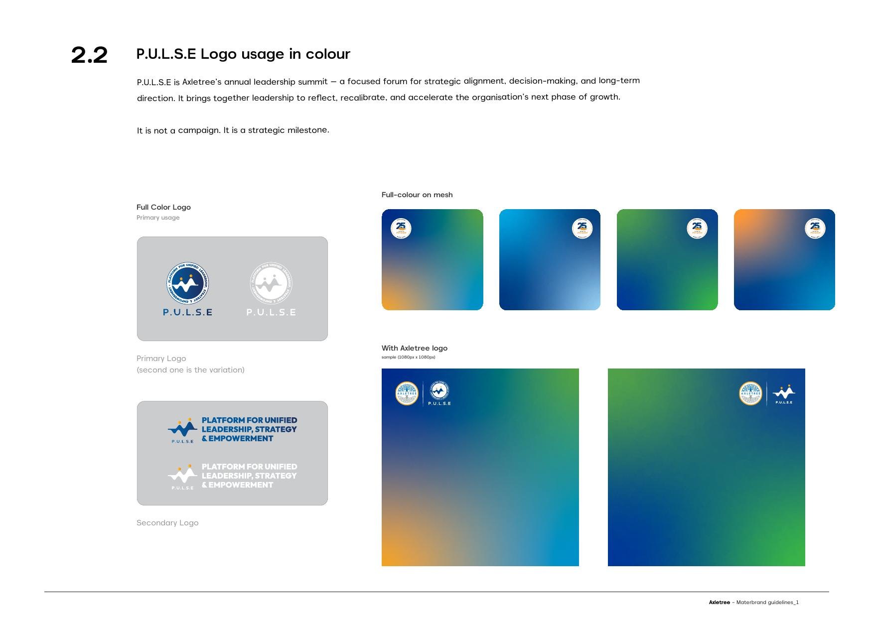
P.U.L.S.E — Platform for Unified Leadership, Strategy and Empowerment — is the annual leadership summit. Also explicit: not a campaign, a strategic milestone.
Each gets its own mark, its own mesh treatment and its own lock-up with the master logo. Which is the real test of a system: three sub-brands that stay recognisably one company.
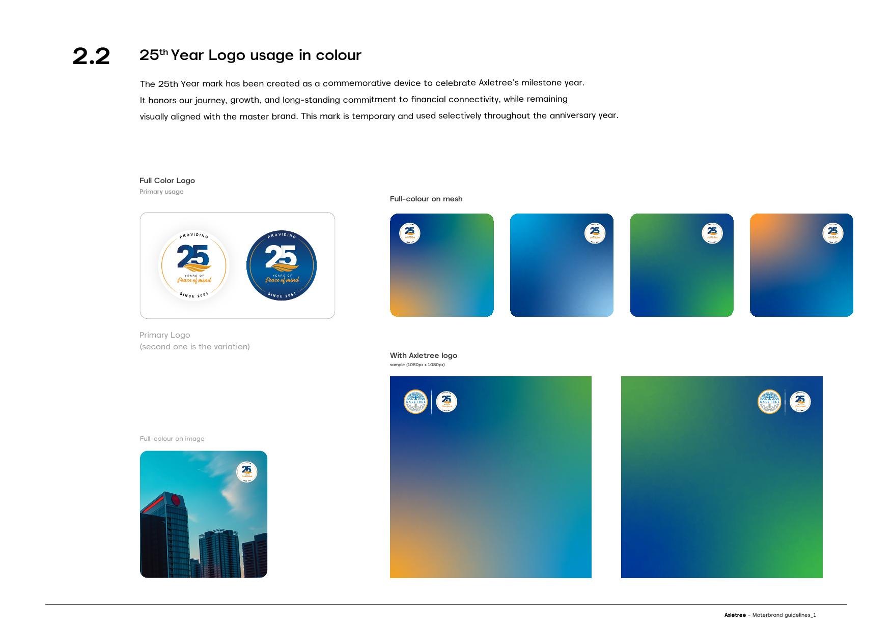
25th Year — providing peace of mind since 2001
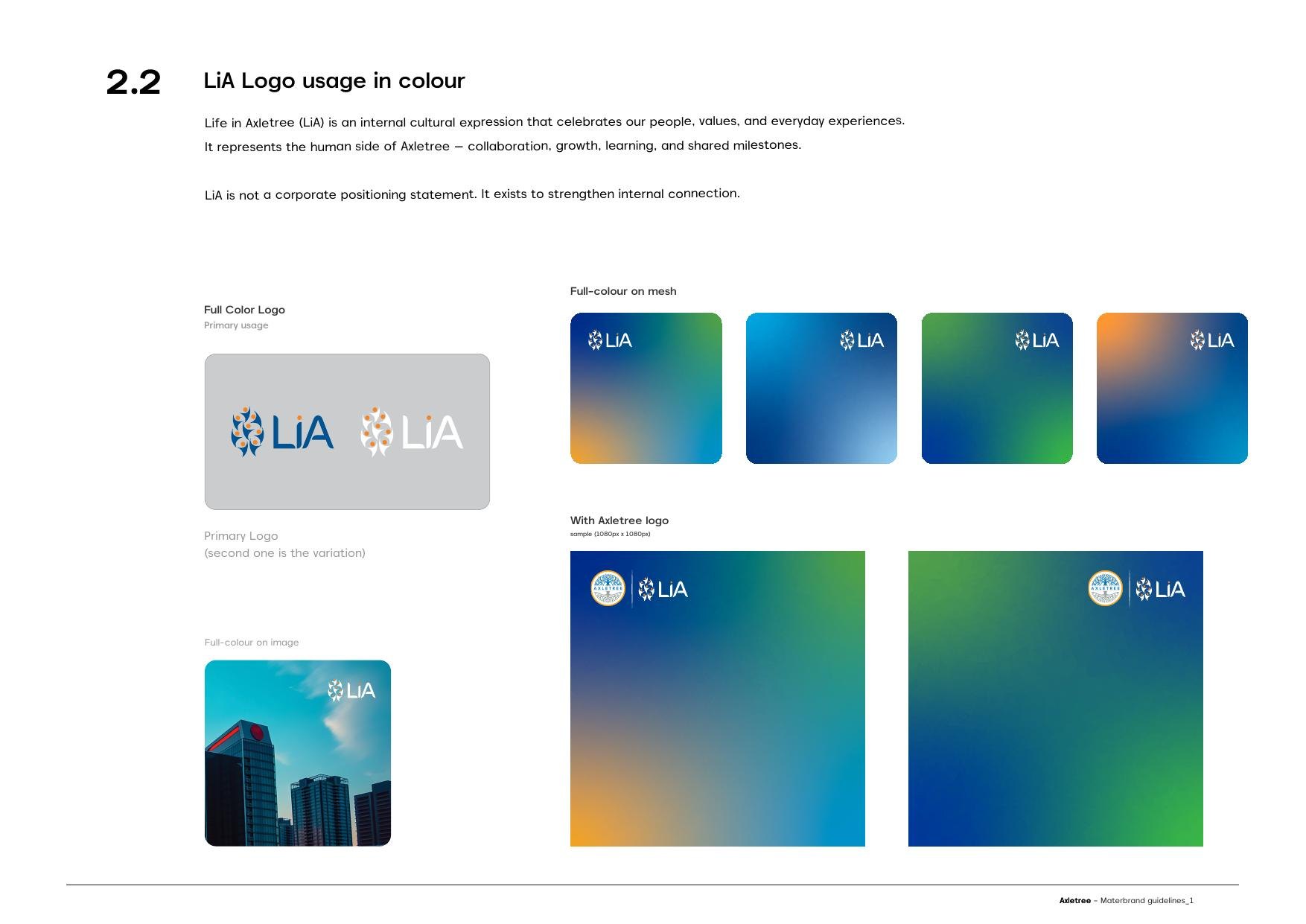
LiA — Life in Axletree, the human side
P.U.L.S.E — the leadership summit
07LiA, Built Out
The leaves become the people.
Life in Axletree needed a mark of its own that could not drift from the parent. The construction is a straight equation: take the leaf cluster from the Axletree tree, take a group of figures mid-jump, and resolve them into two people whose bodies are leaf shapes.
So the company's own tree supplies the raw material for its human side. Nothing borrowed, nothing decorative — the same asset, read differently.
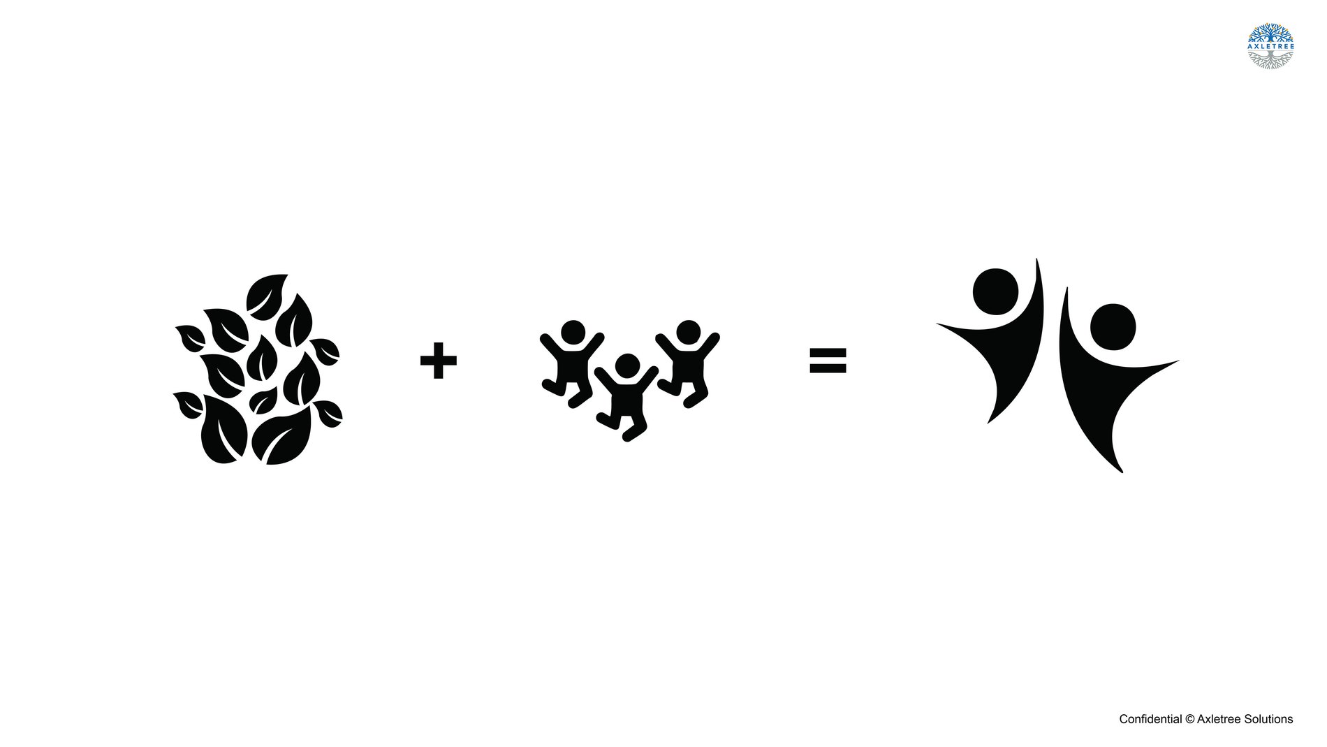
Leaves plus people equals the mark
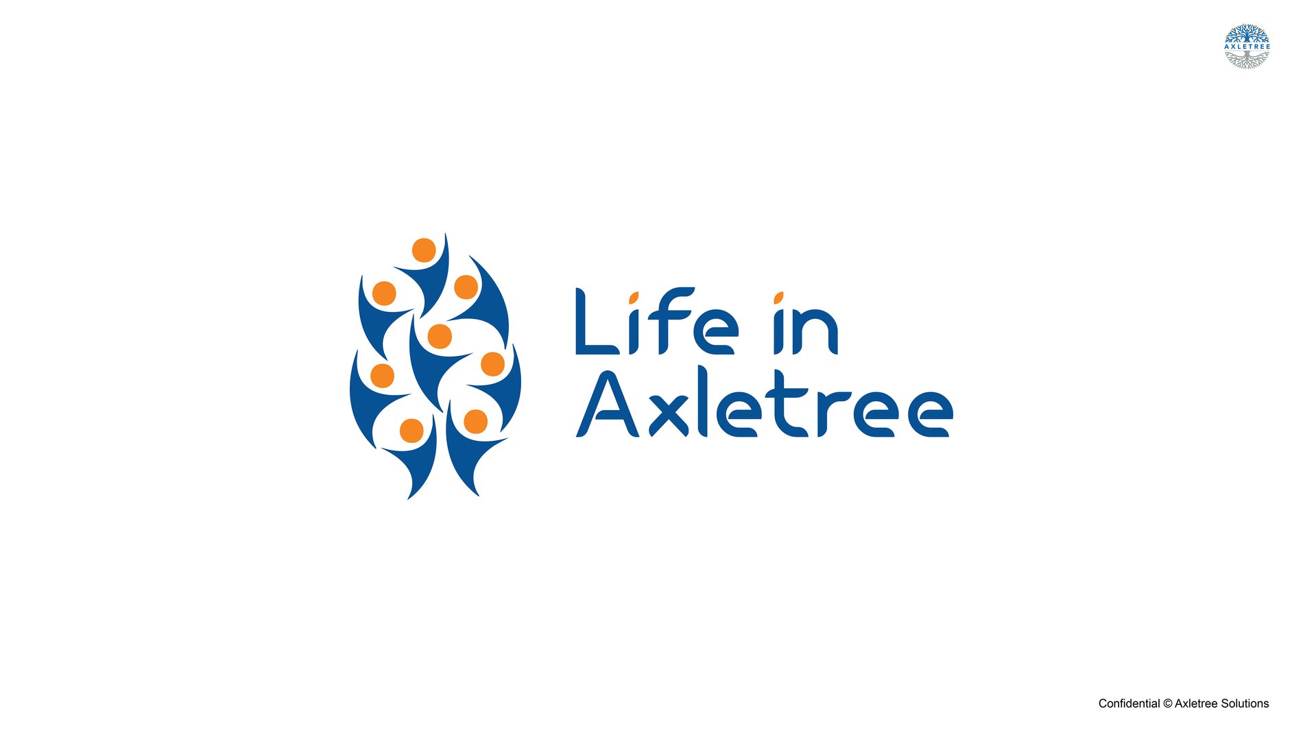
The Life in Axletree lockup
An in-house community celebrating team spirit, work-life balance, and the culture that defines us
08All India Team Meet
The first real test of an internal brand is whether anyone wants to wear it.
LiA's launch moment was the All India Team Meet — the whole company brought together, branded end to end. A welcome standee carrying a line-drawn Chennai landmark, tent cards, wristbands, totes, caps and tees.
Then two days that were not a conference. Sessions and awards on day one; a coach out to Mahabalipuram, the Shore Temple, laser tag and an outdoor night session on day two. We designed it, printed it, directed it and filmed it.
That is the argument for LiA existing at all. A culture programme that only appears in a slide deck is a policy. One that appears on a t-shirt at a temple is a culture.
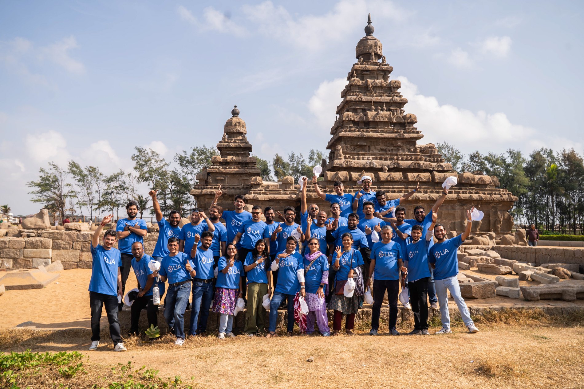
Day two — the Shore Temple, Mahabalipuram
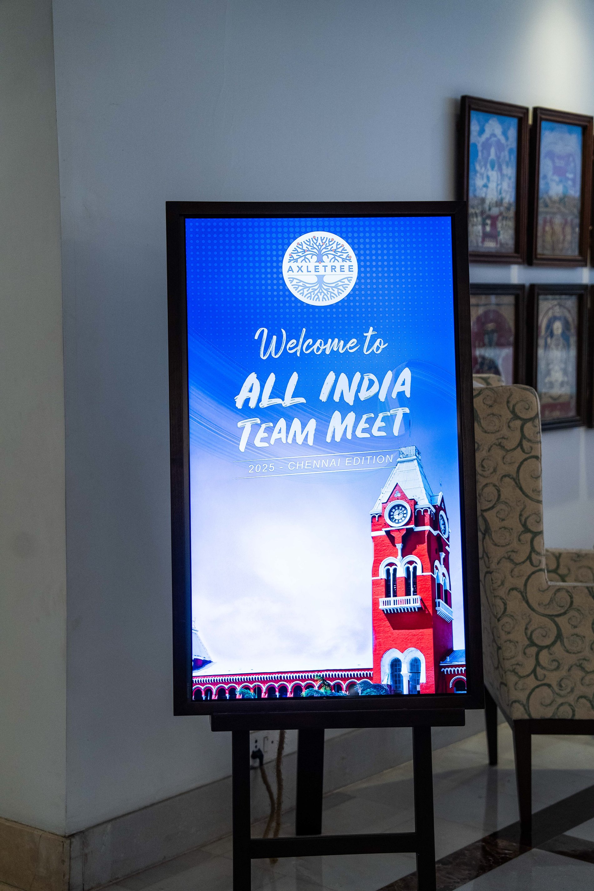
Welcome to the All India Team Meet
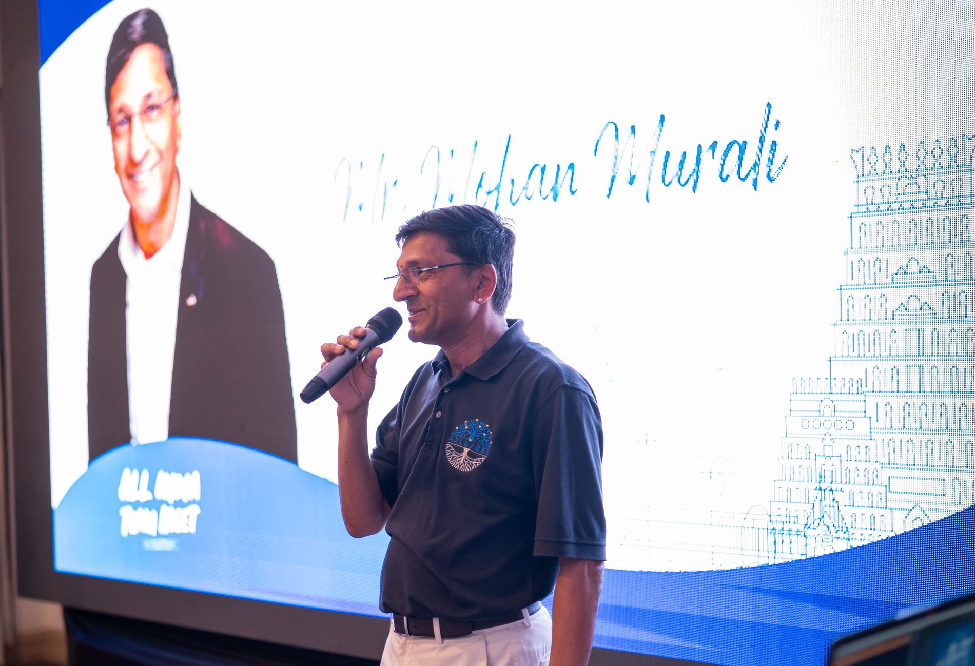
Day one, on stage
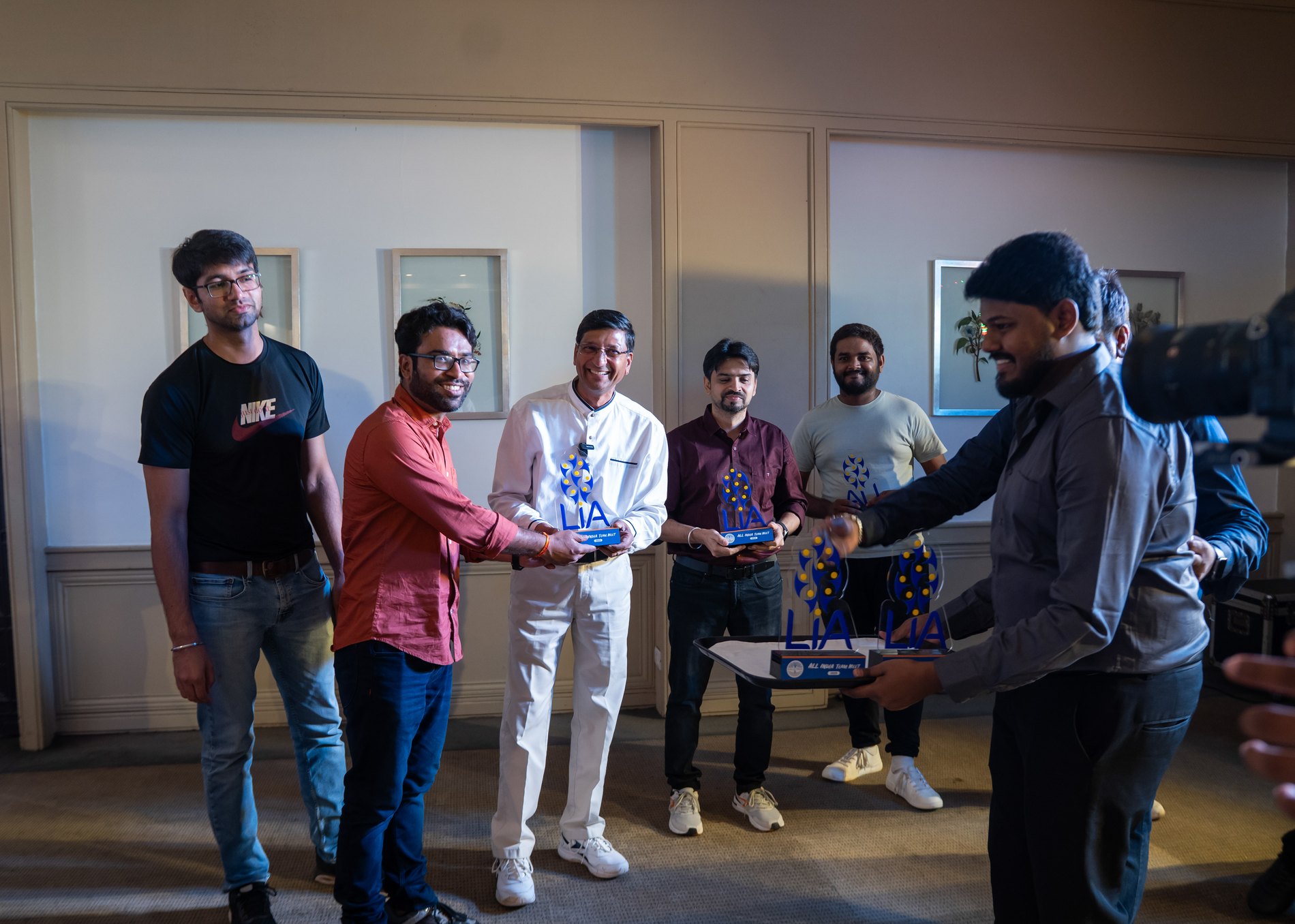
Recognition
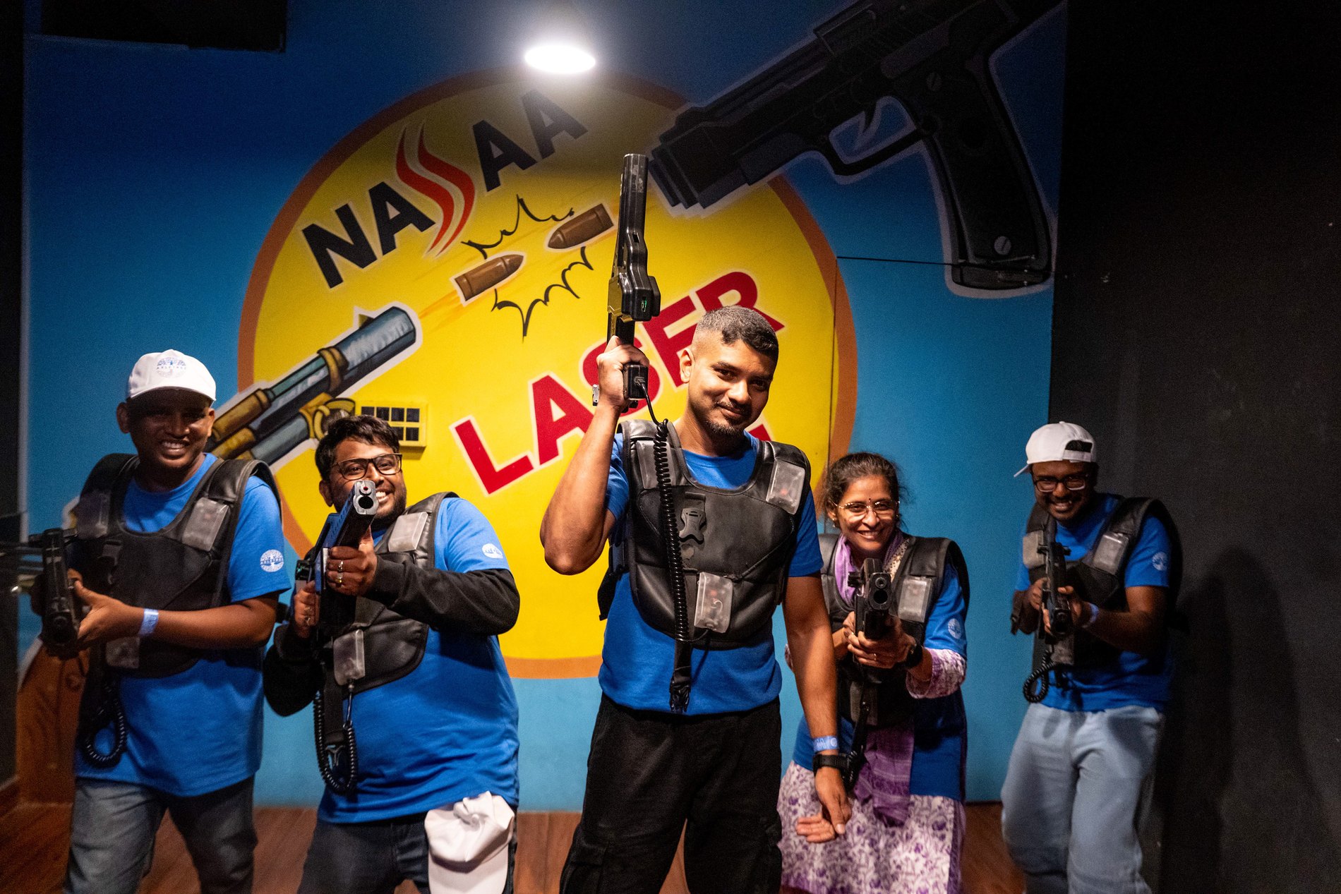
Day two, considerably less formal

The mark, projected
The All India Team Meet, filmed
Day two — temple and games
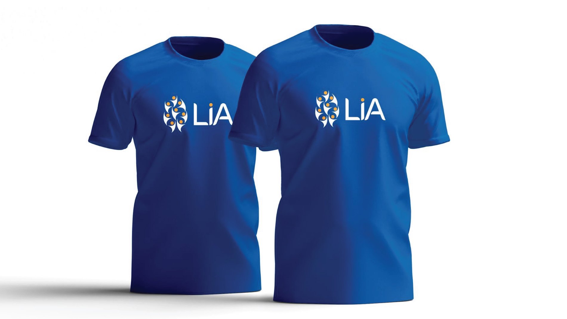
Tees and caps
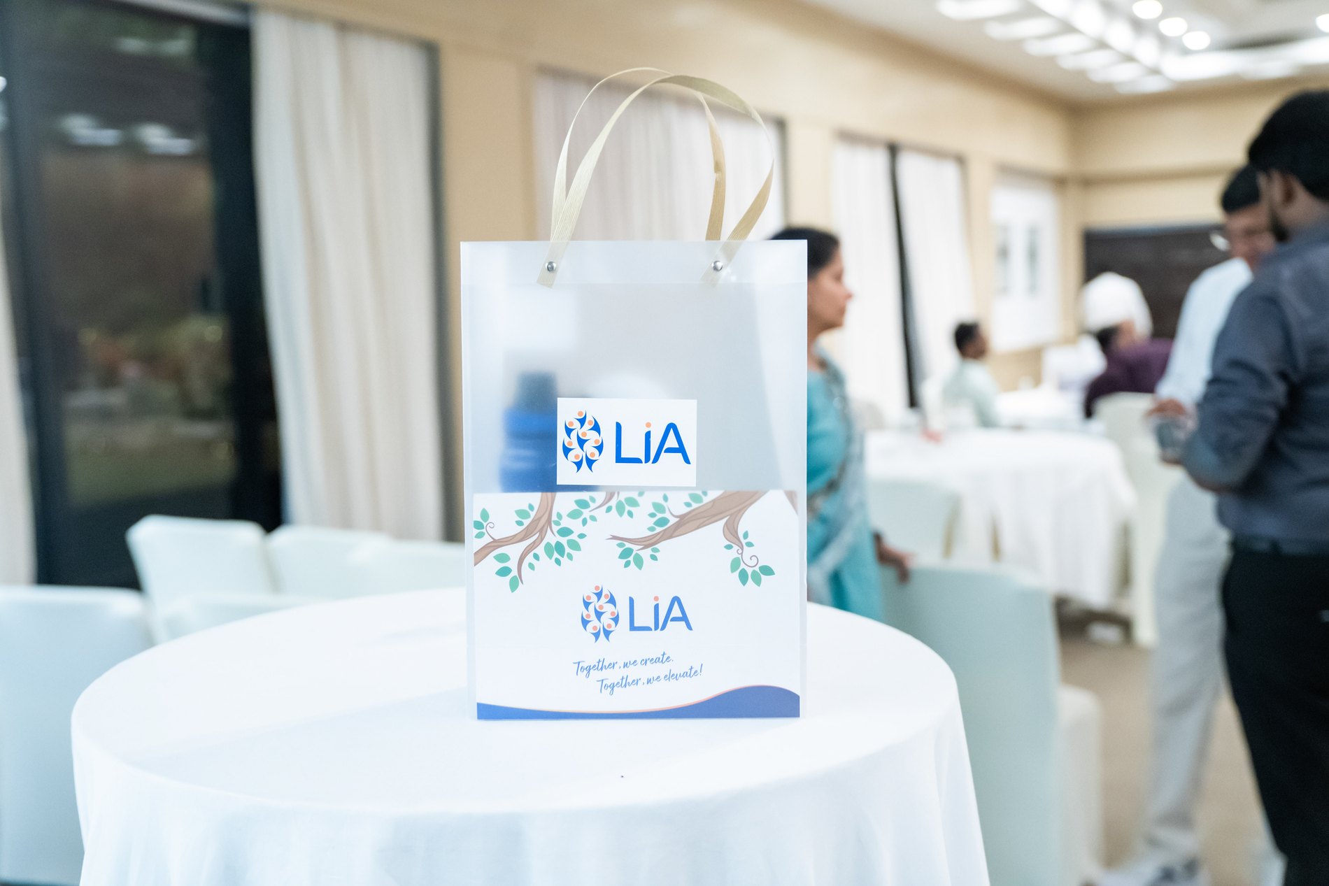
Totes, on the table
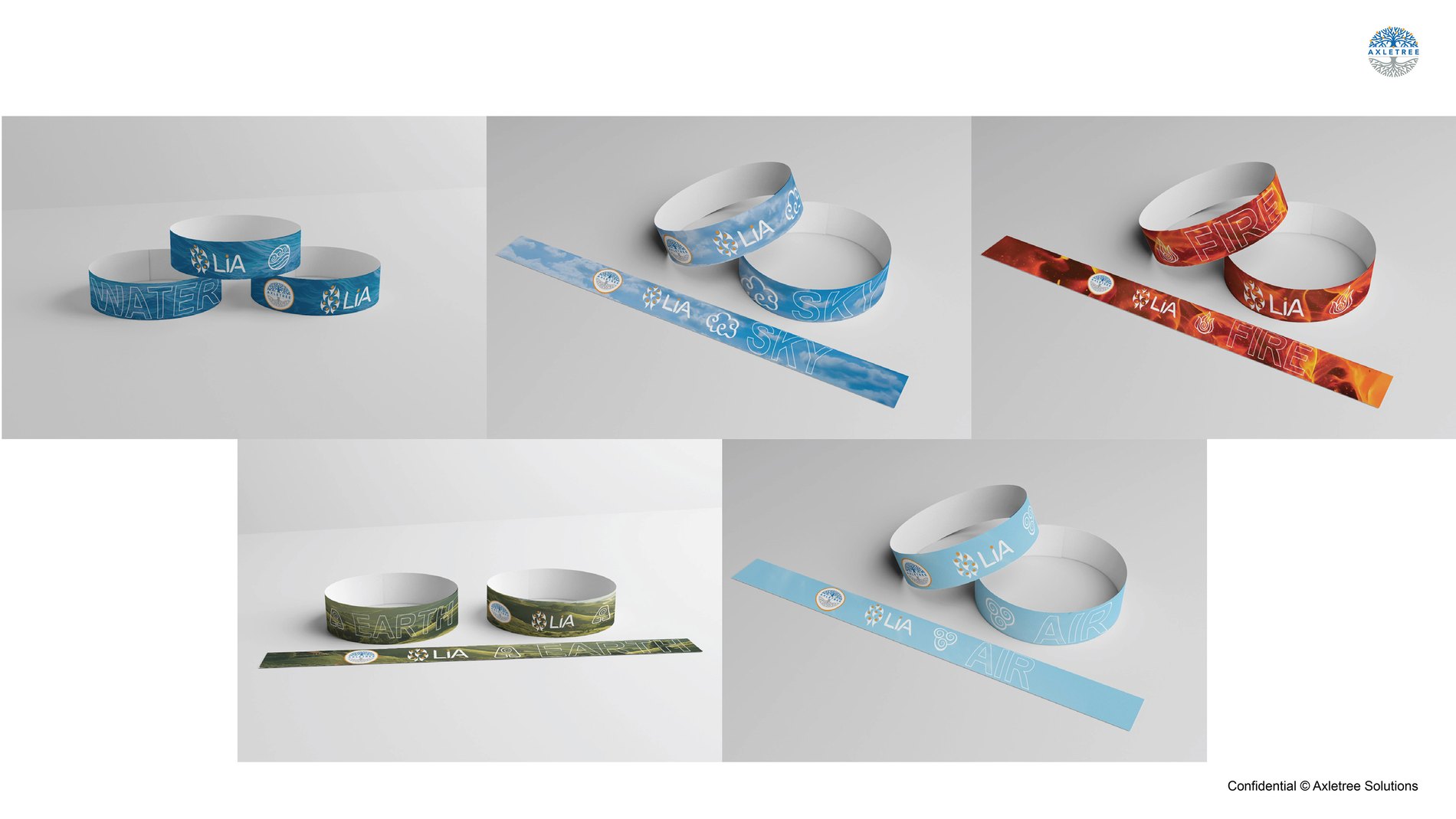
Wristbands and passes
09In Action
A brand this technical is judged on its worst-lit touchpoint, not its best.
Iconography and chart styles so a data-heavy deck stays on brand. Presentation systems for the global sales story. Photography direction. Video openers, lower thirds and transitions. Brochures, event printables, ID cards and lanyards. Merchandise down to the lapel pin.
Then co-branding rules — because a connectivity company spends most of its life appearing next to somebody else's logo.
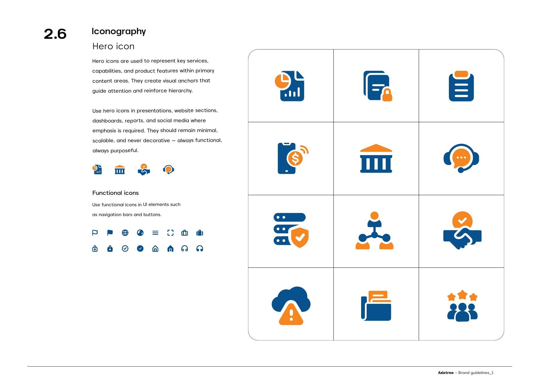
Icons and chart styles
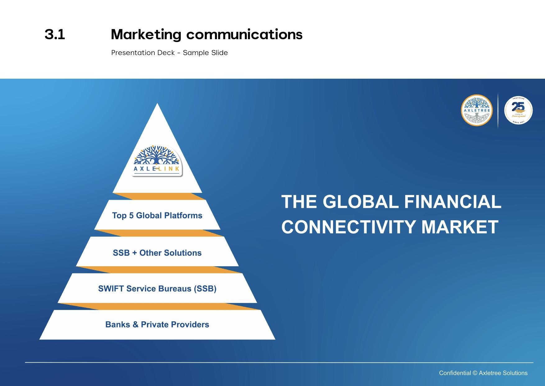
The global sales story
The brand film — 60-second excerpt
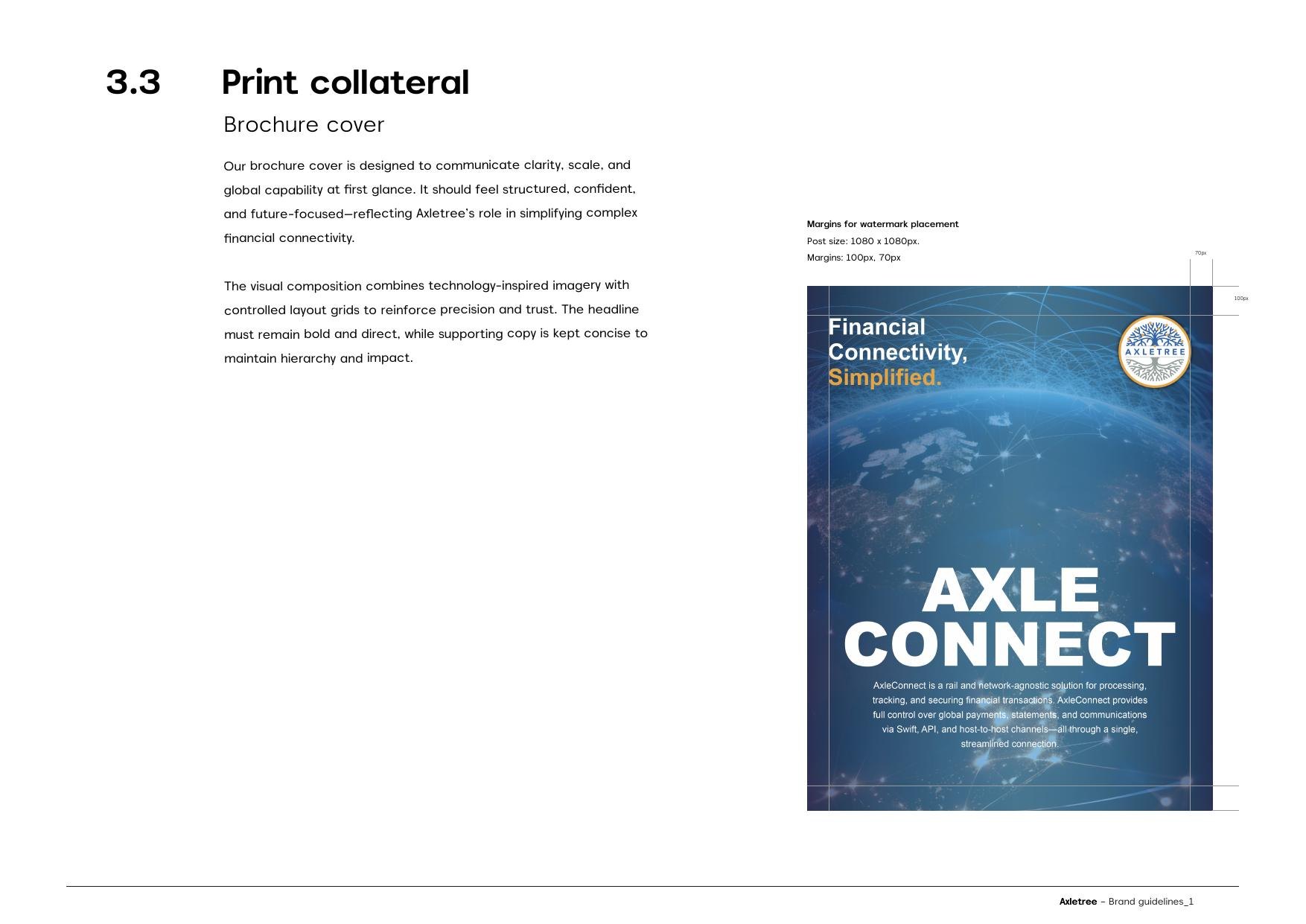
Print collateral
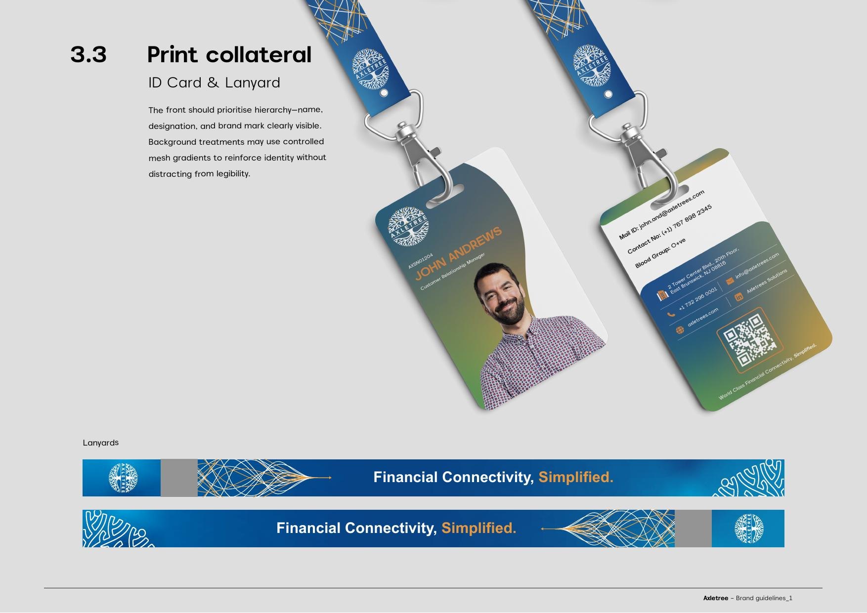
ID card and lanyard
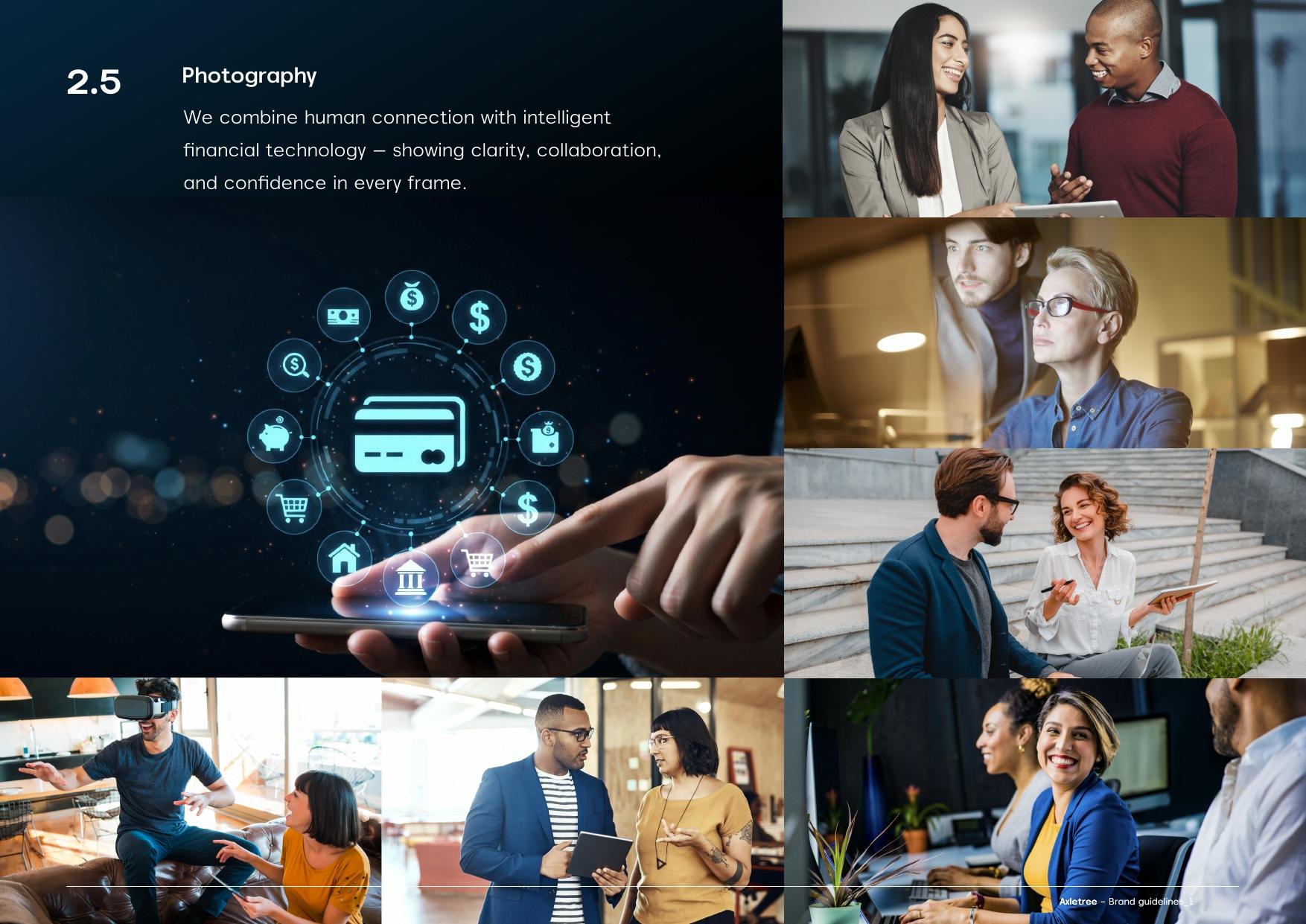
Photography direction
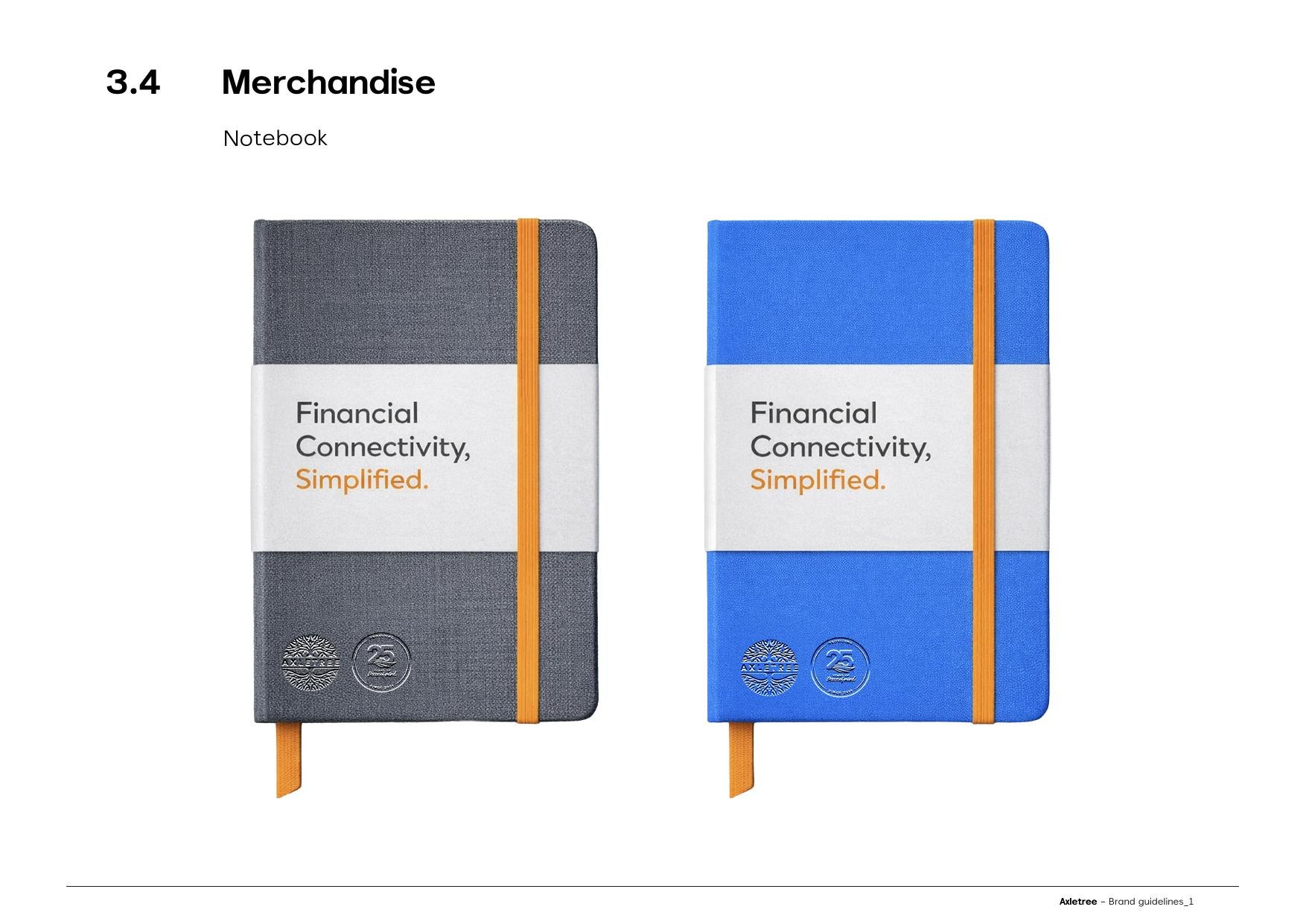
Merchandise
Delivered
- Brand strategy: promise, elevator pitch, positioning, tagline, three design principles
- Symbol, wordmark, adaptive lockups, supergraphic with two approved crops
- Colour system: three core colours plus four specified mesh gradients
- Typography: Akmorn Grotesque across sixteen weights, Arial fallback, hero numerals
- Three sub-brand identities: 25th Year, LiA, P.U.L.S.E
- LiA All India Team Meet: event branding, print, direction and film across two days
- Iconography, chart styles, photography direction
- Presentation, social, video, print, merchandise and co-branding systems
- 63-page brand guidelines document
An identity that holds across three sub-brands, two continents and a room full of partner logos.
Outcome
The measure of a system like this is not the logo. It is whether a leadership summit, an internal culture programme and an anniversary can all run on it without anyone reaching for a new template.
We transmit any transaction, from any system, to any network, anywhere in the world.
The Result
We provide peace of mind
Want this for your brand?
Three fields. We reply on WhatsApp within a few hours.