Work / Retail & Fashion
Avender
The Avender life awaits you
- Client
- Avender
- Year
- 2024
- Industry
- Retail & Fashion
India's first brand built exclusively for pedal-free bikes. The whole identity turns on one idea — balance — resolved as an ambigram.
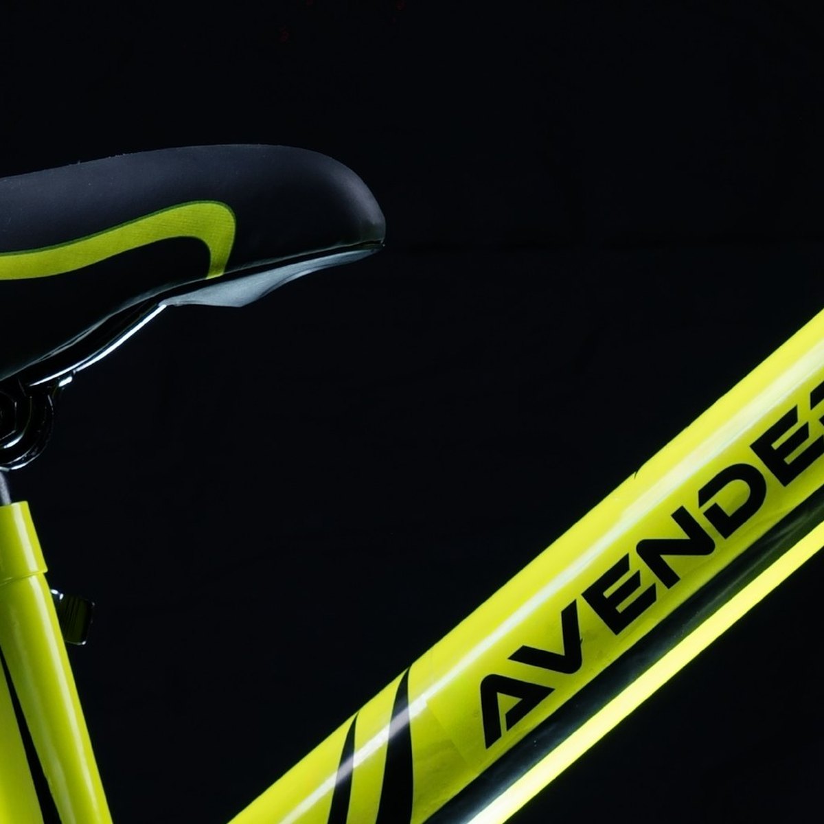
Avender makes premium bikes that inspire confidence, resilience and unforgettable memories — blending safety, durability and unmatched performance. India's first brand built exclusively for pedal-free bikes.
The company was born from its founders' own experience: watching an eighteen-month-old become fearless on a balance bike, and wanting every family to have that.
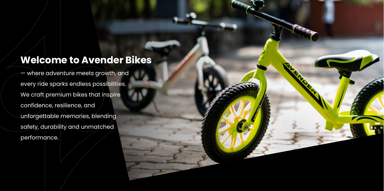
Where adventure meets growth
01The Starting Point
A child's first ride isn't a moment. It's the start of confidence.
Every turn, every glide, every shared smile is a step toward a childhood well spent. Avender builds bikes that turn wobbly beginnings into fearless journeys, strengthening the bond between parents and little riders.
That gave us the voice: Hearth-to-Wheels. A hearth is the warmth and heart of a home — a place of love, nurturing and togetherness. The brand had to carry that warmth out onto the road.
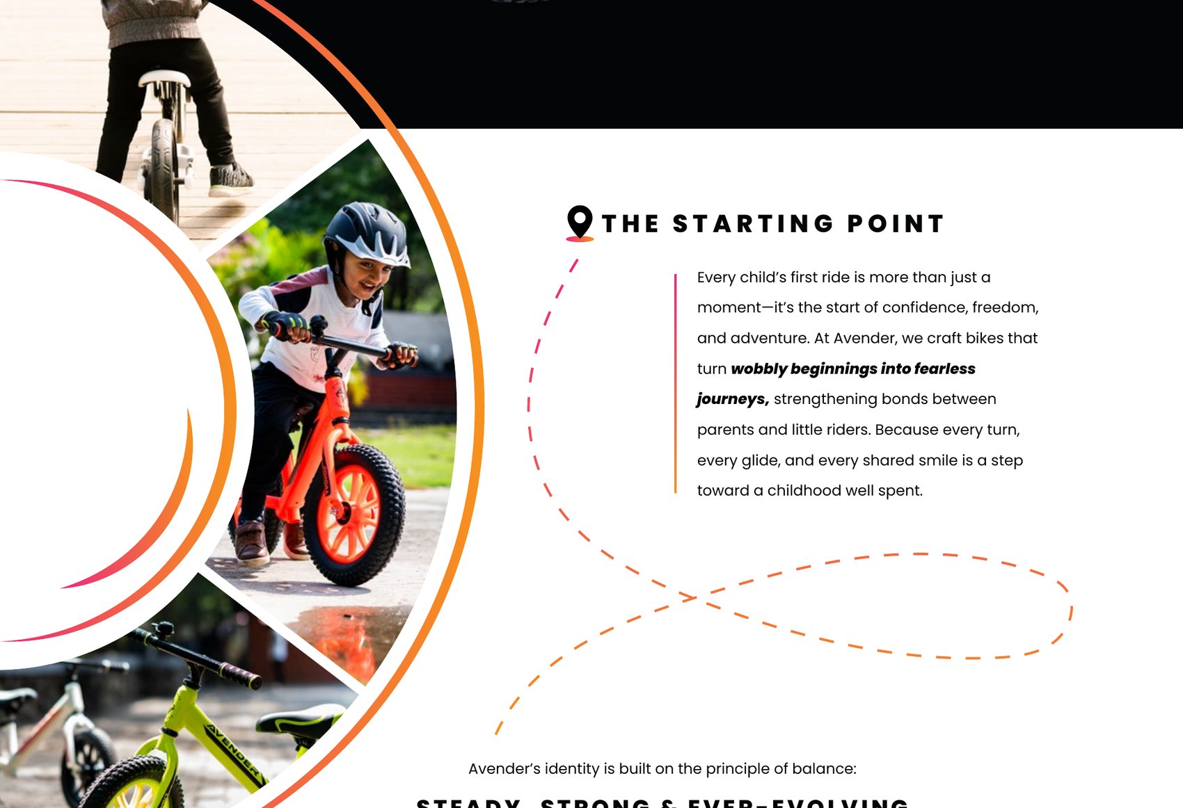
The starting point
A category nobody in India owned yet.
Problem
Pedal-free bikes were unfamiliar to most Indian parents — a product that needed explaining before it could be sold. And the brand couldn't only be a bike brand: the identity had to stretch across every future product under the Avender name, plus a store, a website and a customer community.
02The Principle of Balance
Steady, strong and ever-evolving.
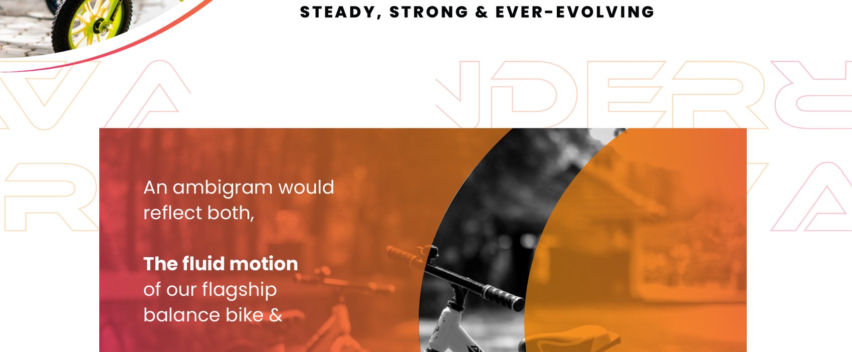
Balance is what a pedal-free bike teaches, so balance became the whole identity — not as a slogan, but as construction. An ambigram would reflect both the fluid motion of the flagship balance bike and the deeper philosophy of stability in every child's journey.
Because balance isn't just about riding. It's about the way we move through life.
The thinking behind the mark
One mark that reads three ways.
Solution
The monogram resolves as fluid motion, as wheels, and as stability — and it holds either way up, which is the point. A brand about balance whose mark is itself balanced.
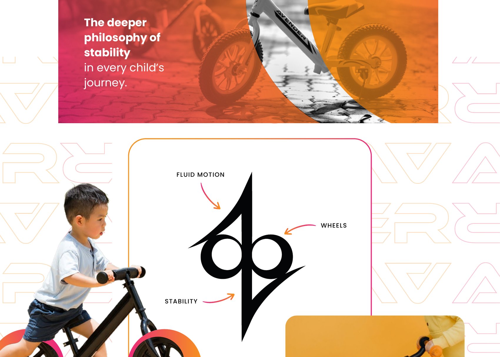
Fluid motion · wheels · stability
Primary logo
Primary, reversed on the brand gradient
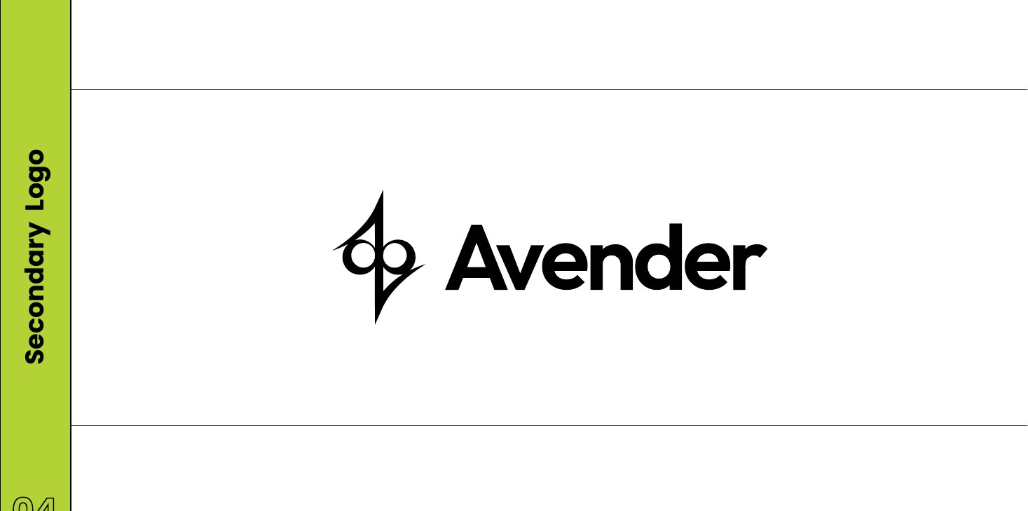
Secondary lockup
03Colour
Warmth, energy and growth.
The palette reflects the joy of childhood and the nurturing bond between families — and it does double duty as the product range. Each of the three flagship bikes takes one of the three primaries: Popora in orange, Ligree in lime, Gradi in pink.
Primary
Popora
#FC4818 — energy
Ligree
#A8CC30 — growth
Gradi
#EF4562 — warmth
Brand gradient
Pink into orange
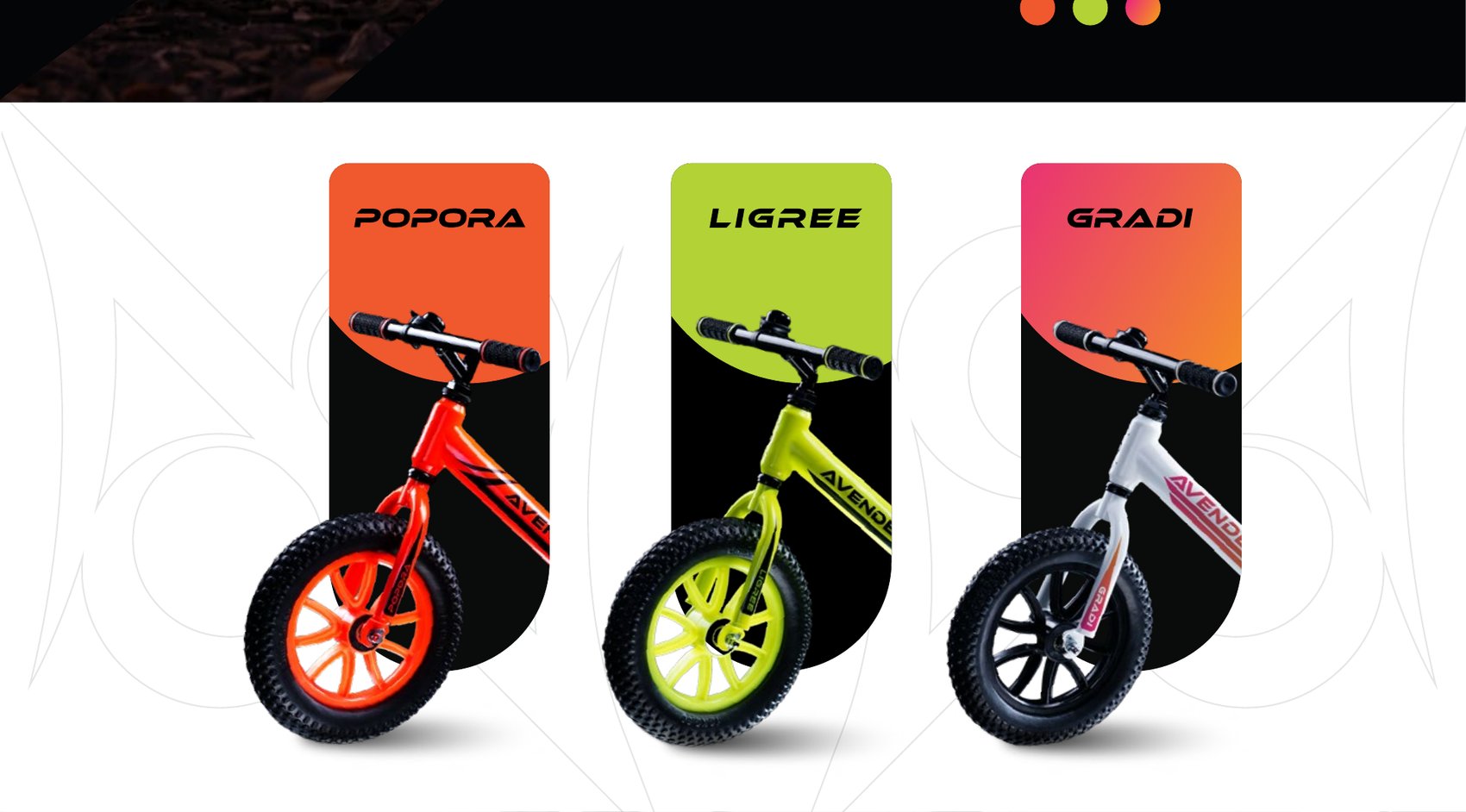
Popora, Ligree, Gradi — one colour each
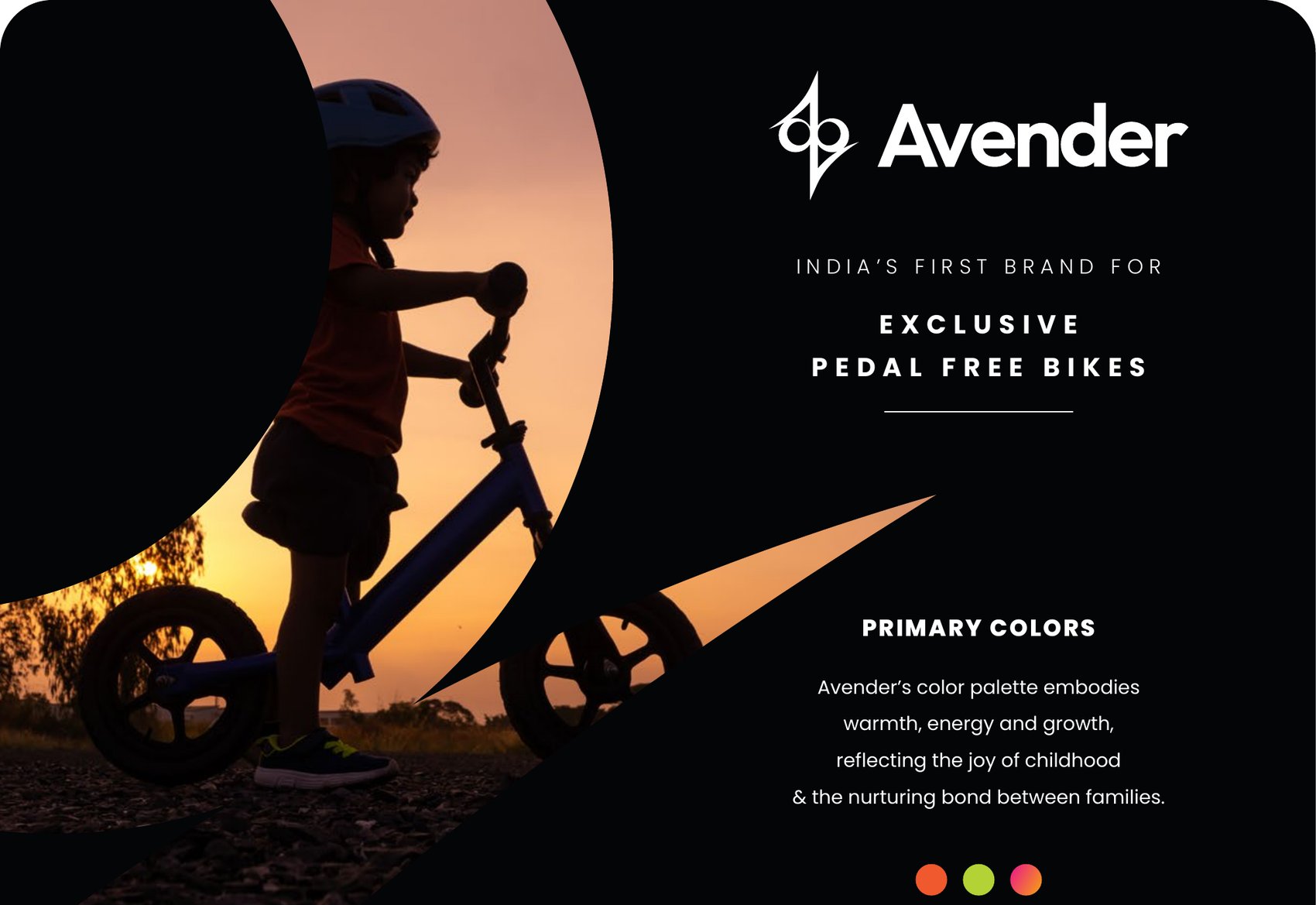
India's first brand for exclusive pedal-free bikes
04Type & Pattern
Ethnocentric for the name, Poppins for everything else.
An italic technical face gives the wordmark its forward lean; Poppins keeps the long-form warm and readable. Three patterns built from the monogram carry the brand across hoardings, social posts, product stickers and packaging.
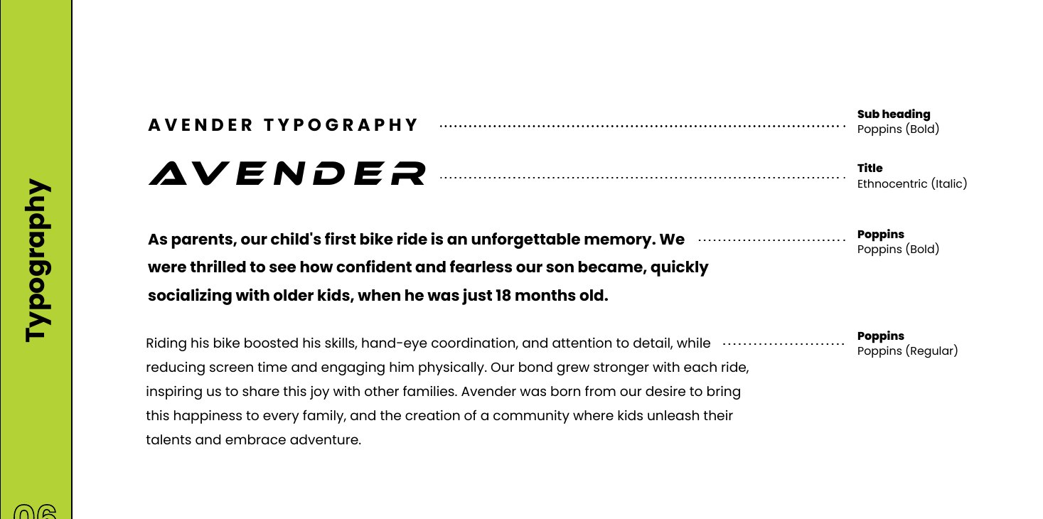
Ethnocentric Italic for titles, Poppins for body
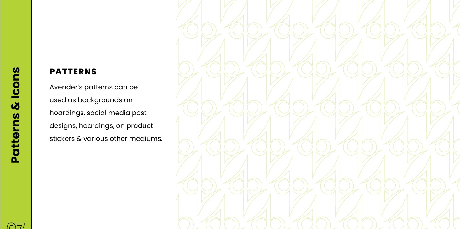
Pattern I
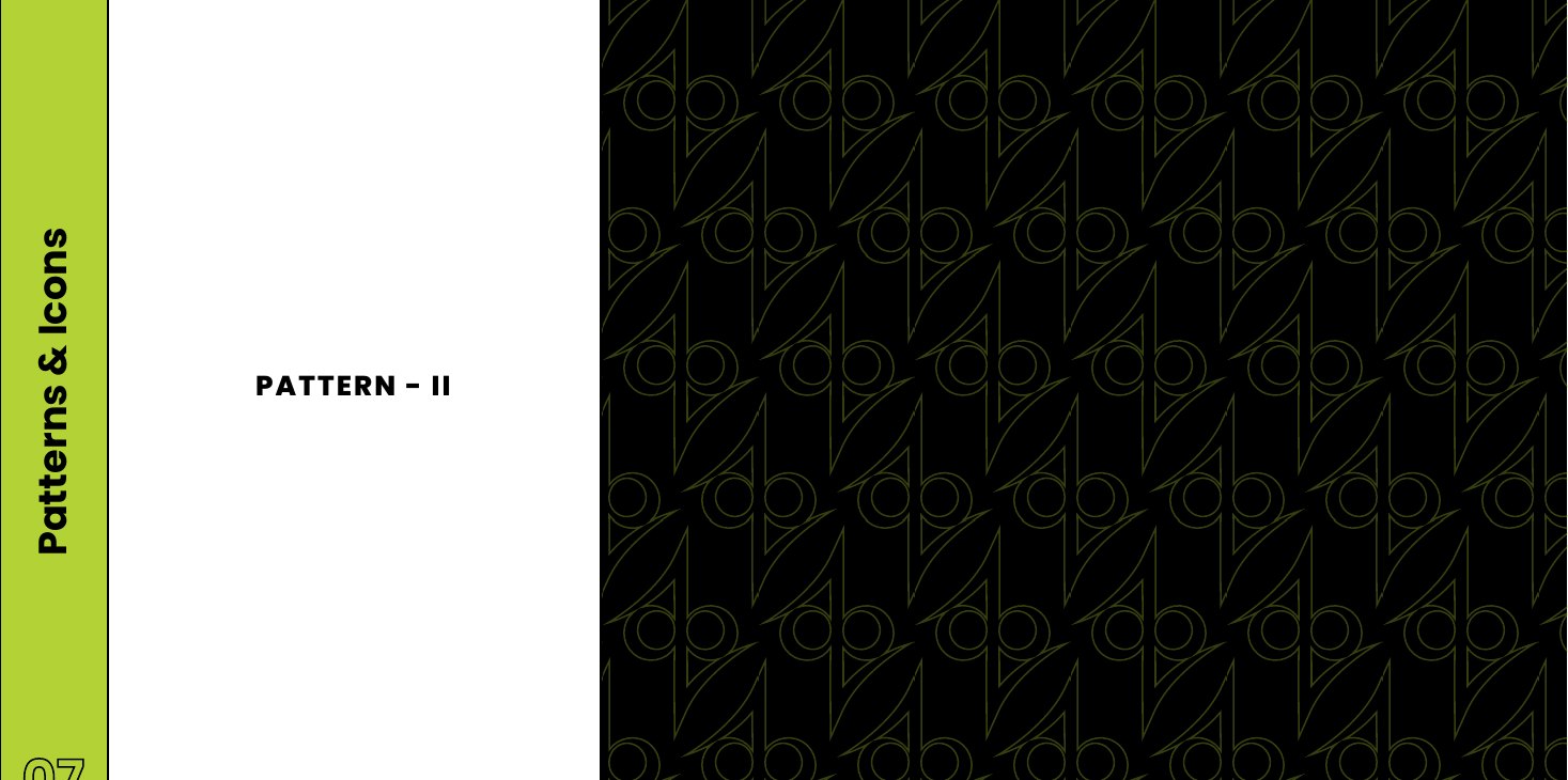
Pattern II
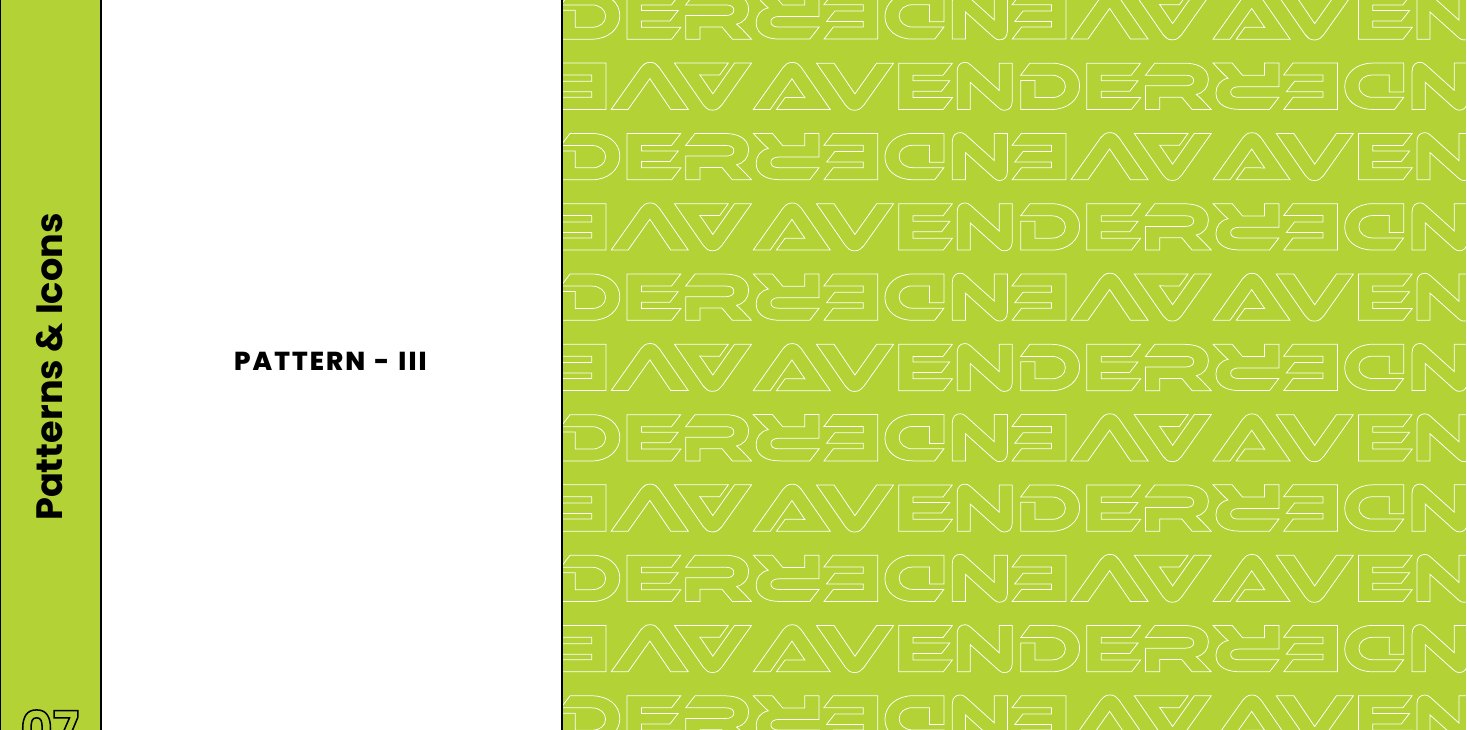
Pattern III
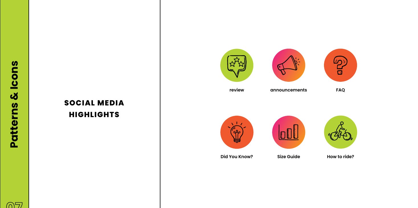
Social highlight covers
05Out in the World
Storefront, stationery, helmets, packaging, banners.
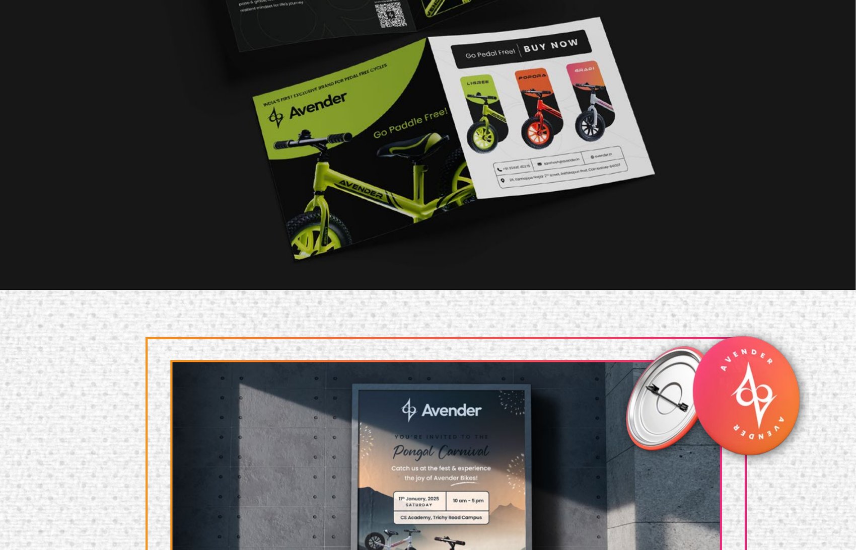
The monogram scales from a business card to a building. The pattern becomes architectural screening on the store façade; the gradient carries the retail bag; the helmets and tees extend the range beyond the bikes themselves.
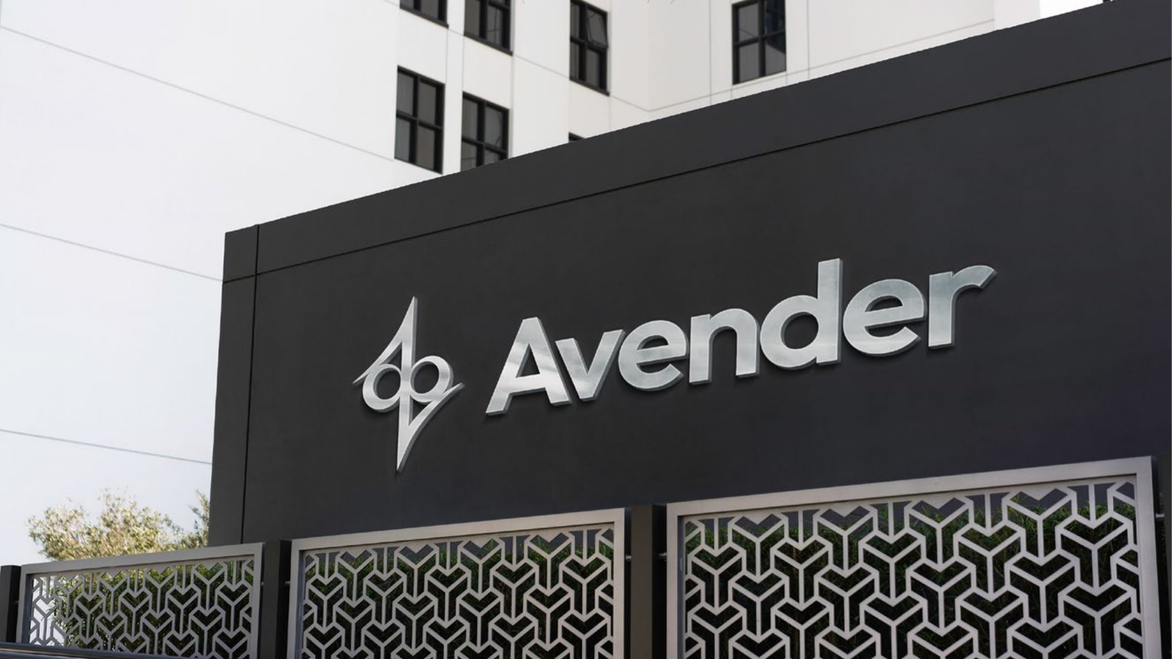
Store signage, with the pattern as screening
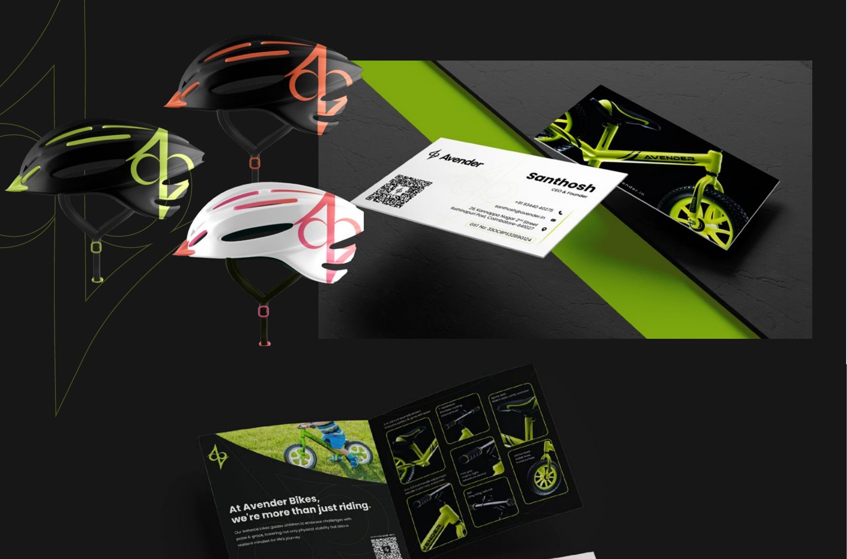
Stationery
Retail bag
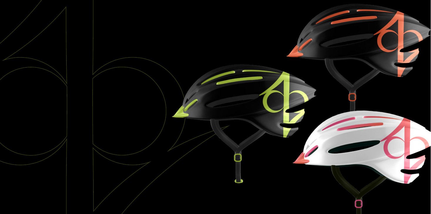
Helmets
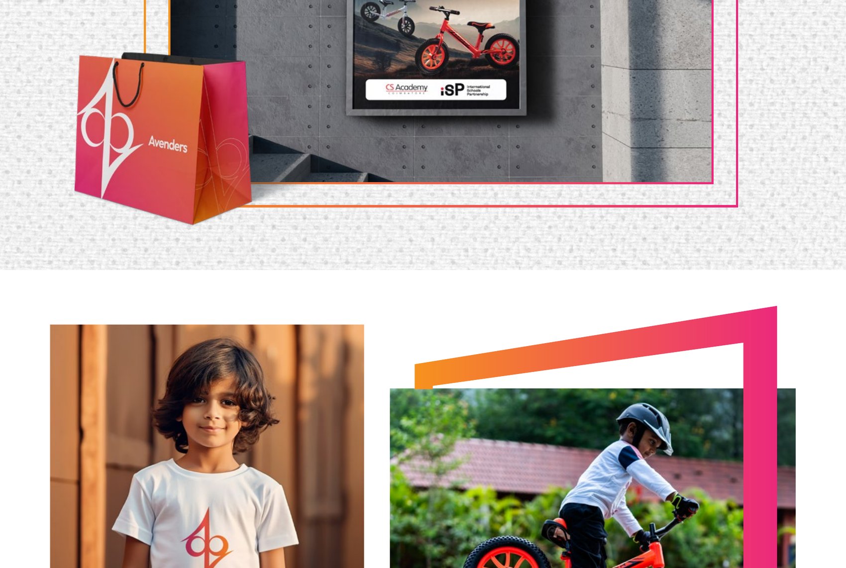
Apparel and board
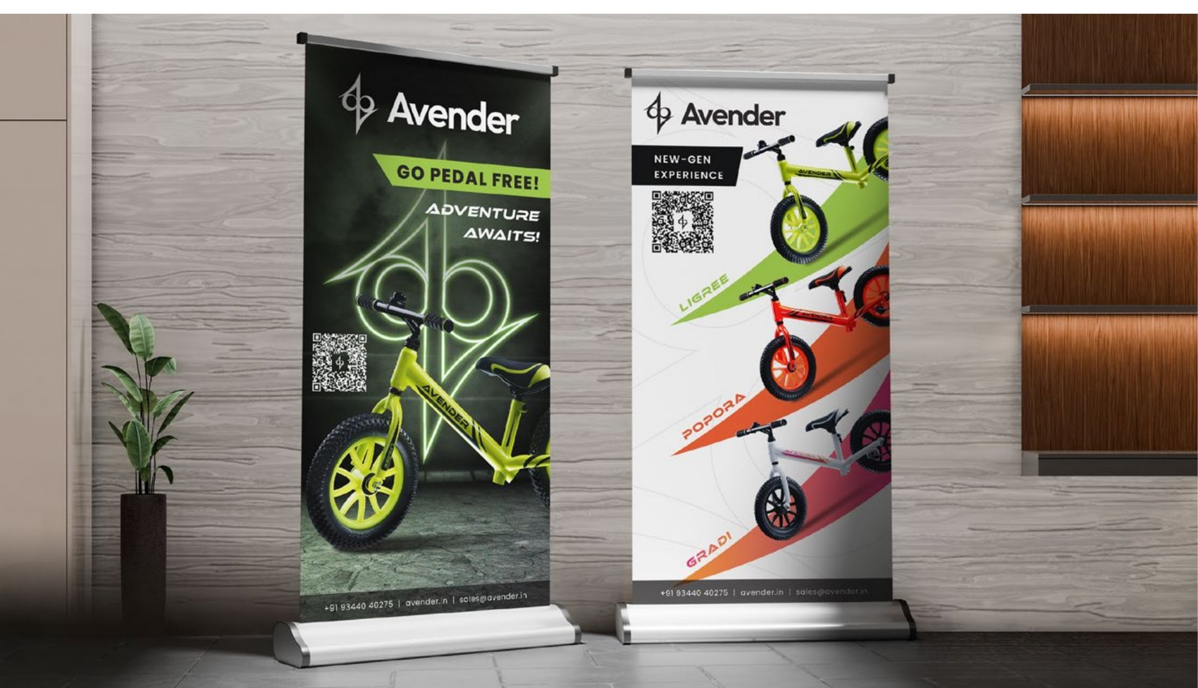
Launch banners
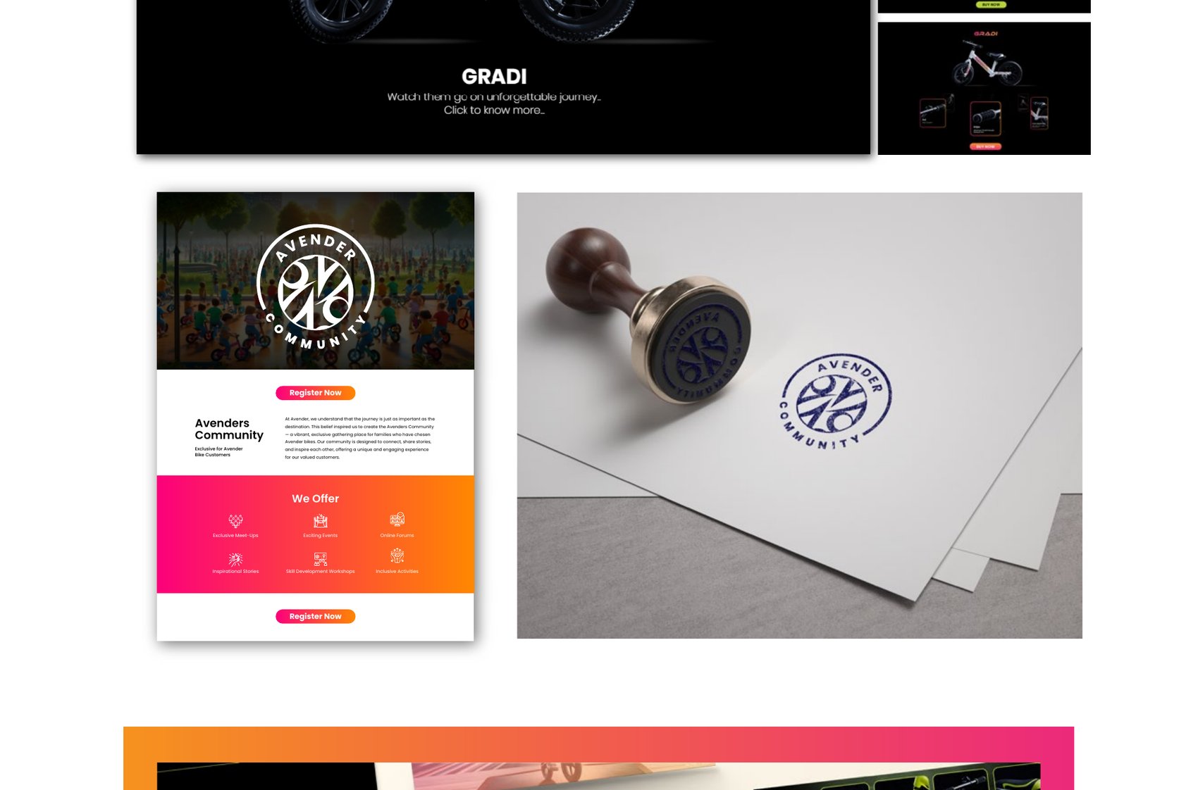
Badges
06Digital
A store, and a community behind it.
The site sells the range on a dark stage so the colours do the talking. Behind it sits the Avenders Community — exclusive to Avender owners, built on meet-ups, events, online forums, inspirational stories, skill workshops and inclusive activities. Because the journey matters as much as the destination.
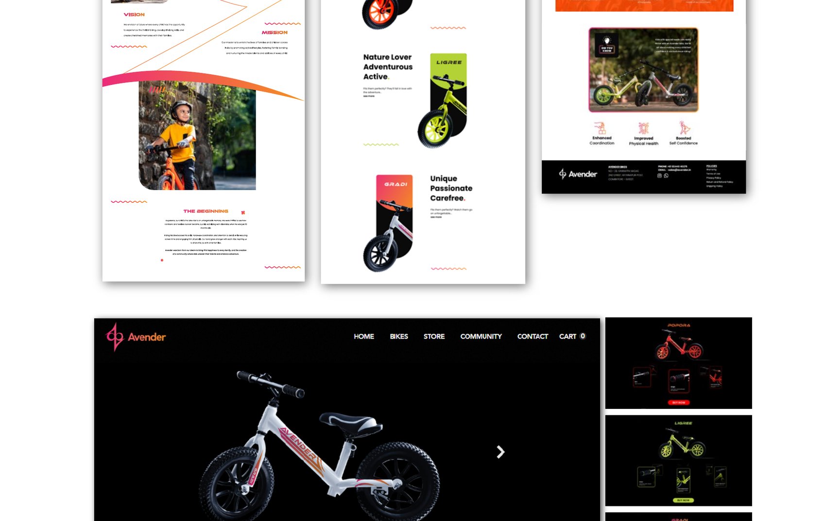
Store
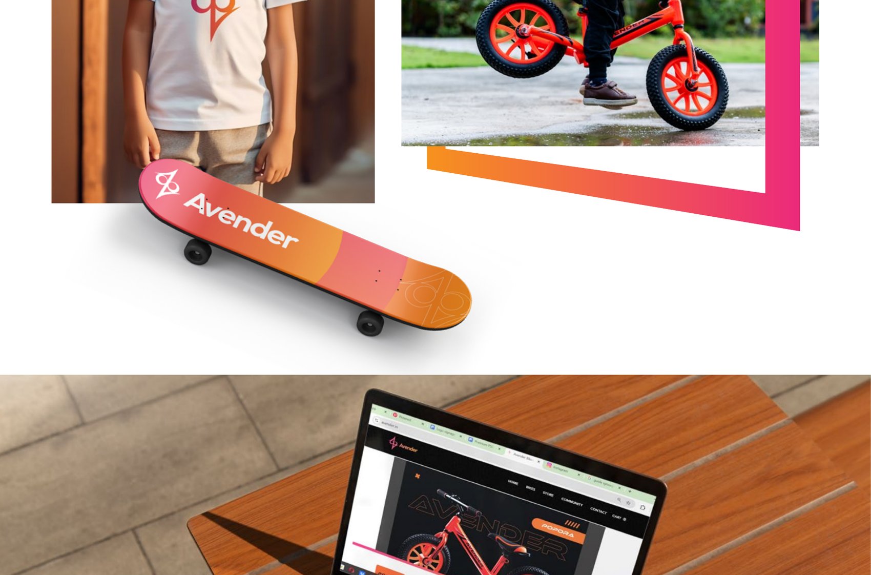
Live
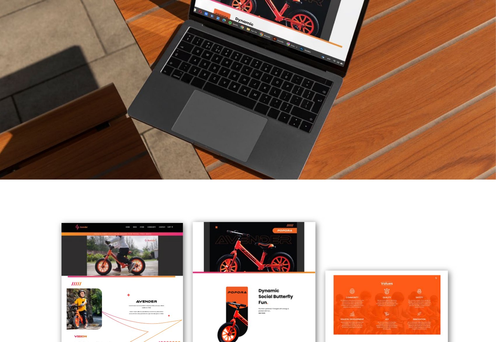
Brochure system
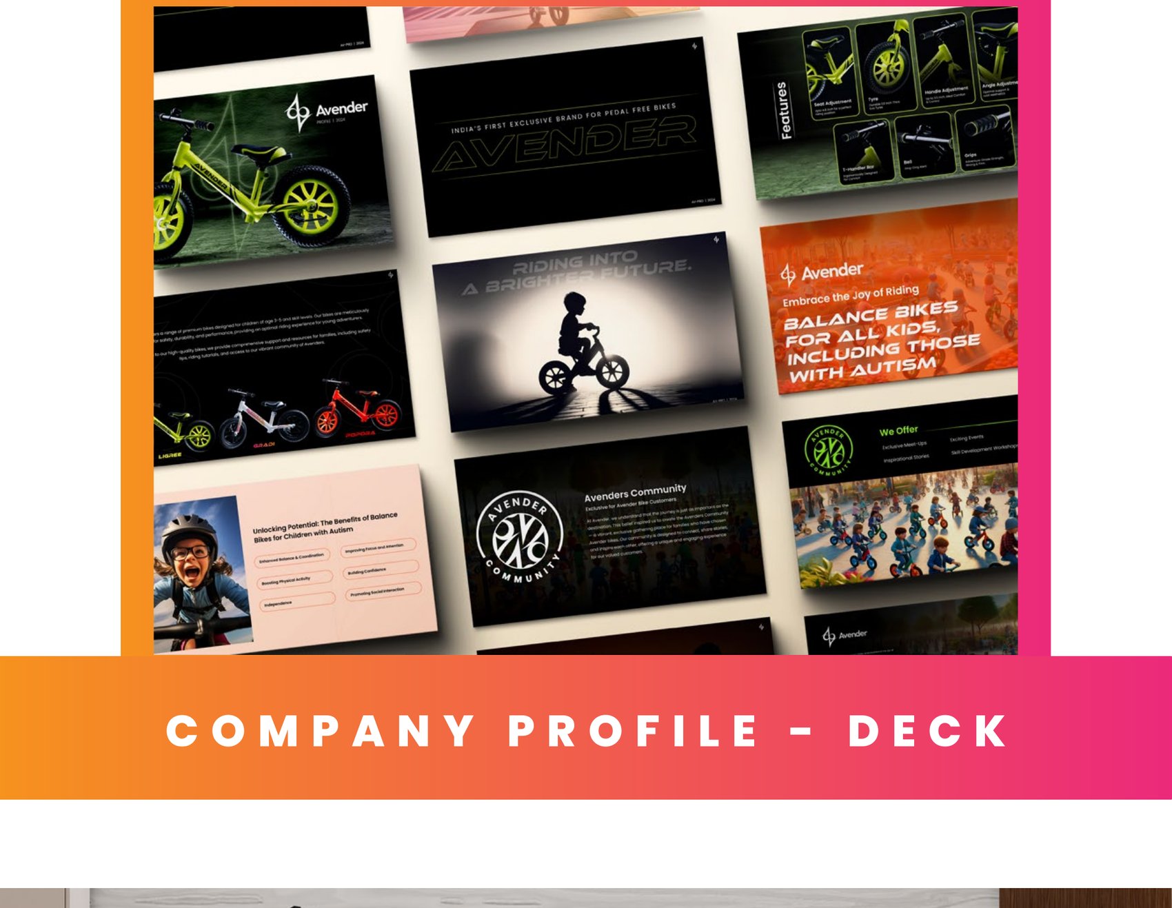
Company profile deck
An identity that balances, in every sense.
Outcome
One mark, readable either way up, holding a product range, a storefront, a website and a community together — and with room left for whatever Avender makes next.
Balance isn't just about riding. It's about the way we move through life.
The Result
India's first exclusive pedal-free bike brand
Want this for your brand?
Three fields. We reply on WhatsApp within a few hours.