Work / F&B
The Baking Society
Around the world in pastries
- Client
- The Baking Society
- Year
- 2023
- Industry
- F&B
A Coimbatore bakery selling pastries from everywhere. We built the identity as a passport — a monogram drawn on a grid, a wall of border stamps, and a skyline of landmarks you eat your way through.
01The Brief
International pastries, in Coimbatore. Which is a promise and a problem at once.
The Baking Society sells babka, croissants, Belgian hot chocolate and quiche in a city where most bakeries sell cake and puffs. The range was the whole proposition — and the hardest thing to explain from a shopfront.
The audience was specific: adults roughly 18 to 50 who, in the studio's own words, revel in the thrill of culinary exploration. Not people looking for a birthday cake. People looking for something they have not had before.
So the identity could not just look premium. It had to carry the idea of somewhere else.
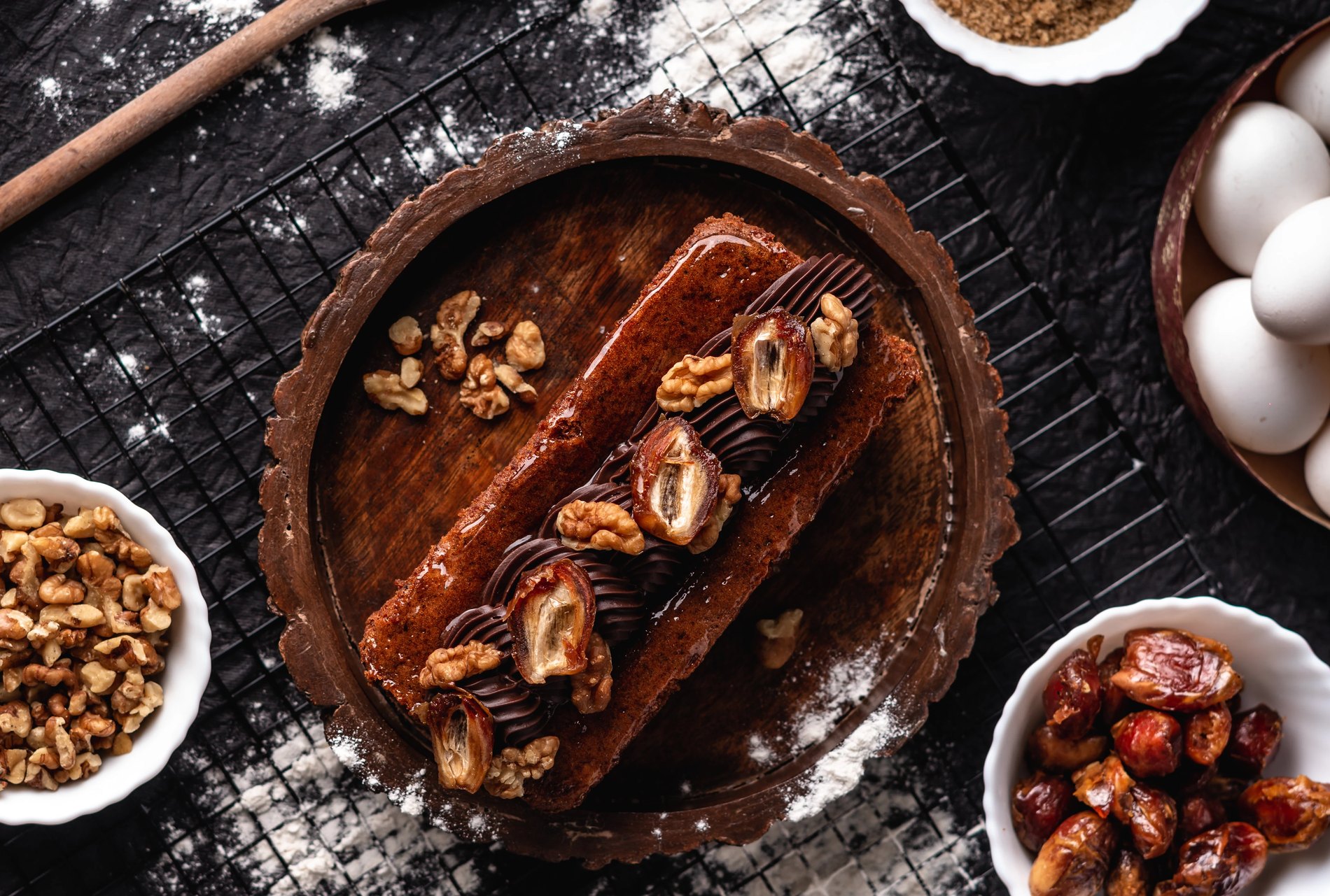
Marble babka — the product the brand was built around
"Premium bakery" is a look every bakery already owns.
Problem
Kraft paper, a serif logotype, a warm palette, a flour-dusted flat lay. It signals quality and nothing else — and it would have made a shop full of Polish, French and Belgian baking look like every other patisserie on the road.
Build it as a passport.
Solution
If the brand's promise is that every counter is a different country, then the identity should behave like travel documents. Border stamps. A skyline of landmarks. A booklet you collect marks in. The pastry becomes the destination and the bag becomes the visa.
It gives the range a reason to exist as a system rather than a menu, and it gives the brand somewhere to grow — every new country is a new stamp, not a redesign.
02The Monogram
T, B and S sharing one skeleton.
The mark is a three-letter ligature. The T's crossbar runs the full width and becomes the top of the S; the B and S share a bowl so the two curves read as one continuous stroke. Drawn on a grid so the joins are constructed rather than eyeballed.
It gives the brand two assets from one drawing: a full lockup for signage and print, and a compact monogram that works embossed on a box or tiled as a pattern.
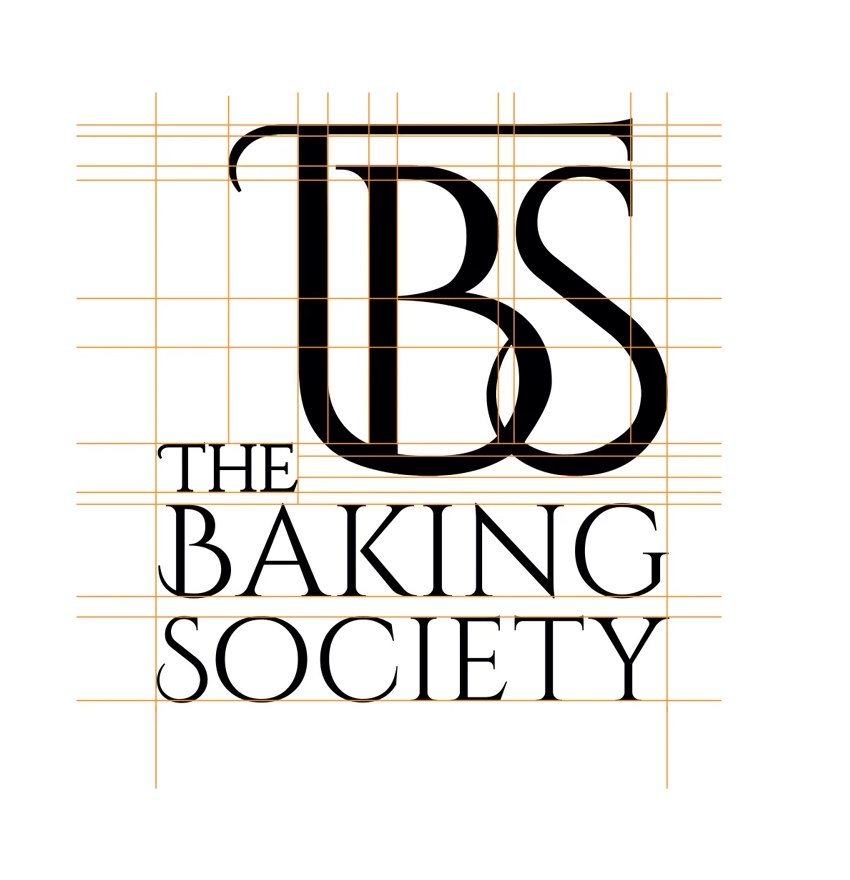
Built on a grid
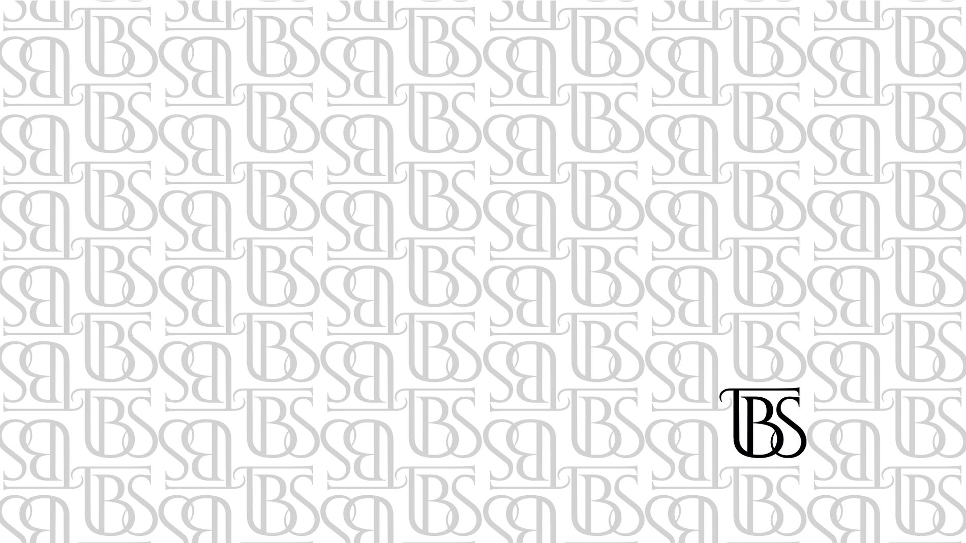
The monogram, tiled
The stacked lockup
The studio's own note on the type: a typeface that reflects a fusion of traditional craftsmanship with modern simplicity — a high-contrast serif for the wordmark, set wide and quiet, against a geometric sans for everything operational.
03Stamps and Skylines
The device that does the explaining.
A collected wall of border stamps — Russia, Sweden, Turkey, Colombia, Jamaica, Canada, the USA — sits behind the brand as its texture. Alongside it, a single continuous line drawing of world landmarks: the pyramids, the Taj Mahal, the Eiffel Tower, Big Ben, a ferris wheel.
That line runs the length of the store counter as a mural, so the room itself makes the argument before anyone reads a menu.
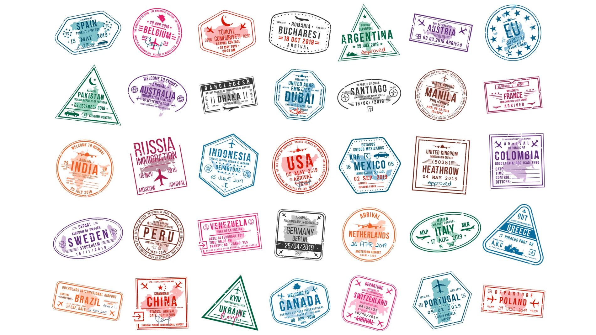
Border stamps as brand texture
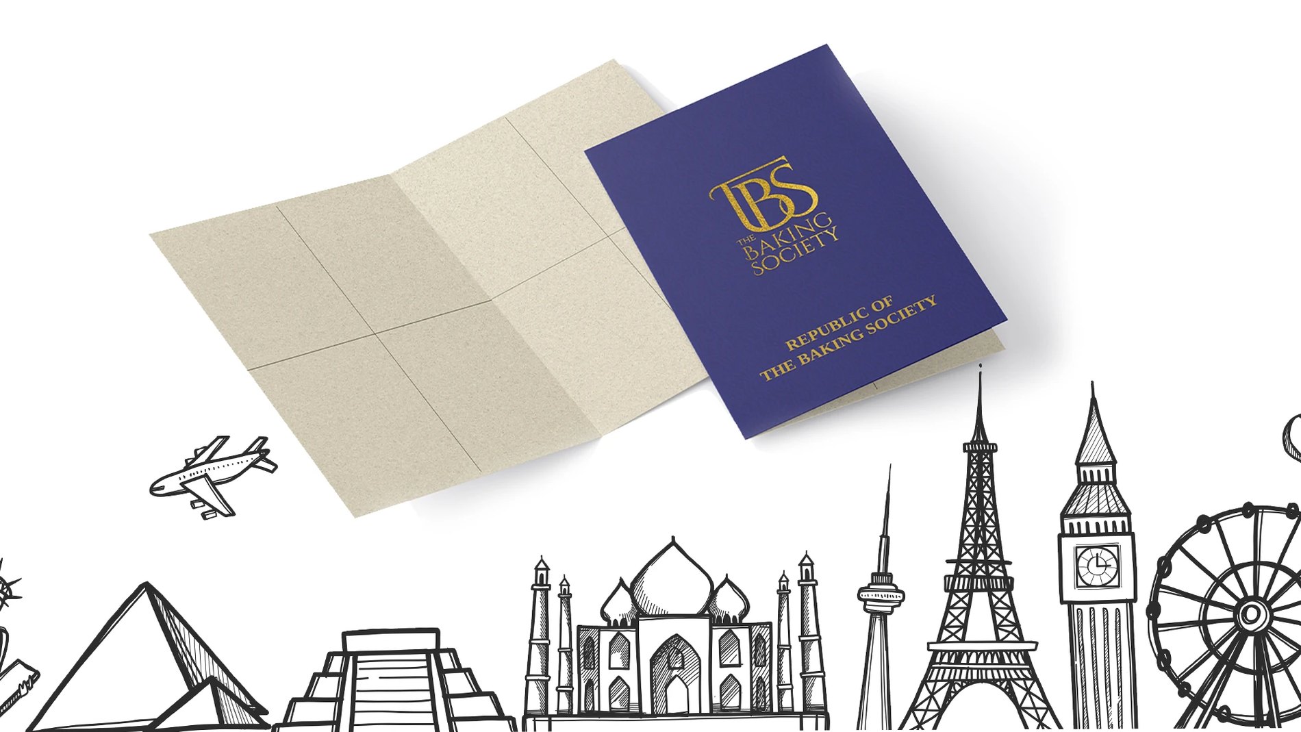
The passport booklet and its skyline
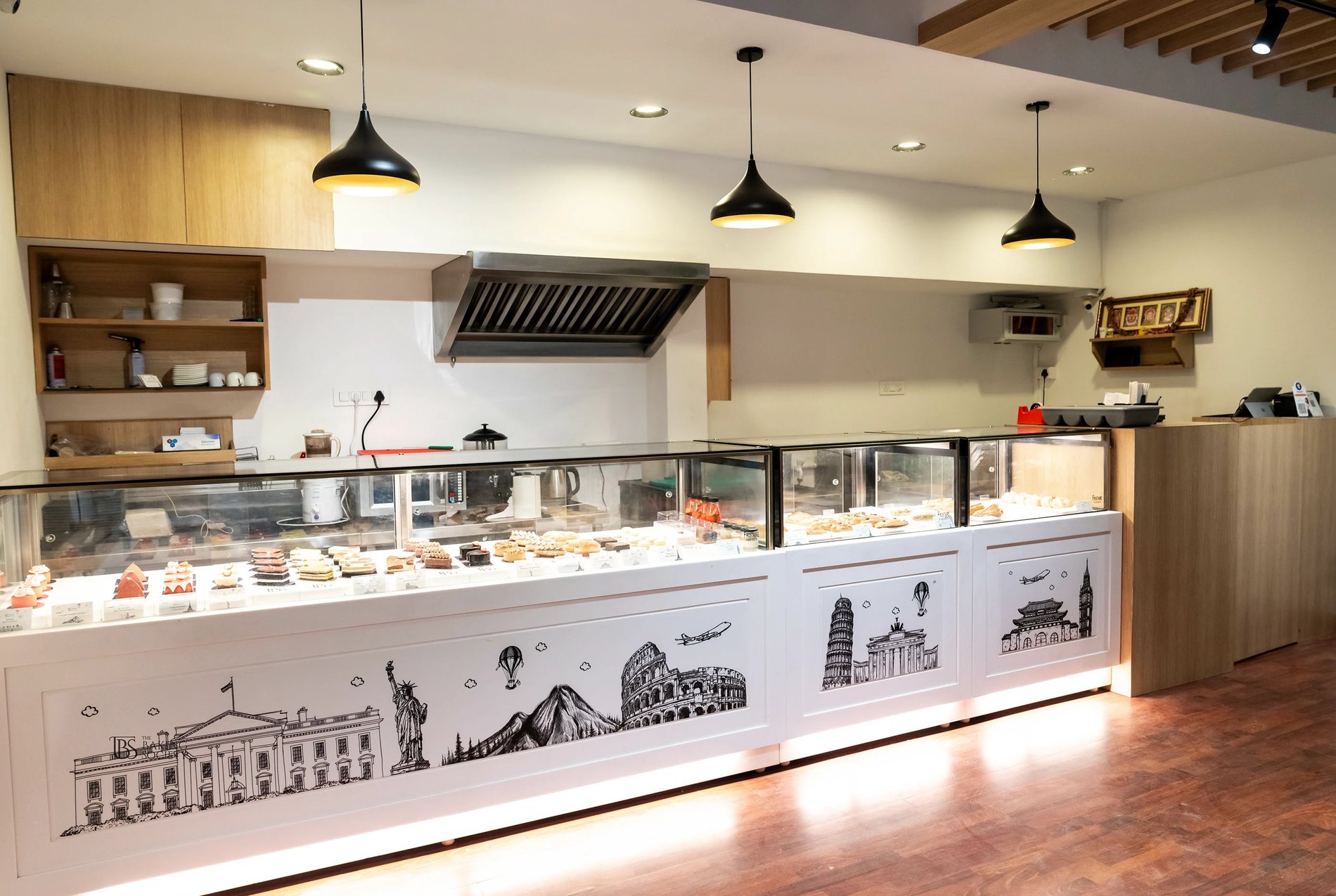
The same line, running the counter
04Colour
Warm, because the product is warm.
A near-black ink for the mark so the serif holds its contrast, and a baked orange for everything that needs to feel like an oven. The studio described stirring the pot with a mix of warm, inviting colours to evoke freshly-baked warmth — that is exactly the brief the palette answers.
Palette
Ink
The mark
Baked Orange
Primary warm
Deep Amber
Campaign grounds
Kraft
Packaging stock
05In the Hand
Packaging is the only part of a bakery brand the customer takes home.
Kraft bags, boxes, sleeves, cold-press bottles and an embossed monogram that reads by touch before it reads by eye. Deliberately unlaminated — the brand is warmth, and gloss reads cold.
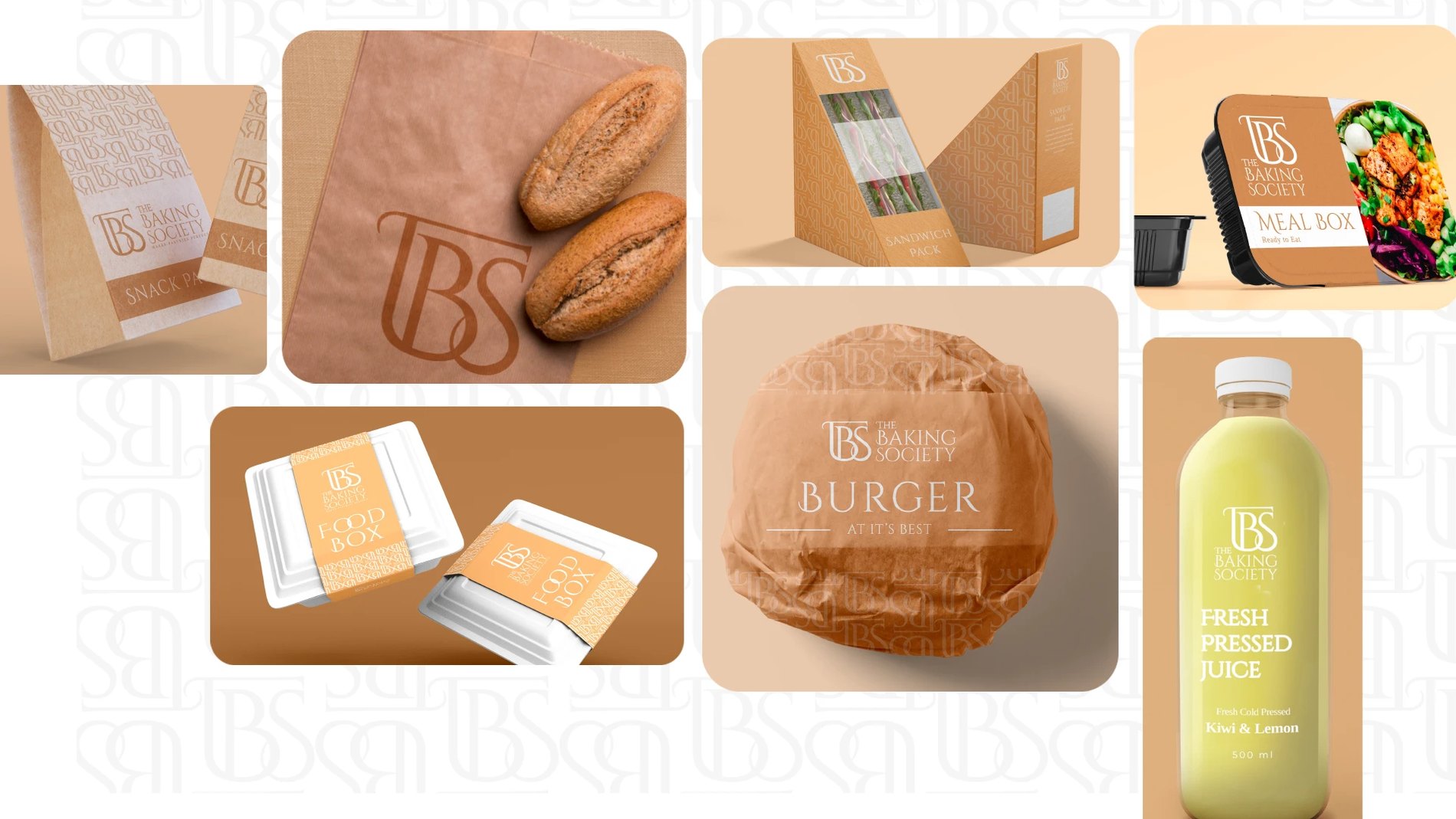
The packaging family
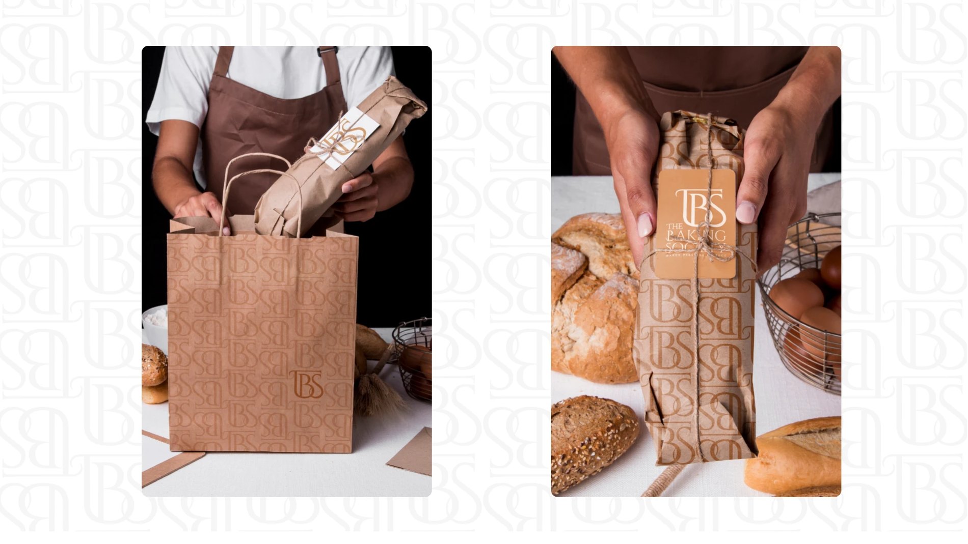
Where it actually gets judged
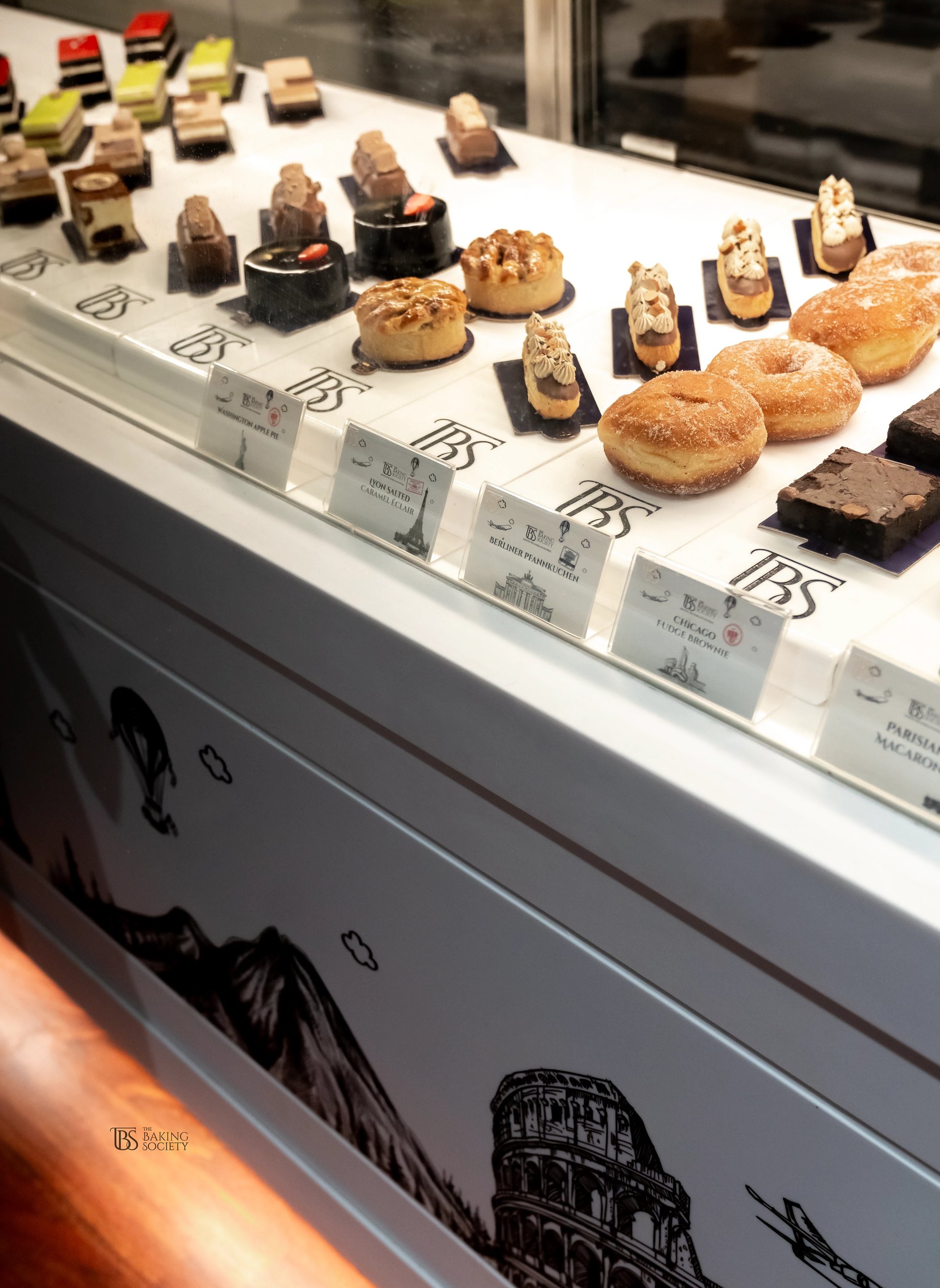
The counter, stocked
06Shot in-House
Every plate on this page was lit and shot by the same team that drew the logo.
Two treatments, on purpose. Dark and low-key for the chocolate and the babka, where the drama is in the gloss. Bright and clean on white for the savoury range, where the appetite cue is freshness.
That footage then fed the campaigns — Chocolate Babka on a mall billboard, Belgium Hot Chocolate, the croissant on amber, Fry-Day, and Around the World in Pastries. One shoot, a season of media.
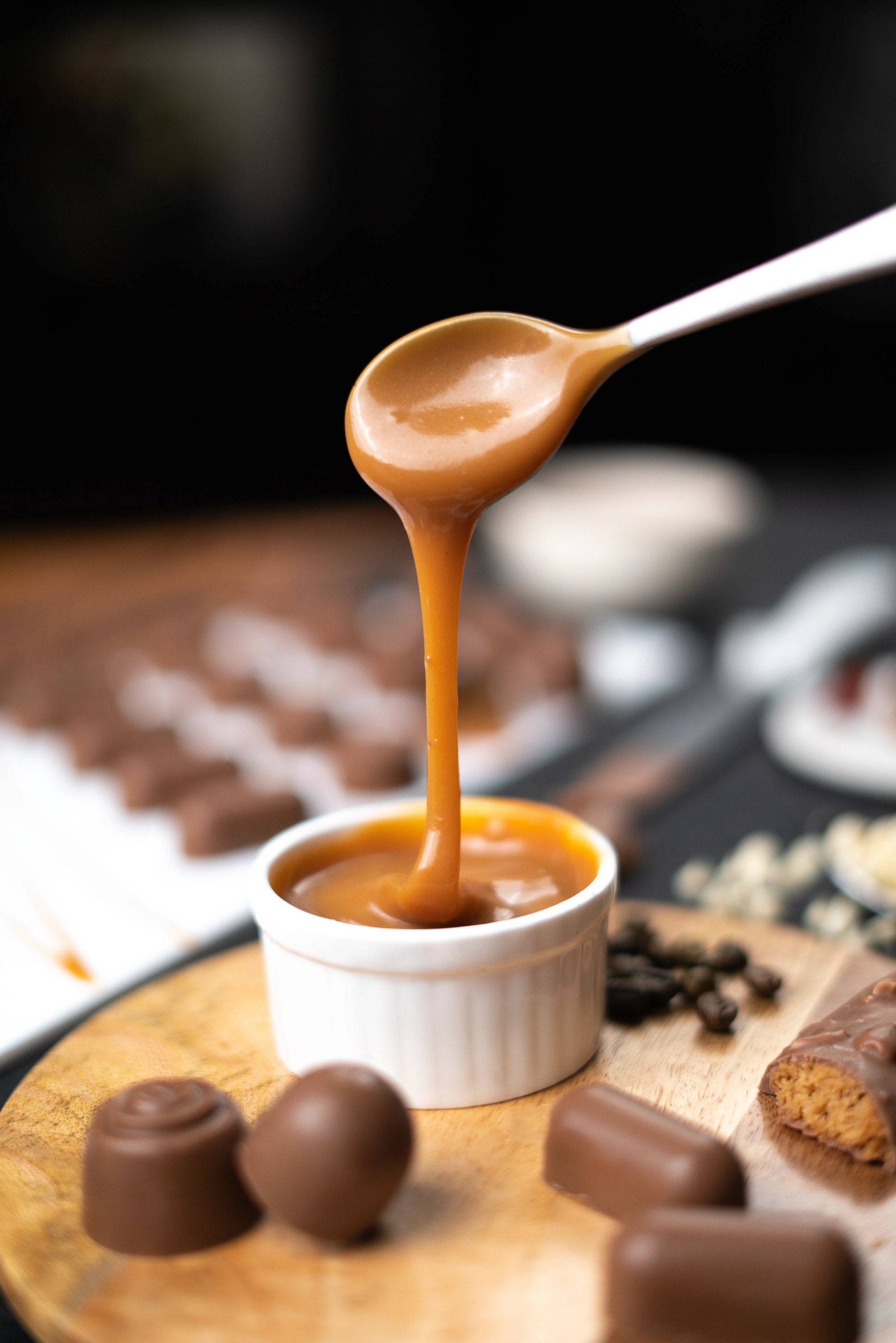
Low-key, for chocolate
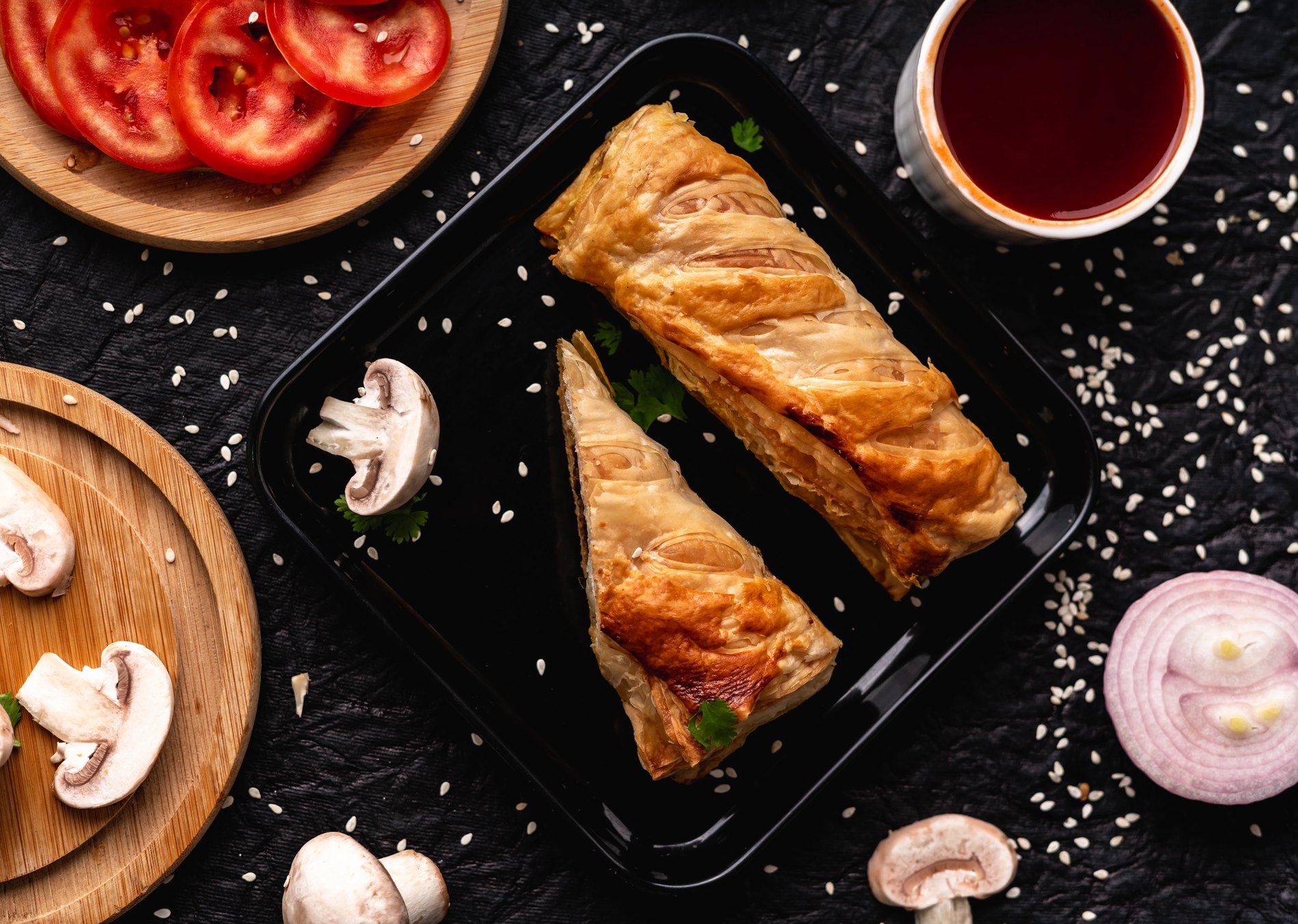
Bright, for savoury
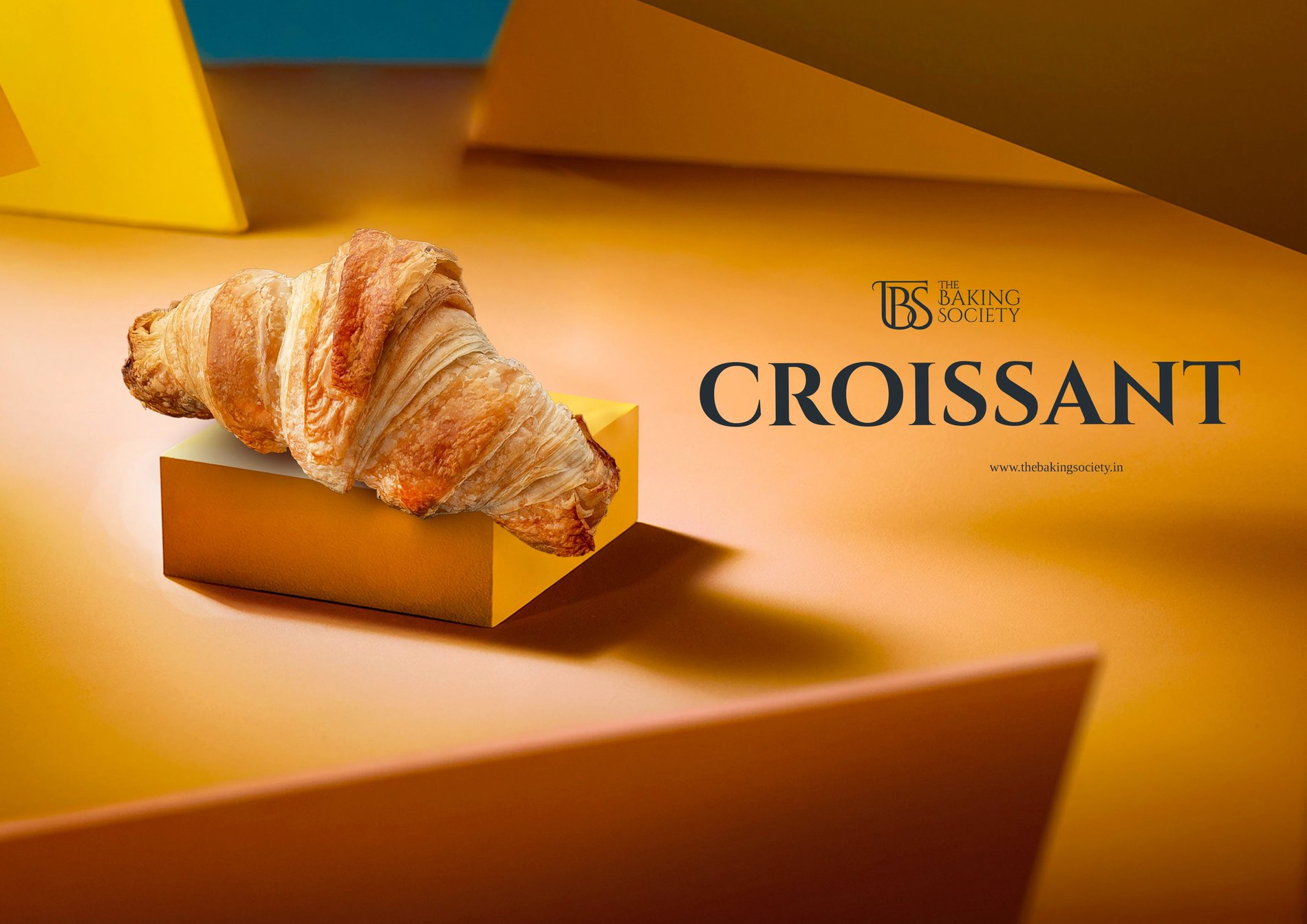
Croissant
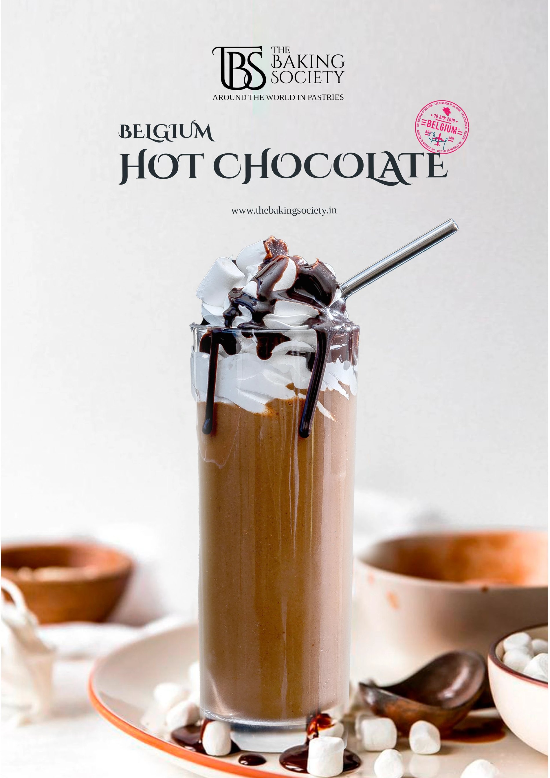
Belgium hot chocolate
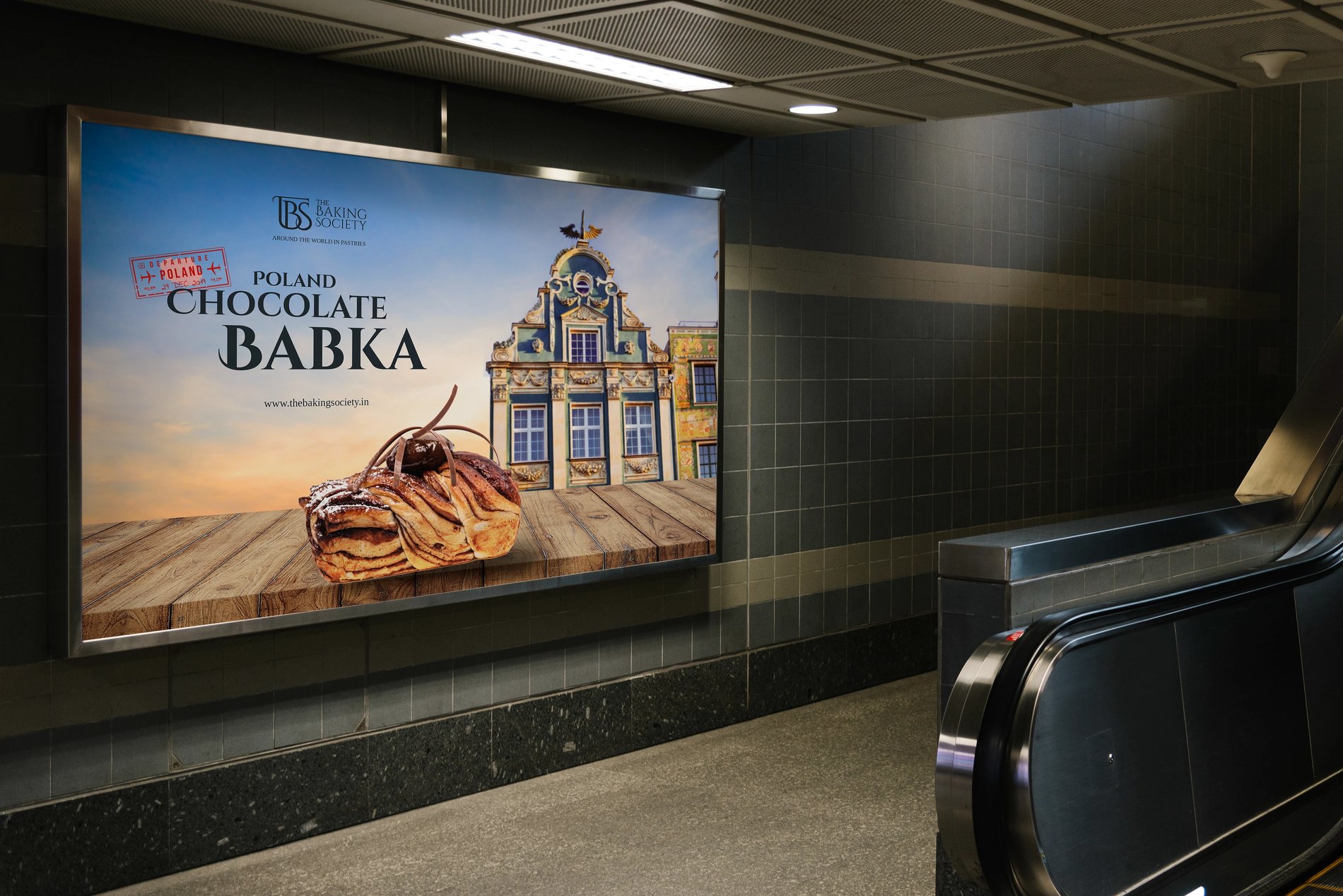
Chocolate Babka, in situ
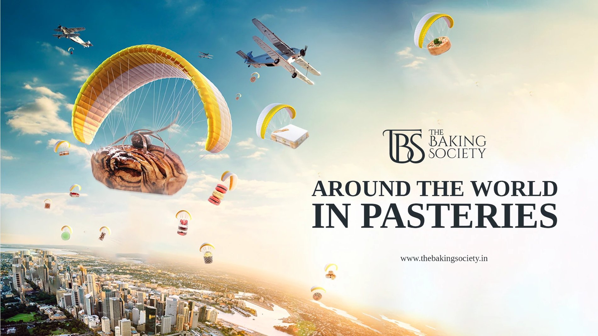
Around the world in pastries
Delivered
- Monogram, wordmark and four lockups, registered and trademarked
- Passport stamp library and continuous landmark line illustration
- Packaging: bags, boxes, sleeves, bottles, embossed monogram
- Store interior graphics and counter mural
- Product photography, two lighting treatments
- Campaign posters, billboards and always-on social
- Two themed store launches: New York and Paris
Two themed stores opened on the same identity without it bending.
Outcome
New York and Paris were launched as separate rooms under one brand — which is the test a travel-built identity is supposed to pass. The stamp does the work the theming would otherwise have to.
Around the world in pastries.
The Result
Around the world in pastries
Want this for your brand?
Three fields. We reply on WhatsApp within a few hours.