Work / Retail & Fashion
Ruah
Defining you!
- Client
- Ruah
- Year
- 2024
- Industry
- Retail & Fashion
A South Indian womenswear label that needed a mark as considered as its clothing. Three routes in, the paisley became the letterform.
Rooted in South Indian heritage yet effortlessly modern, Ruah crafts styles that let you own every version of you. From bold statement pieces to timeless essentials, the label blends tradition with trend, confidence with comfort, and individuality with elegance.
Because style isn't about fitting in. It's about standing out, unapologetically.
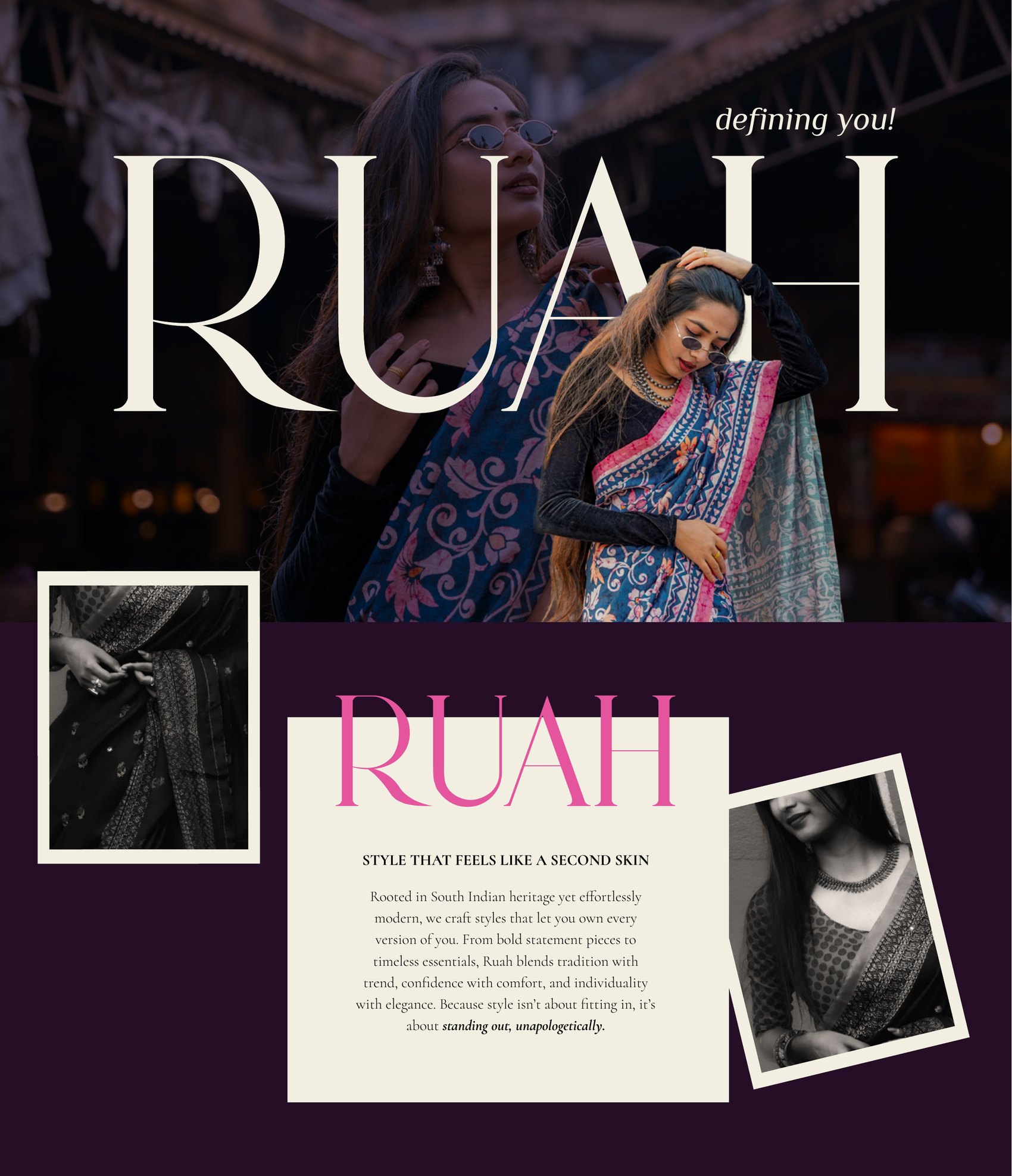
Style that feels like a second skin
01The Brief
A versatile mark that reads as style and confidence for all women.
The vision was to become the go-to brand for trend-setting attire, and the brand that guides women to their own unique style. The mission: stylish, trend-setting pieces mixing tradition with modern vibes, so women feel their best and rock their individuality every day.
The brief
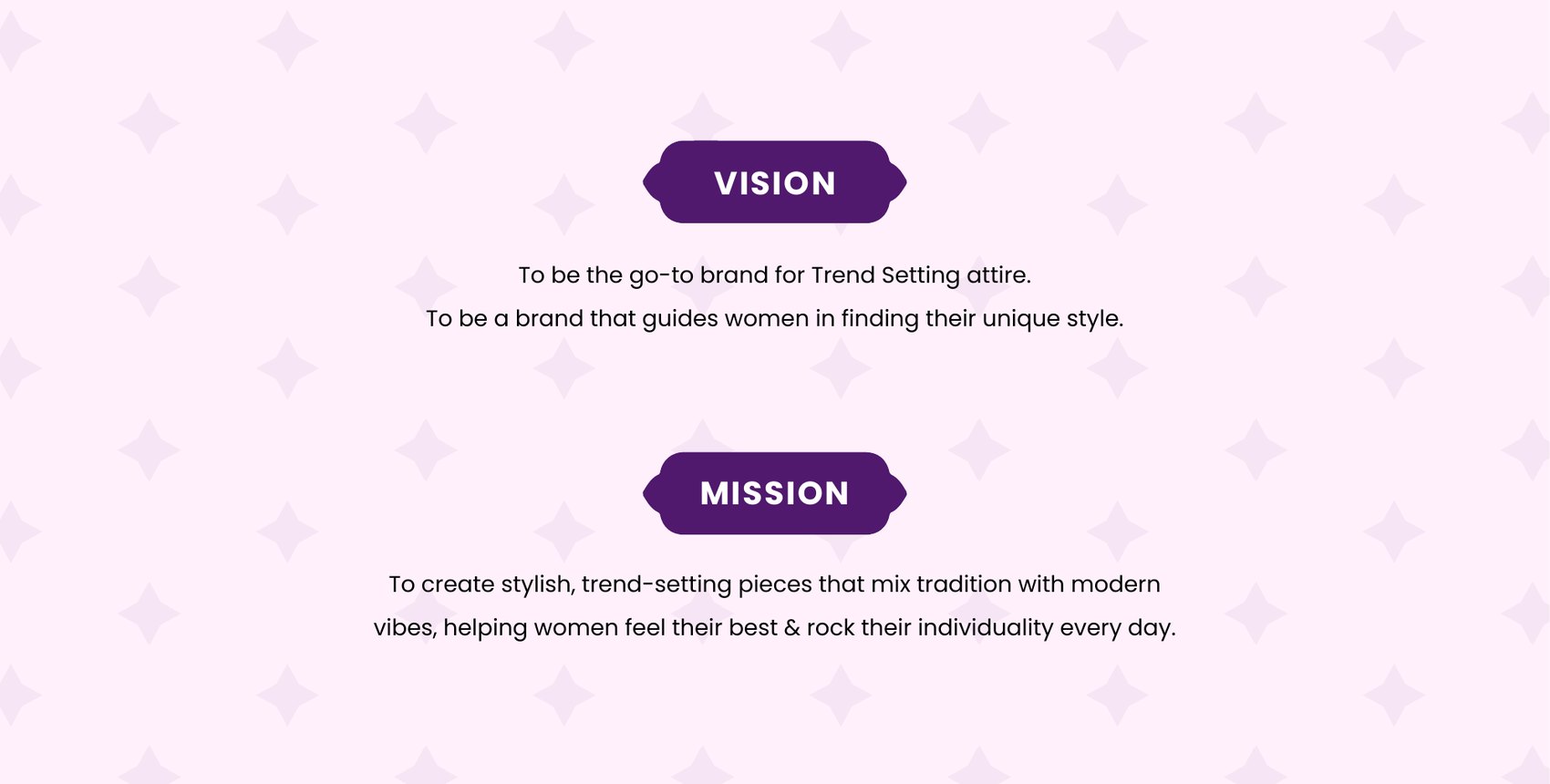
Vision and mission
02The Woven Story
Indian. Iconic. Chic. Feminine.
Ruah's identity needed to be woven with threads that style the brand in a way that's true to its roots — traditional, but with a twist, and iconic in terms of fashion statements. Those four words became the test every route had to pass.
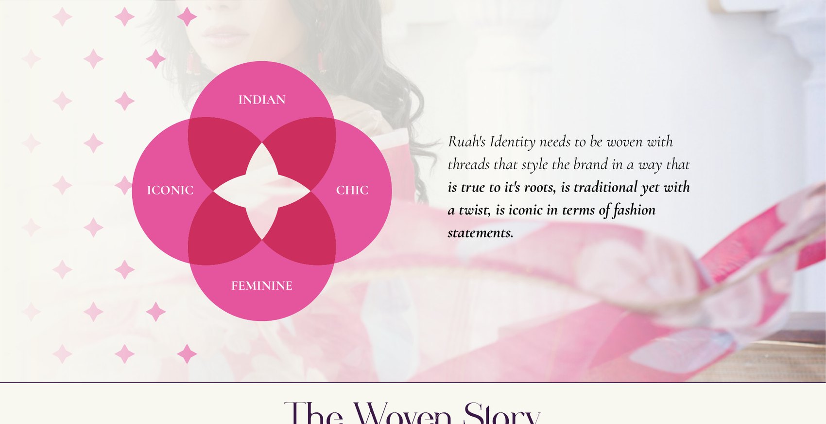
The four threads
Indian-ness and legibility kept pulling against each other.
Problem
Route one oozed Indian-ness and read as unmistakably women-centric, with real elegance and minimalism — but it was difficult to read, and too traditional.
Route two was well balanced, modern and fluid, and still clearly a women's brand — but it wasn't elegant enough, and the Indian touch had gone missing.
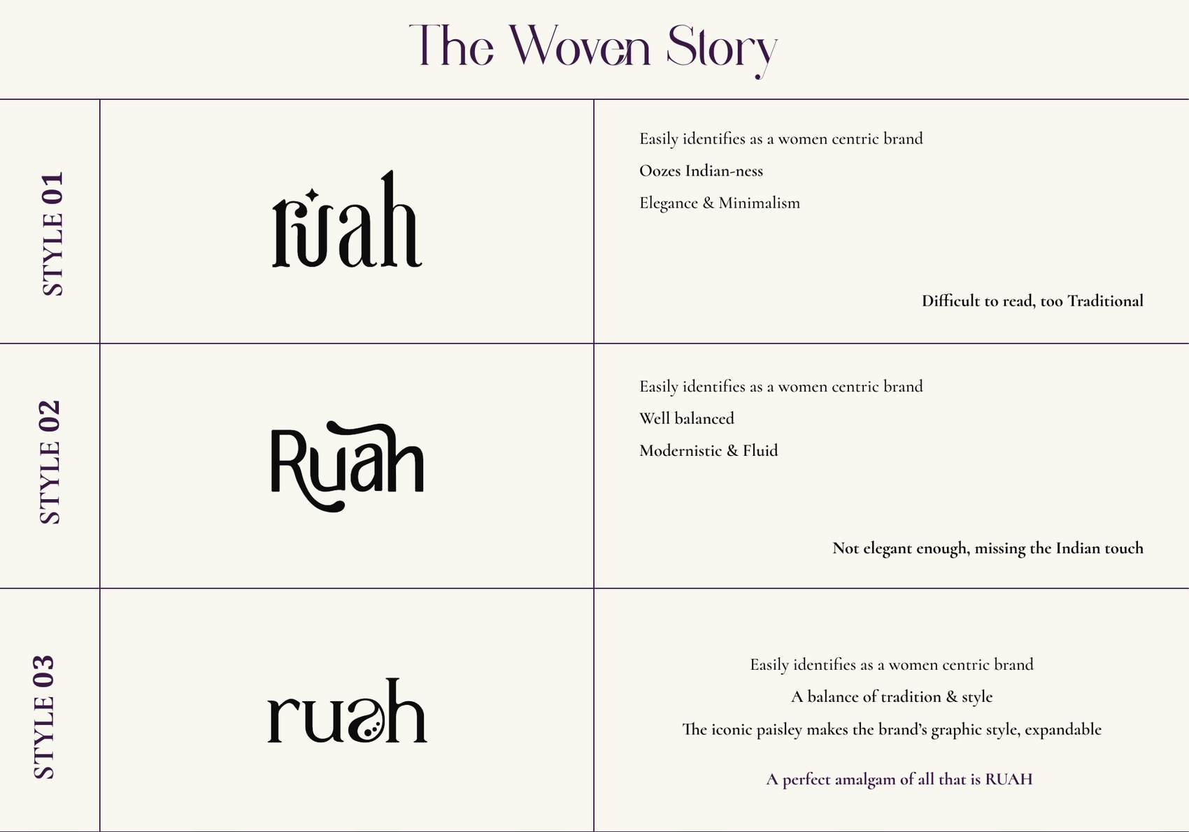
Three routes, and the verdict on each
Make the paisley do the work of a letter.
Solution
Route three balanced tradition and style, and it did one thing the others couldn't: the iconic paisley becomes the 'a', which makes the brand's graphic language expandable — a motif that can leave the wordmark and become pattern, packaging and print. A perfect amalgam of all that is Ruah.
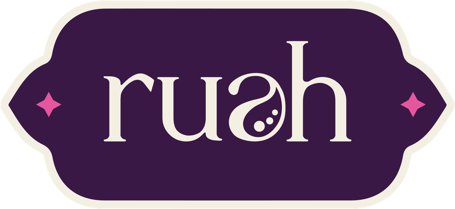
Primary lockup
Cream with pink keyline

Reversed, for dark surfaces
Defining you!
03Colour
Deep plum, cream, and a pink that does the talking.
Plum carries the elegance and holds the range together; cream gives it air; the pink is used sparingly and only where the brand needs to raise its voice.
Palette
Plum
#3A1845 — primary
Deep plum
#31133D — depth
Cream
#F8F7F0 — ground
Pink
#E05098 — accent
04Out in the World
The paisley becomes pattern, and the pattern goes everywhere.
Cards, hang tags, care labels, thank-you notes, the tote, the storefront. Once the motif left the wordmark it became the connective tissue — a repeat that reads as texture at a distance and as heritage up close.
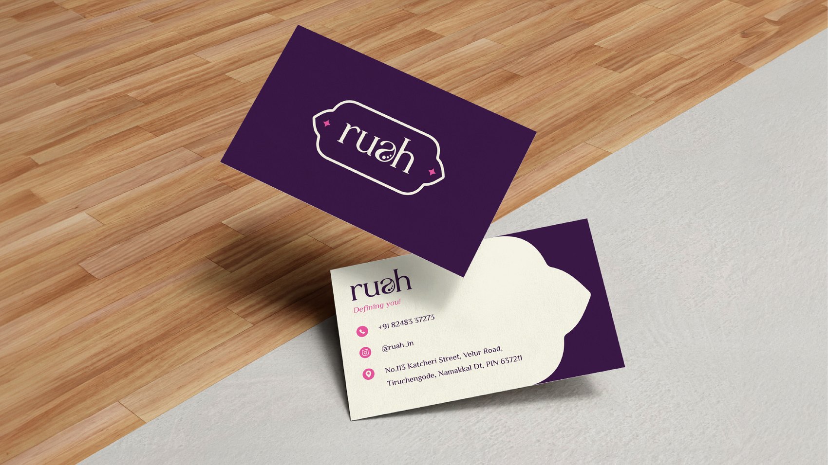
Stationery
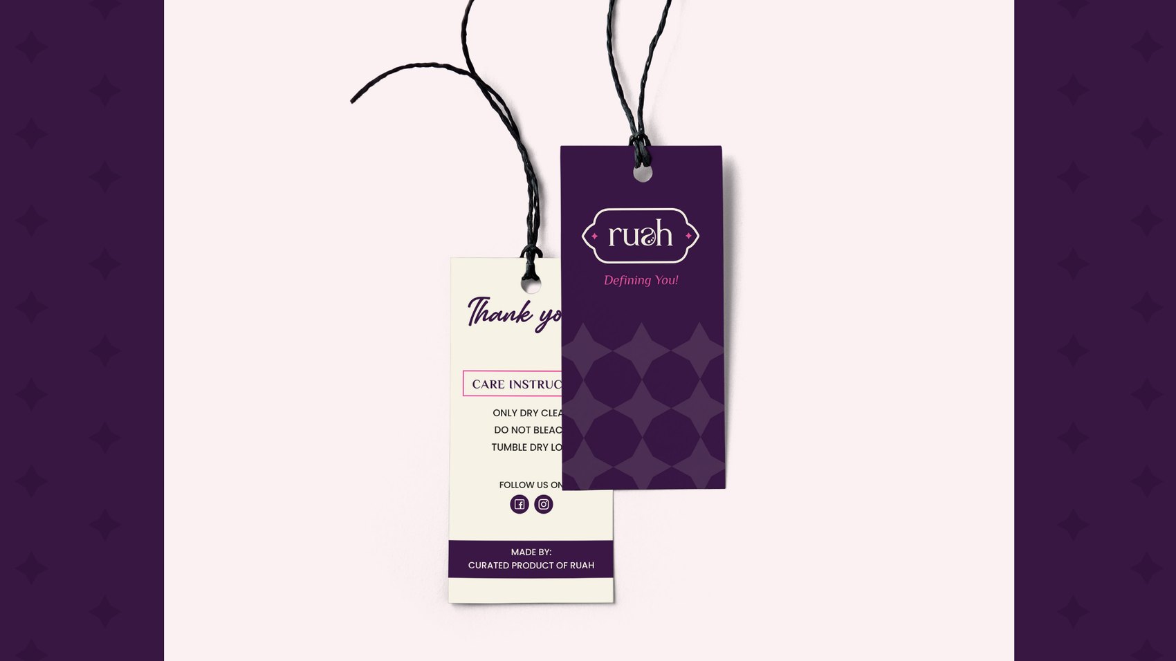
Hang tags and care labels
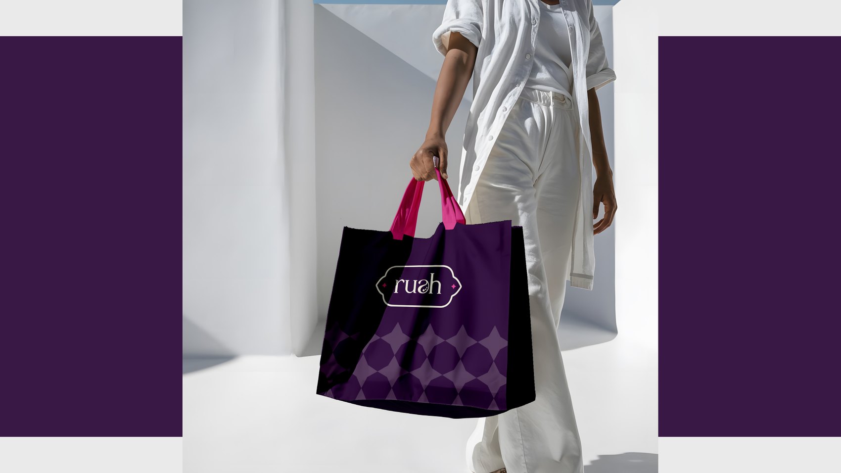
Tote, with the paisley repeat
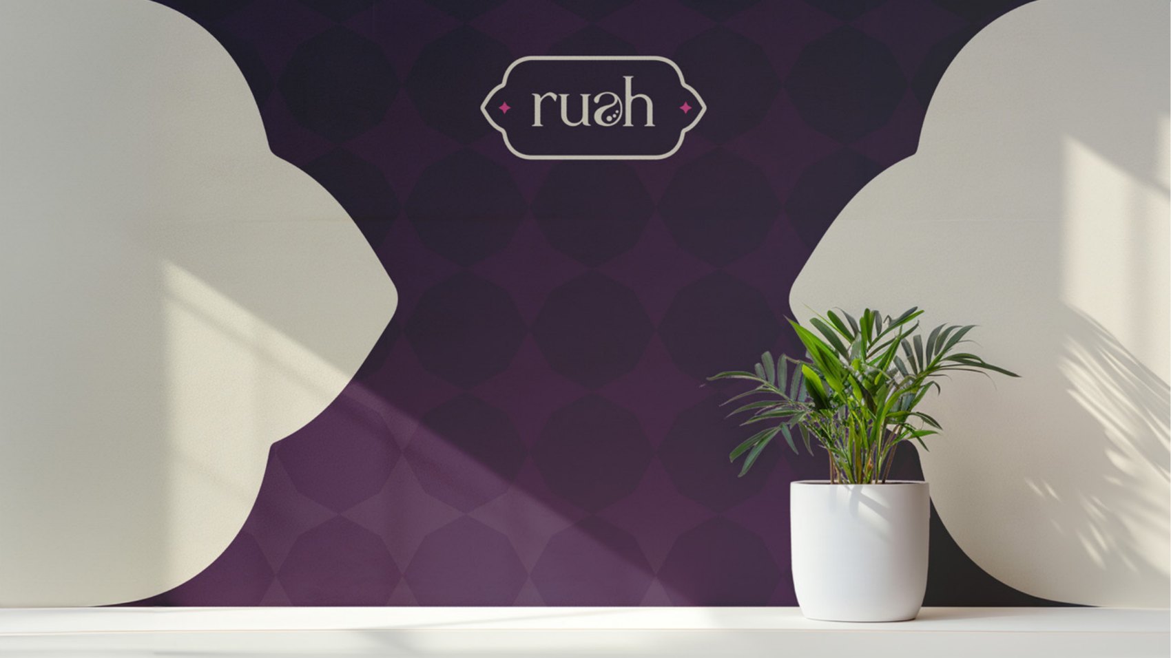
Interior signage
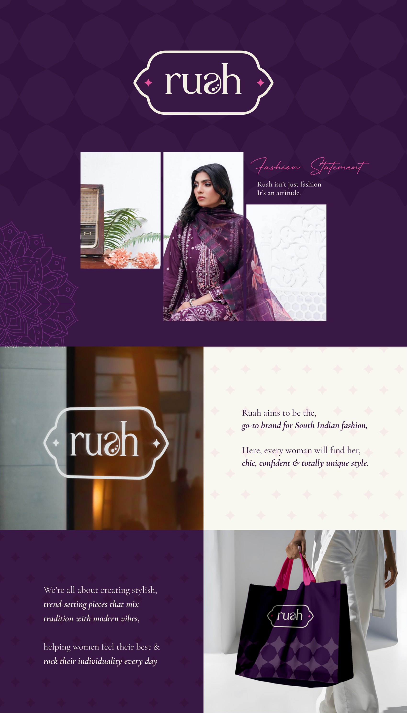
The system in use
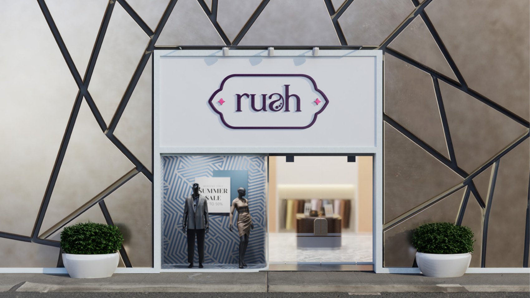
Storefront
05Fashion Statement
Ruah isn't just fashion. It's an attitude.
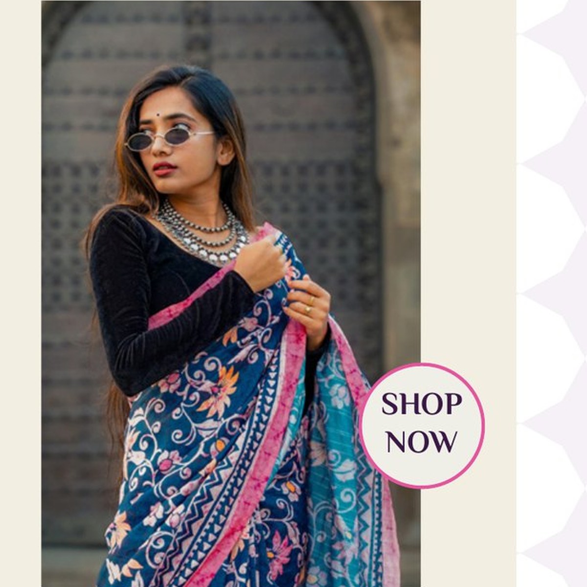
The label aims to be the go-to brand for South Indian fashion — where every woman finds her chic, confident and totally unique style. The social system carries that: product-led posts that name the print and the colourway, so the clothes stay the hero.
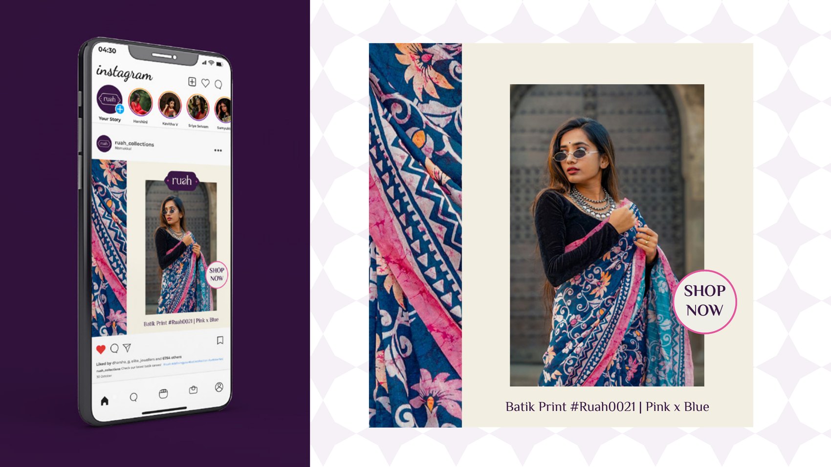
Batik Print #Ruah0021 · Pink x Blue
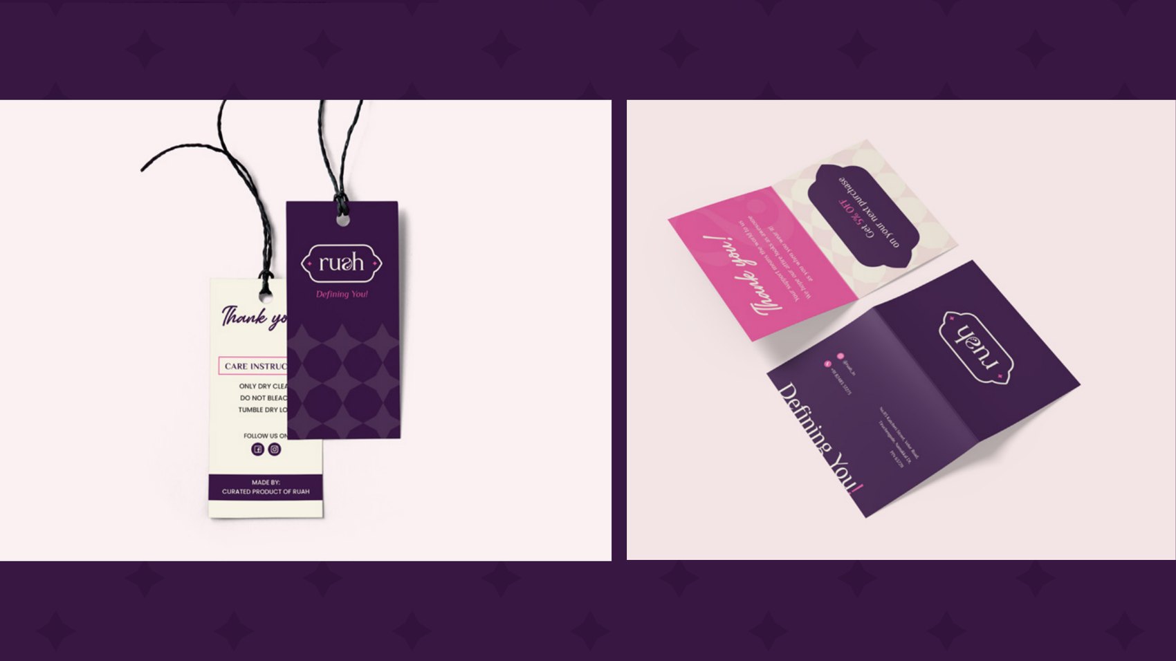
Labels
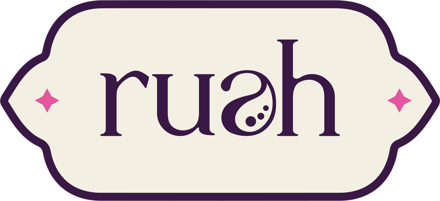
Cream on plum
A mark rooted enough to feel inherited, modern enough to feel new.
Outcome
One letterform carries the whole idea: the paisley sitting inside the name, traditional and legible at once — and expandable into every surface the label needed.
Style isn't about fitting in. It's about standing out, unapologetically.
The Result
Style that feels like a second skin
Want this for your brand?
Three fields. We reply on WhatsApp within a few hours.