Work / Travel
Into the Wow
Roverland Voyage
- Client
- Roverland Voyage
- Year
- 2025
- Industry
- Travel
The one client that runs through six of our seven services: brand and launch, social, website, videography, CRM and lead automation, and show direction for Iceland Expeditions 2026.
01The Brief
Premium self-driven road trips, built to end in a state of wow.
Roverland Voyage is a premium, self-driven road trip company curating immersive journeys across Iceland, New Zealand and Scandinavia. With surprise-filled itineraries and scenic routes, they turn road travel into a state of discovery — drives that become long-lasting memory.
The brand archetype is the Magical Explorer: a seeker of the unknown who turns each road into a portal of wow. Founder Prawin's vision was clear — this isn't conventional tourism, it's exploratory living.
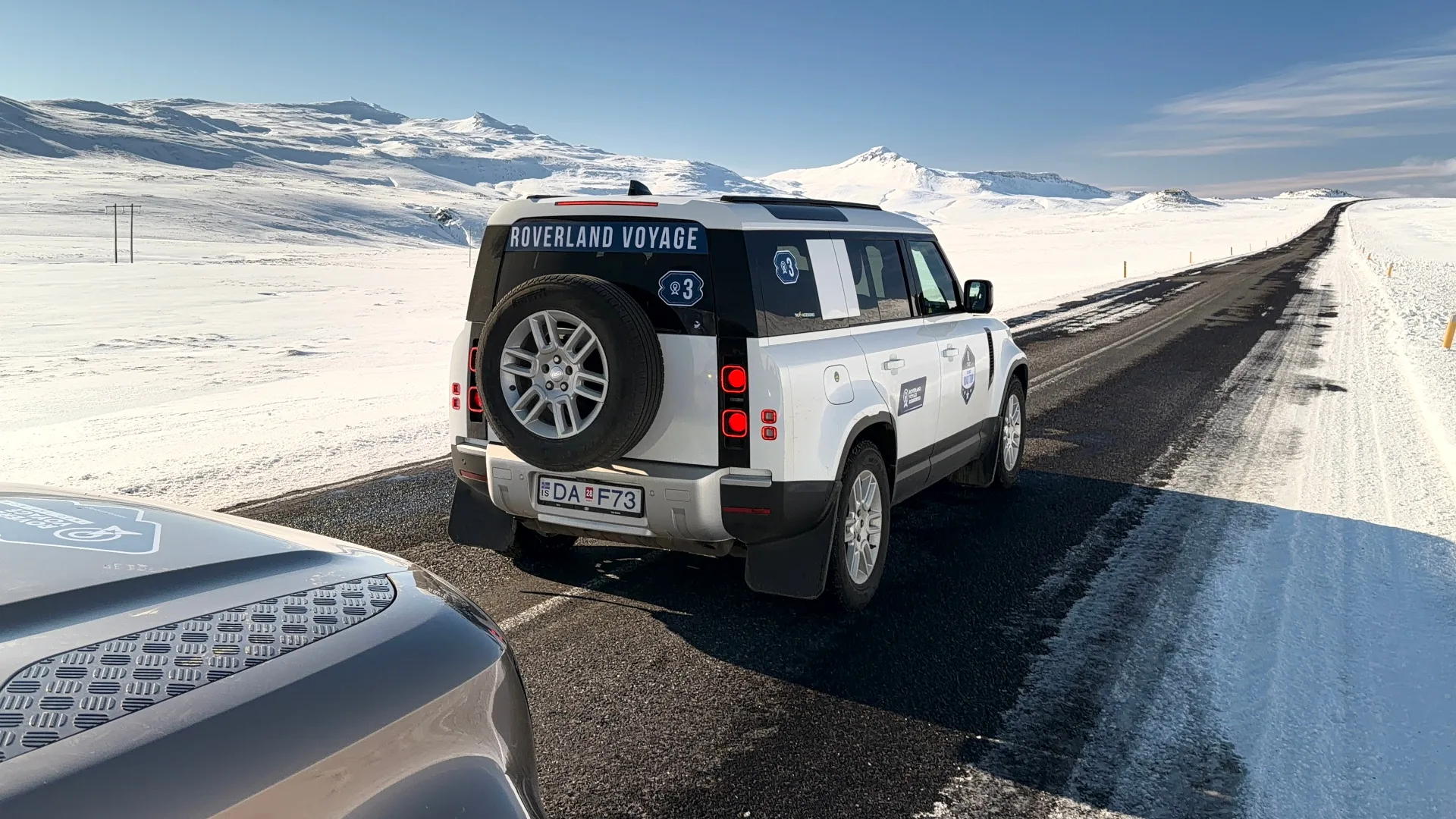
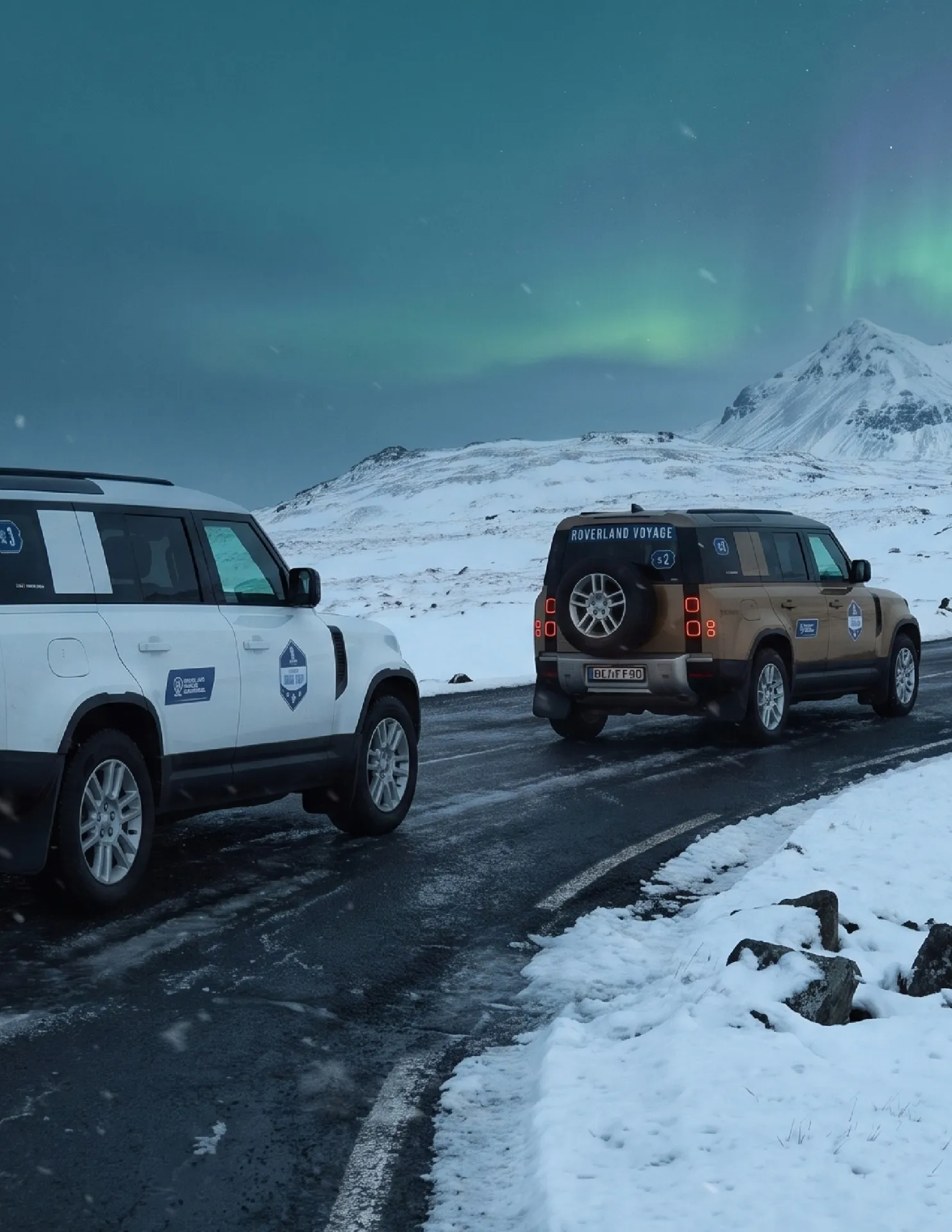
Iceland, on the brand's own wheels
A premium product with no identity to match it.
Problem
Roverland had curated self-drive expeditions in Land Rover Defenders, but no visual system carrying the emotional weight of the experience. They needed the whole thing: symbol, colour theory, typography, merchandise and a website that sells the feeling of the road rather than the itinerary.
Anchor everything to the Northern Lights.
Solution
We built an identity rooted in the aurora — the Wow Spectrum — tying every colour and gradient to the emotional arc of a Roverland journey. The logo fuses five symbolic travel elements into one abstract mark, and the website was designed and built cinematic: full-bleed film, day-by-day storytelling and a booking flow that respects the premium positioning.
02The Symbol
Five touchpoints, one mark.
At the heart of Roverland Voyage lies a single promise — to take travellers into a state of wow. On the way there, they pass through five symbolic touchpoints, and those became the DNA of the logo.
The five elements
- Directions (compass) — guiding the path
- Location pins — anchoring meaningful moments
- Travel roads — the evolving story
- Wow expression — the emotional peak of discovery
- Surprises (star) — thoughtfully placed delights that lift the trip beyond expectation
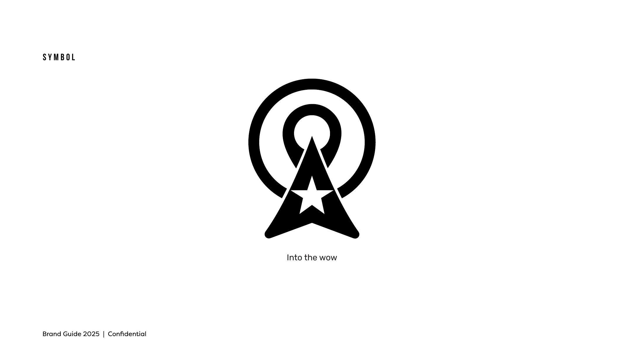
The symbol — Into the wow
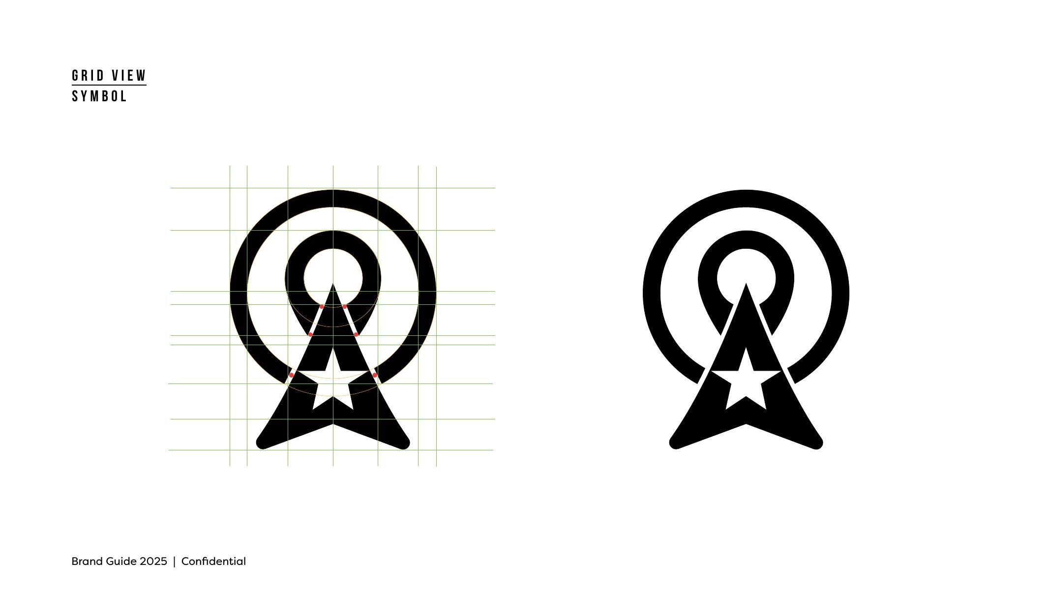
Grid construction
The mark holds the five elements in a partly abstract, minimal form — the emotional map of every Roverland journey. The star folded into the symbol stands for surprise: one of the brand's key USPs and the magical high point that sets Roverland apart.

Primary lockup
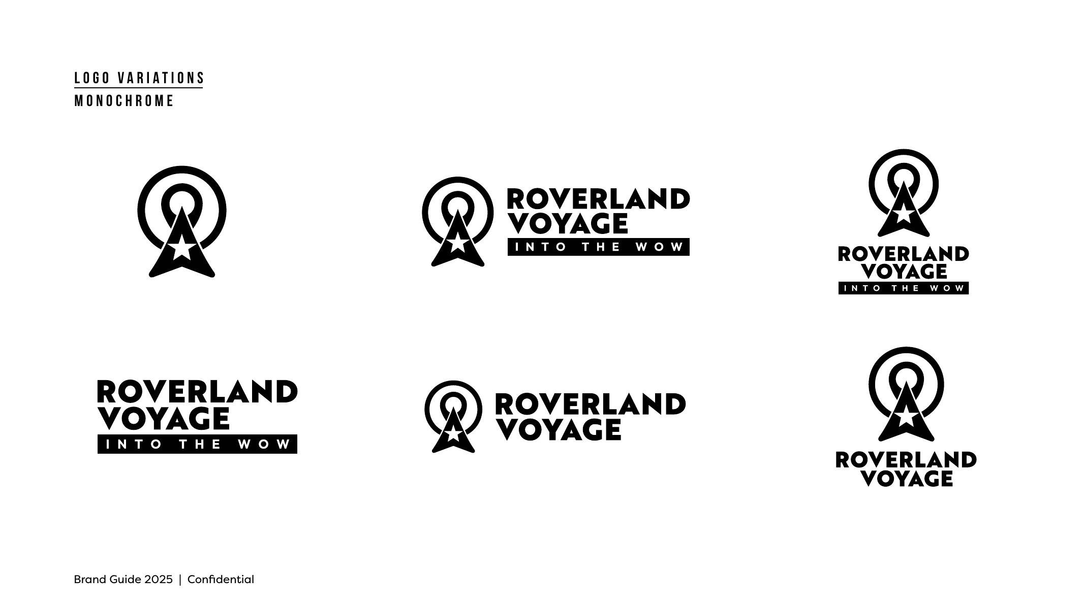
Monochrome variations
03The Wow Spectrum
A palette that follows the emotional arc of the drive.
The colour system is more than a palette. Inspired by the Northern Lights and built around the promise of the state of wow, it captures the evolving moods, moments and memories that shape each curated road trip.
The system
Voyage Blue
The open sky at dawn — movement, direction, trust
Explorer Teal
Hidden lagoons and lush horizons — adventure and surprise
Wow Spectrum
Aurora gradient across all collateral
Monochrome
Black and white, always underneath
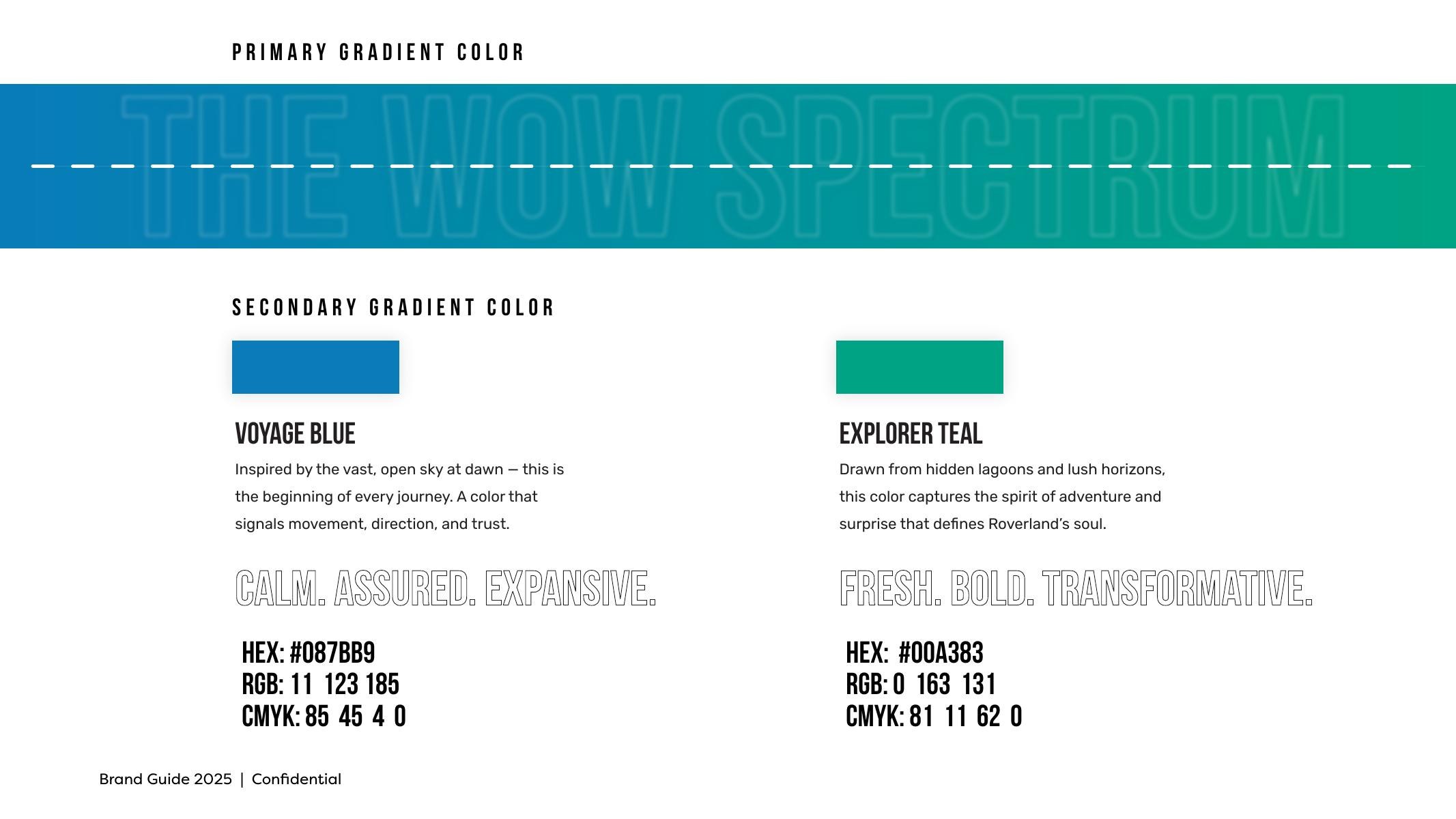
Voyage Blue and Explorer Teal, with full specs
04Typography
Bold for the call, warm for the story.
Bebas Neue Regular handles headlines and display — compressed, uppercase, unapologetic. Mulish, regular and bold, carries the narrative: clean, contemporary and legible across screen and print.
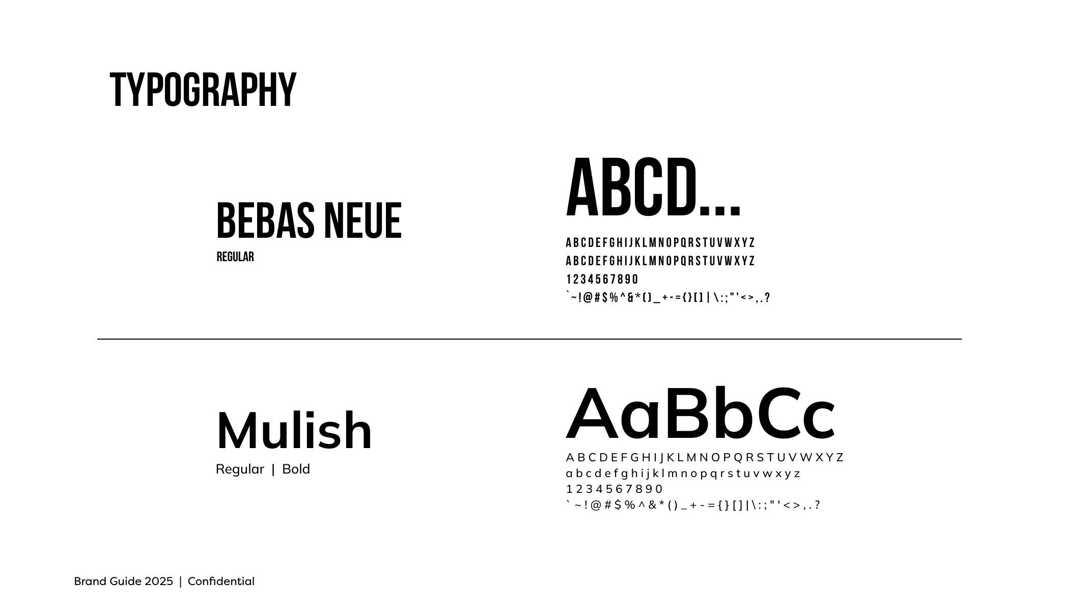
Bebas Neue and Mulish
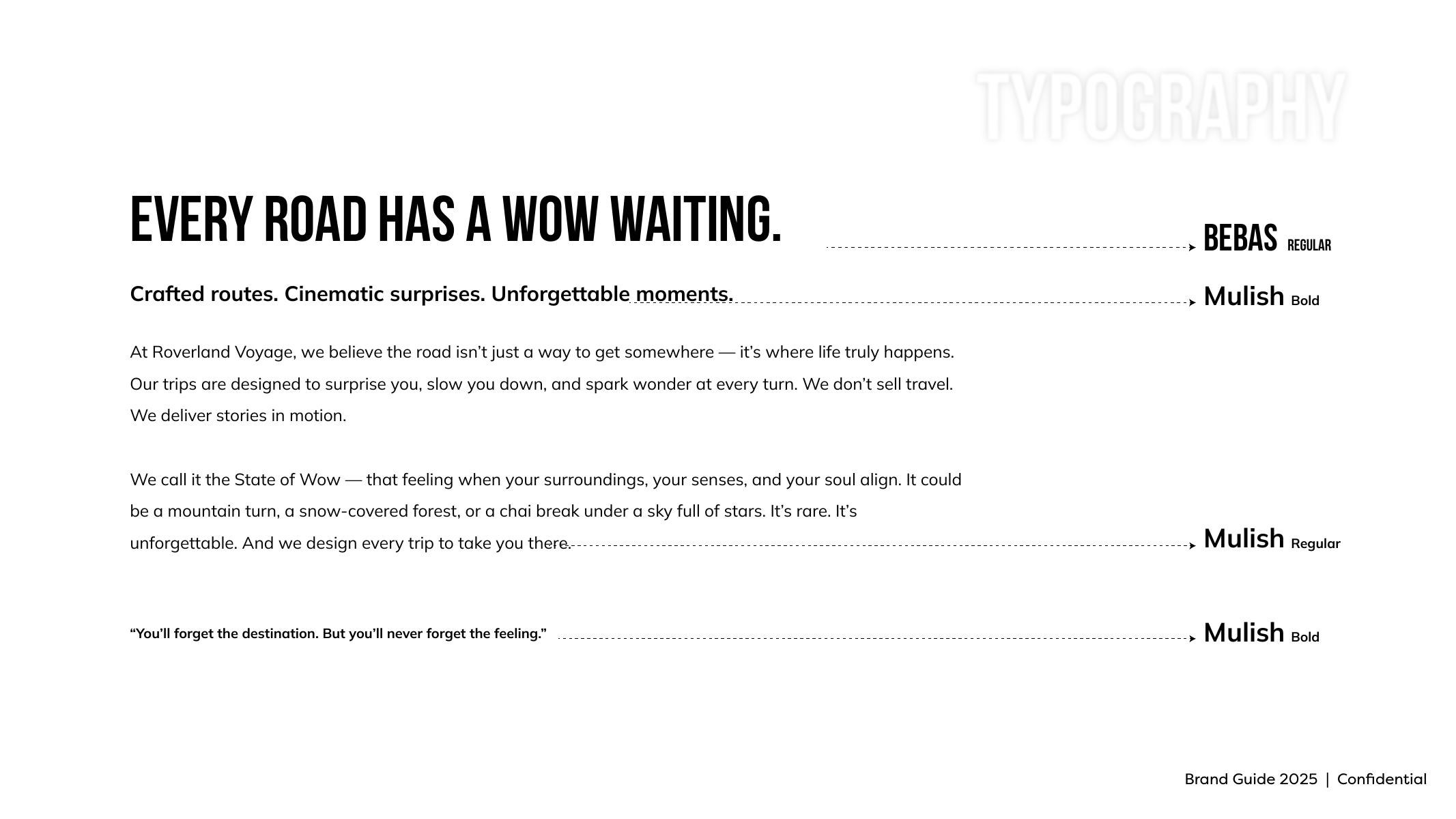
Every road has a wow waiting
05The Website
A booking experience shot like a film.
We designed and built roverlandvoyage.in as a cinematic booking experience — full-bleed hero videos, day-by-day itinerary storytelling, convoy and vehicle detail, hotel galleries and a seamless Razorpay-powered reservation flow.
The Iceland Voyage page runs seven cinematic hero films, one per experience, from whale encounters and glacier snowmobiling to the Blue Lagoon farewell. A 3D illustrated map traces the 1,400 km route, with traveller testimonials and transparent pricing closing the funnel.
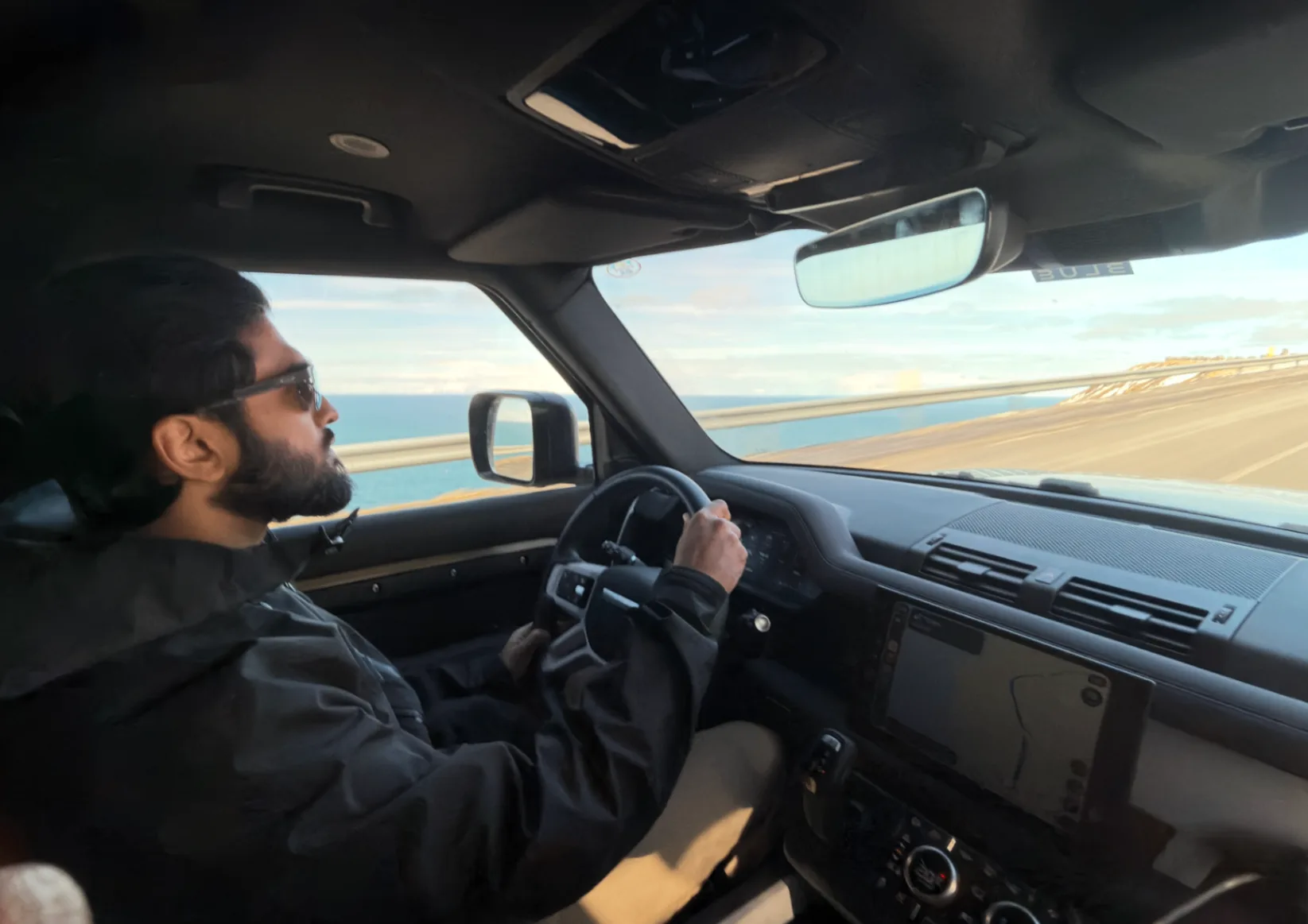
Golden hour, somewhere on the ring road
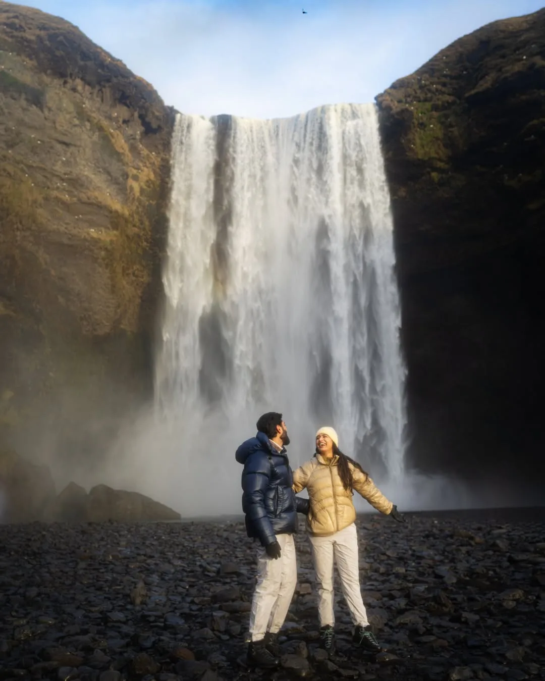
Skógafoss
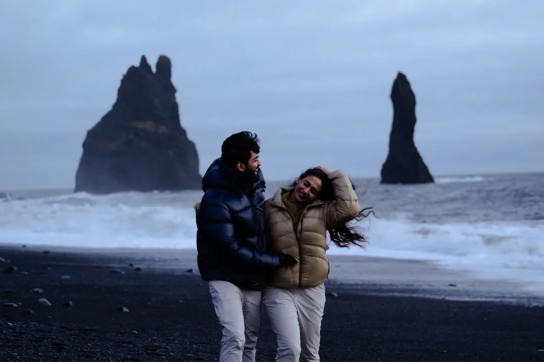
Reynisfjara
06Merchandise
The system, packed for the expedition.
The brand extends into expedition merchandise — bottle, backpack and duffel — each carrying the Wow Spectrum gradient and the brand's adventure-first voice.
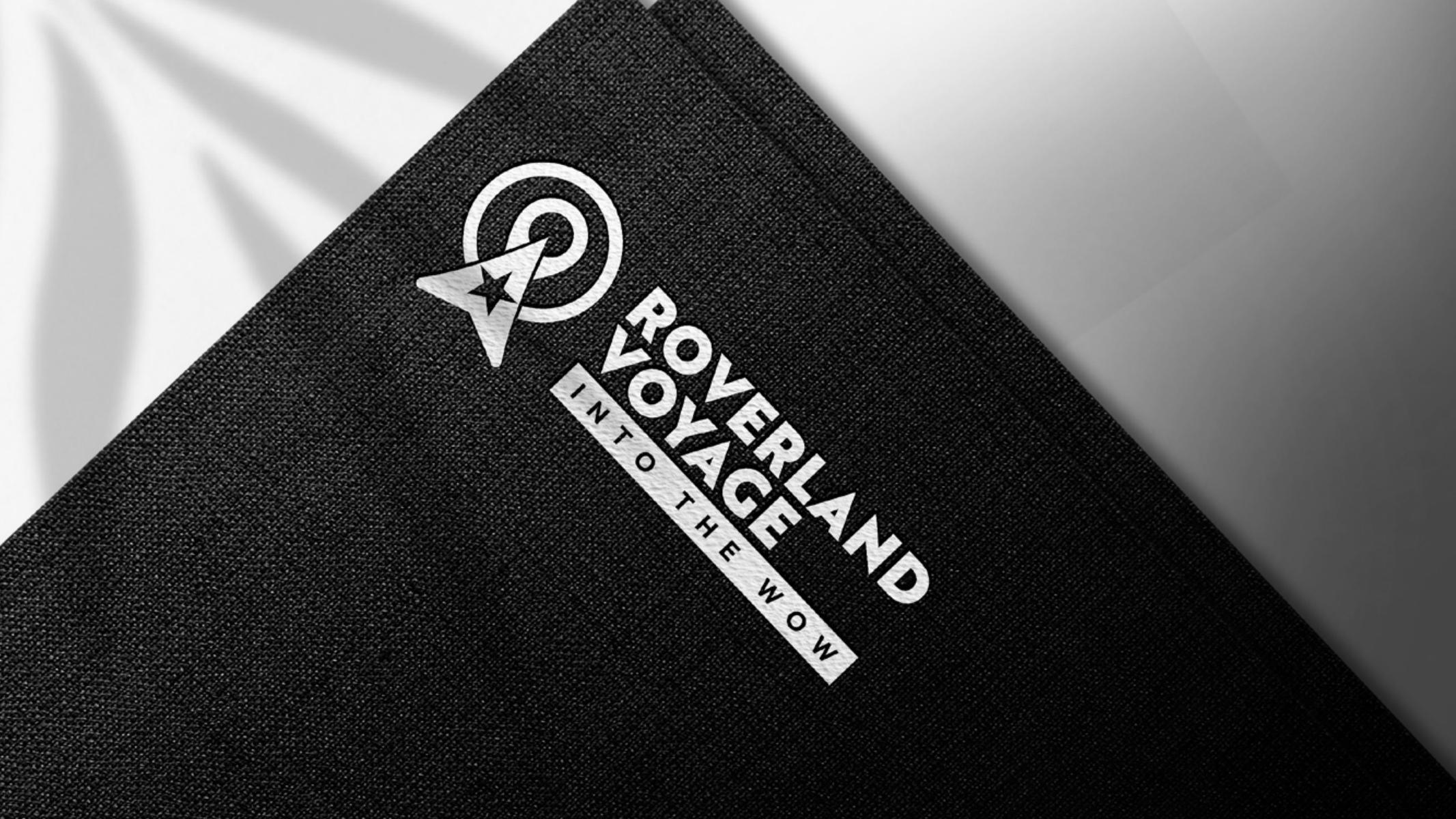
Embossed on charcoal
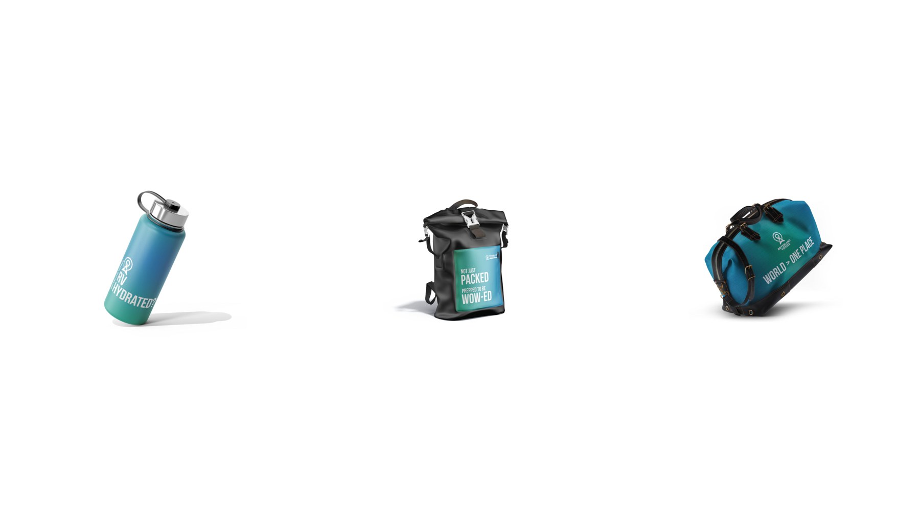
Bottle, backpack, duffel
A brand and a booking engine, built from zero.
Outcome
Symbol, wordmark, colour theory, typography, a full merchandise line and a cinematic website with integrated booking. The Iceland Voyage (Oct 2026) launched at INR 5,75,000 per person — Land Rover Defenders, nine days, 1,400 km Reykjavík to Reykjavík. New Zealand and Scandinavia follow in Dec 2026 and Feb 2027.
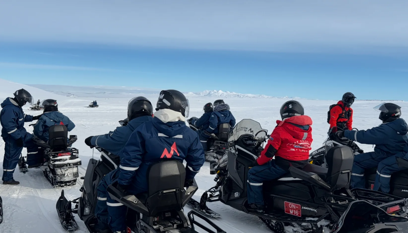
Glacier snowmobiling
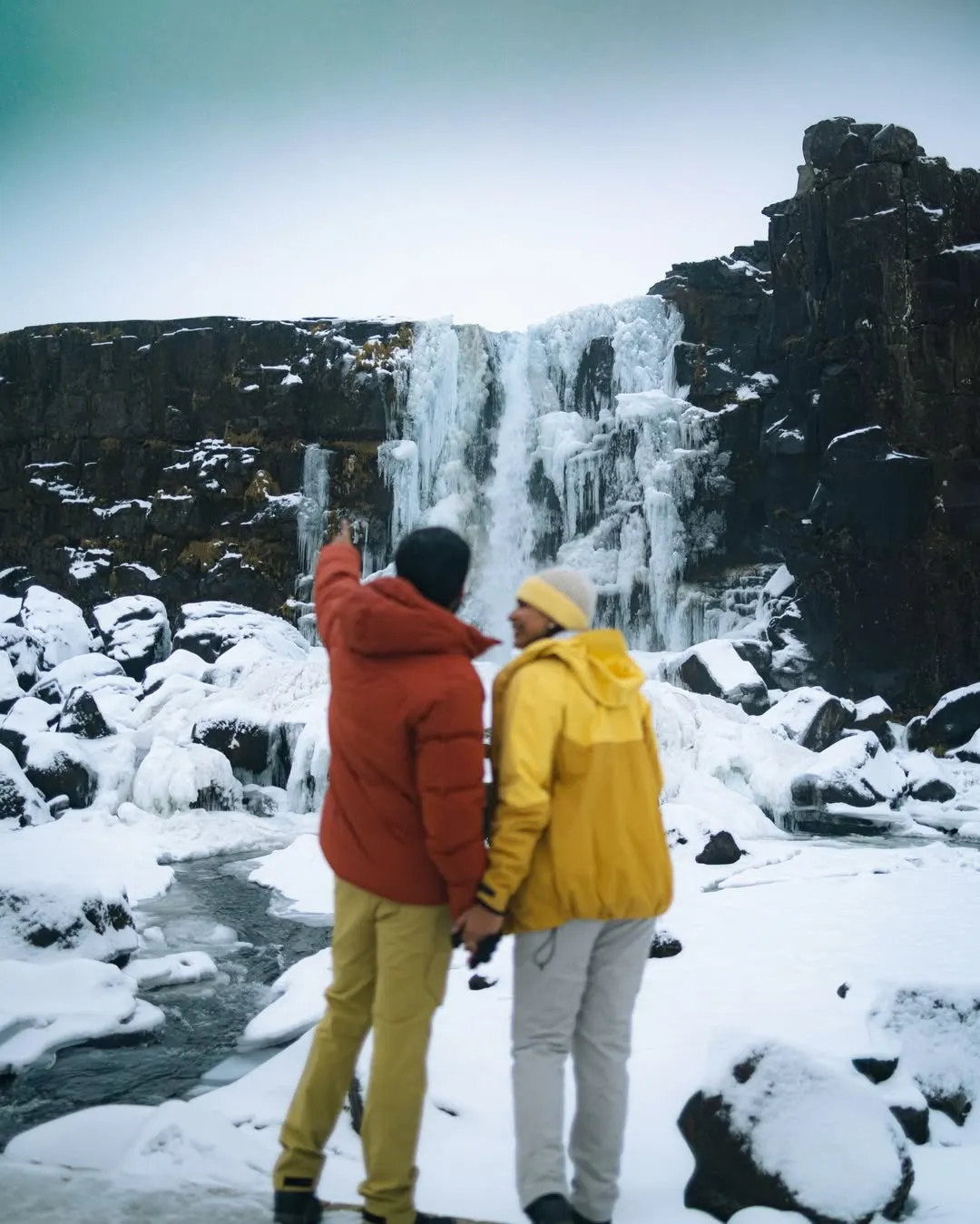
A frozen waterfall
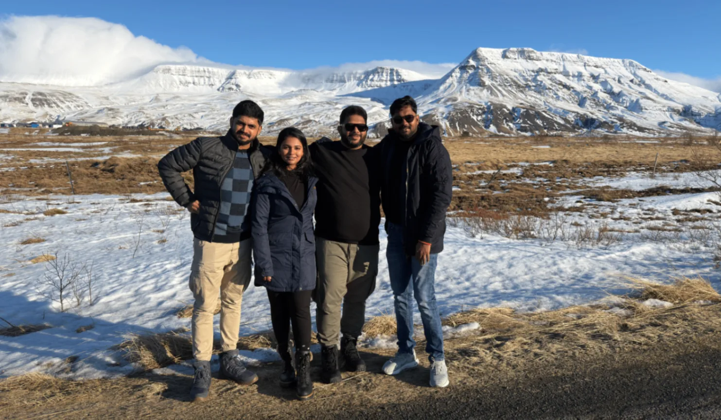
The voyagers
You'll forget the destination. But you'll never forget the feeling.
The Result
6 of 7 services, one client
Want this for your brand?
Three fields. We reply on WhatsApp within a few hours.